If you’re wondering how to visually represent a set of data and you’re not sure which chart to use, we’re here to help! Knowing how to create a pie chart template is the first step to structuring your data.
Table of Contents
- 1 Pie Chart Templates
- 2 What Is a Pie Chart?
- 3 When Is a Pie Chart Used?
- 4 Pie Chart Examples
- 5 Four of The Best Practices When Using a Pie Chart
- 6 How To Make a Pie Chart
- 7 Pie Graph Charts
- 8 How To Design Pie Chart Templates
- 9 When Should a Pie Chart Be Avoided?
- 10 What Are Some Alternatives To Pie Charts?
- 11 Conclusion
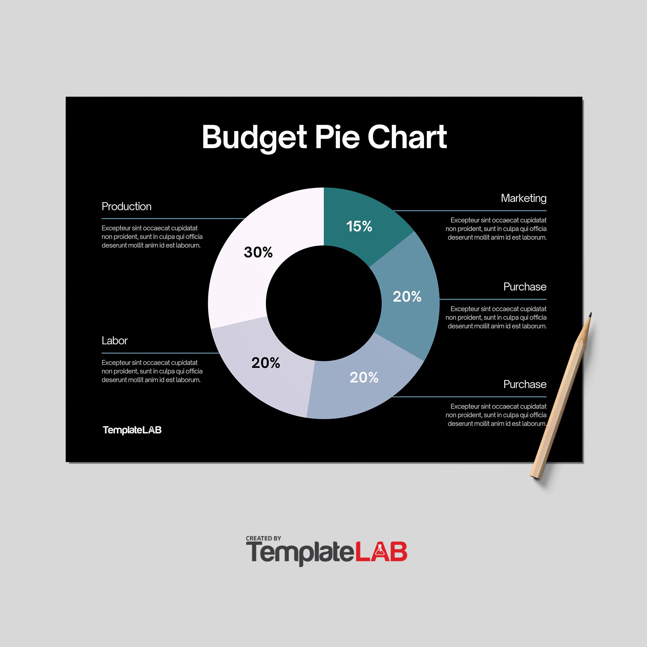
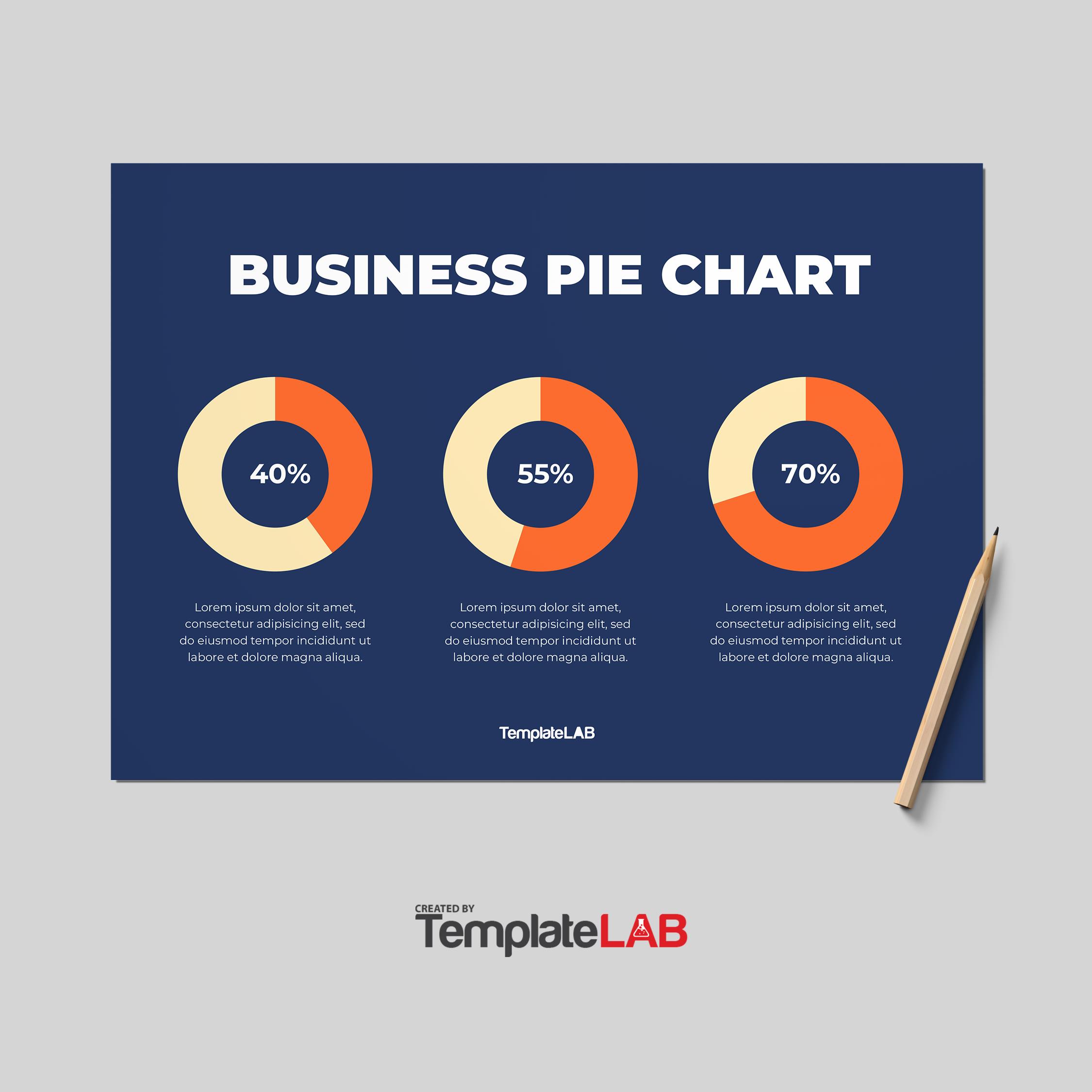
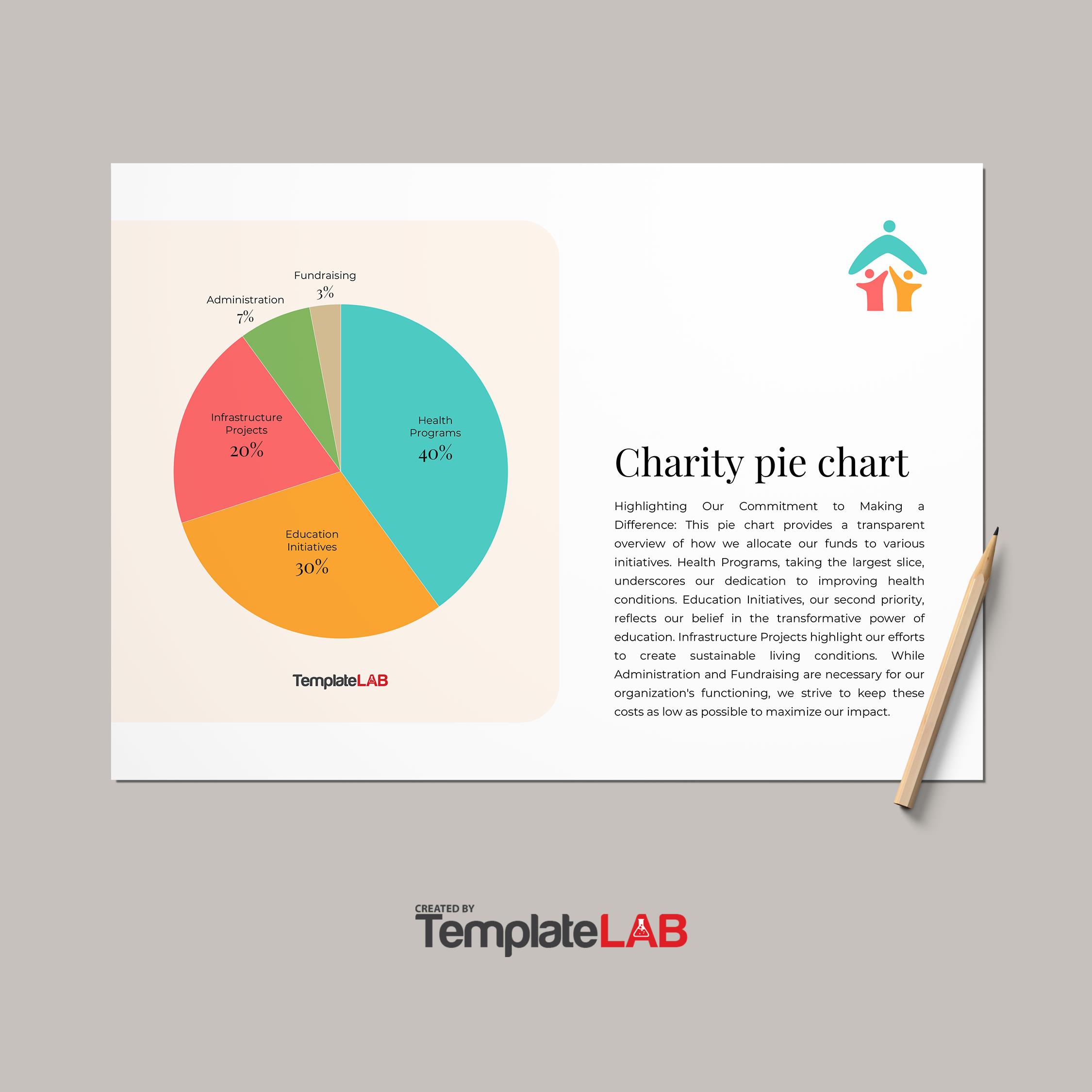
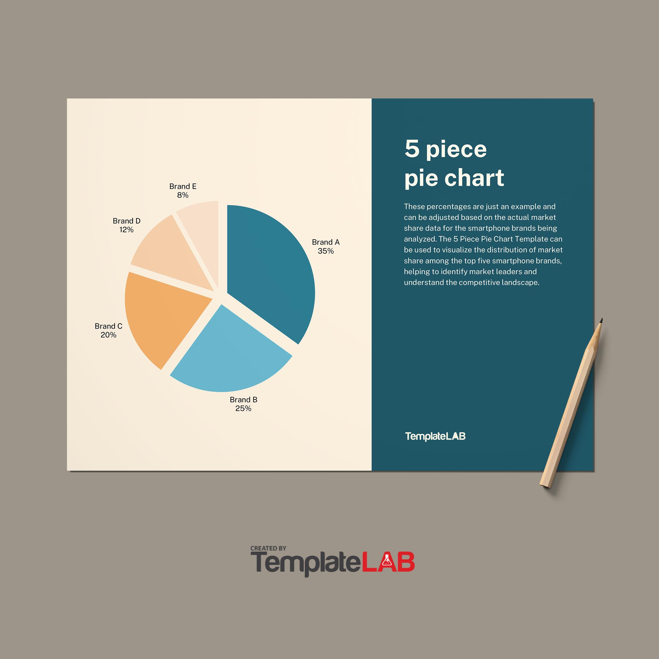
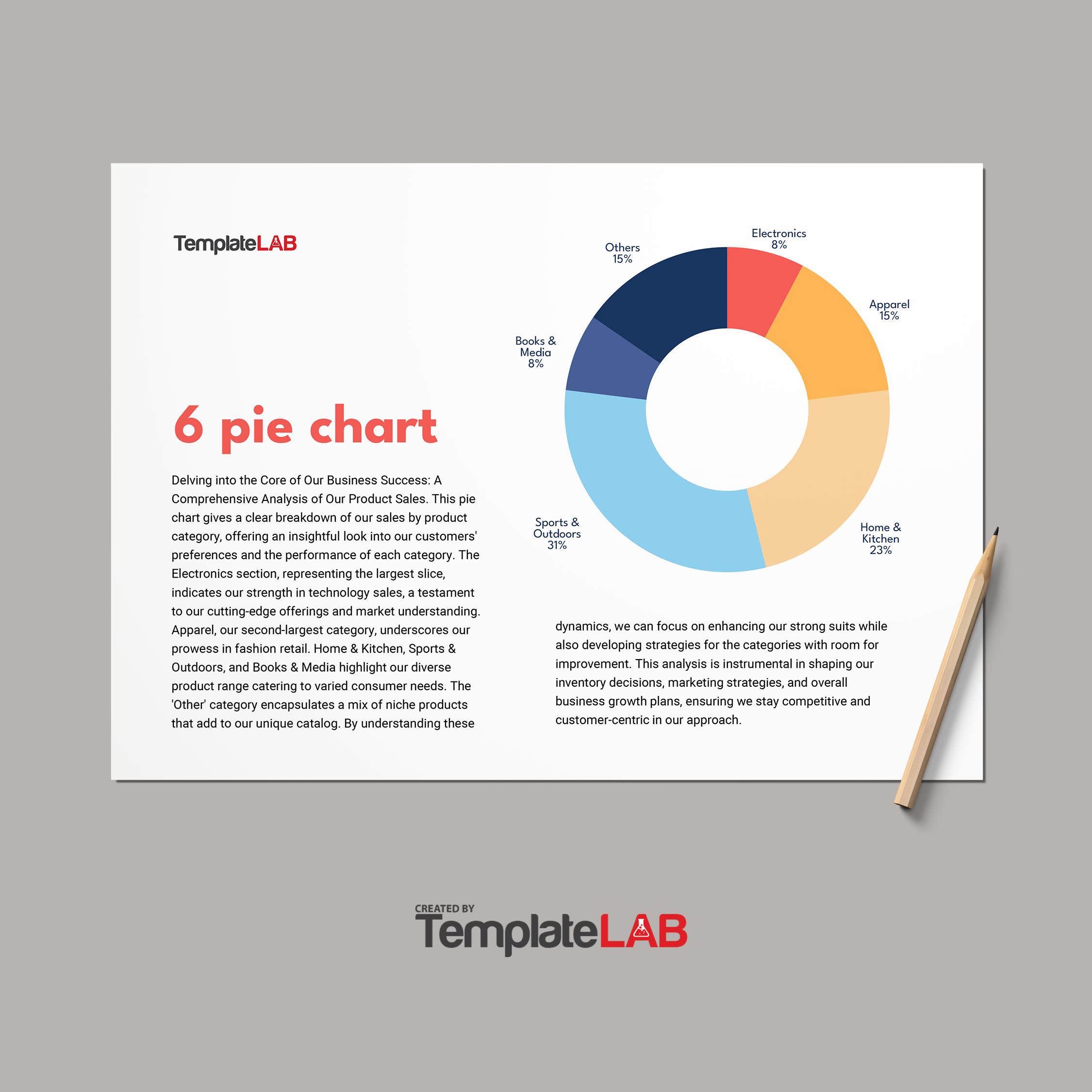
A pie chart, sometimes known as a circle chart, is a circular statistical visual that shows numerical proportions through slices of data. Your pie chart data should represent different percentages or pieces of a larger whole.
Pie Chart Templates
What Is a Pie Chart?
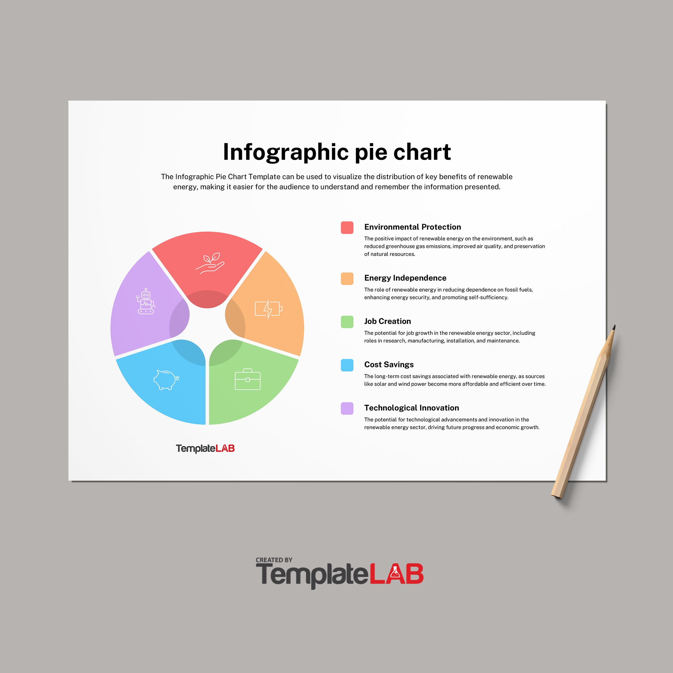
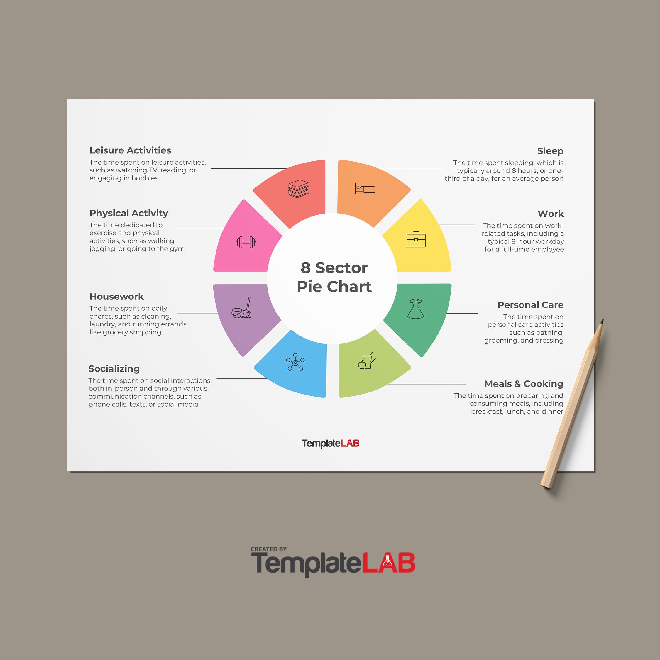
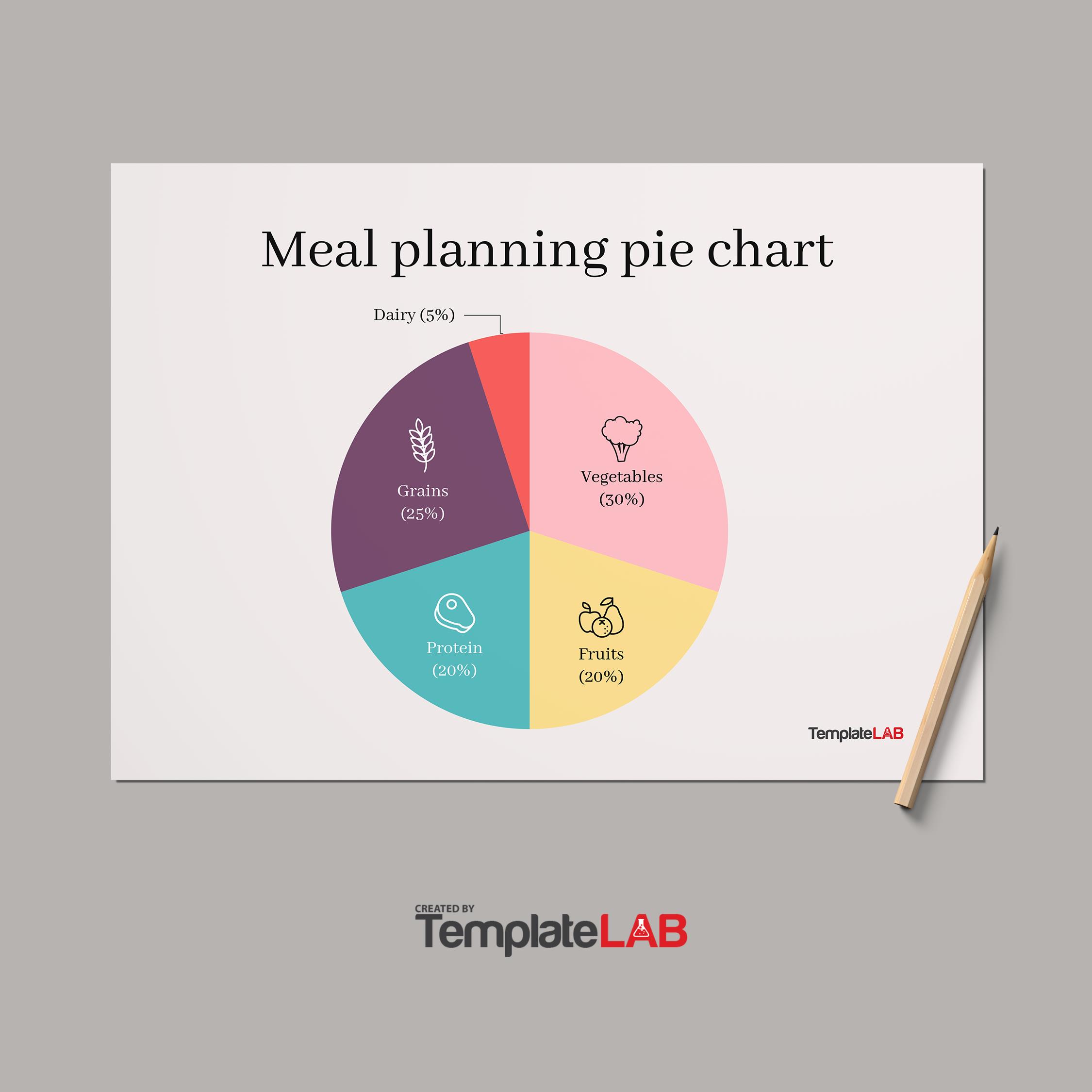
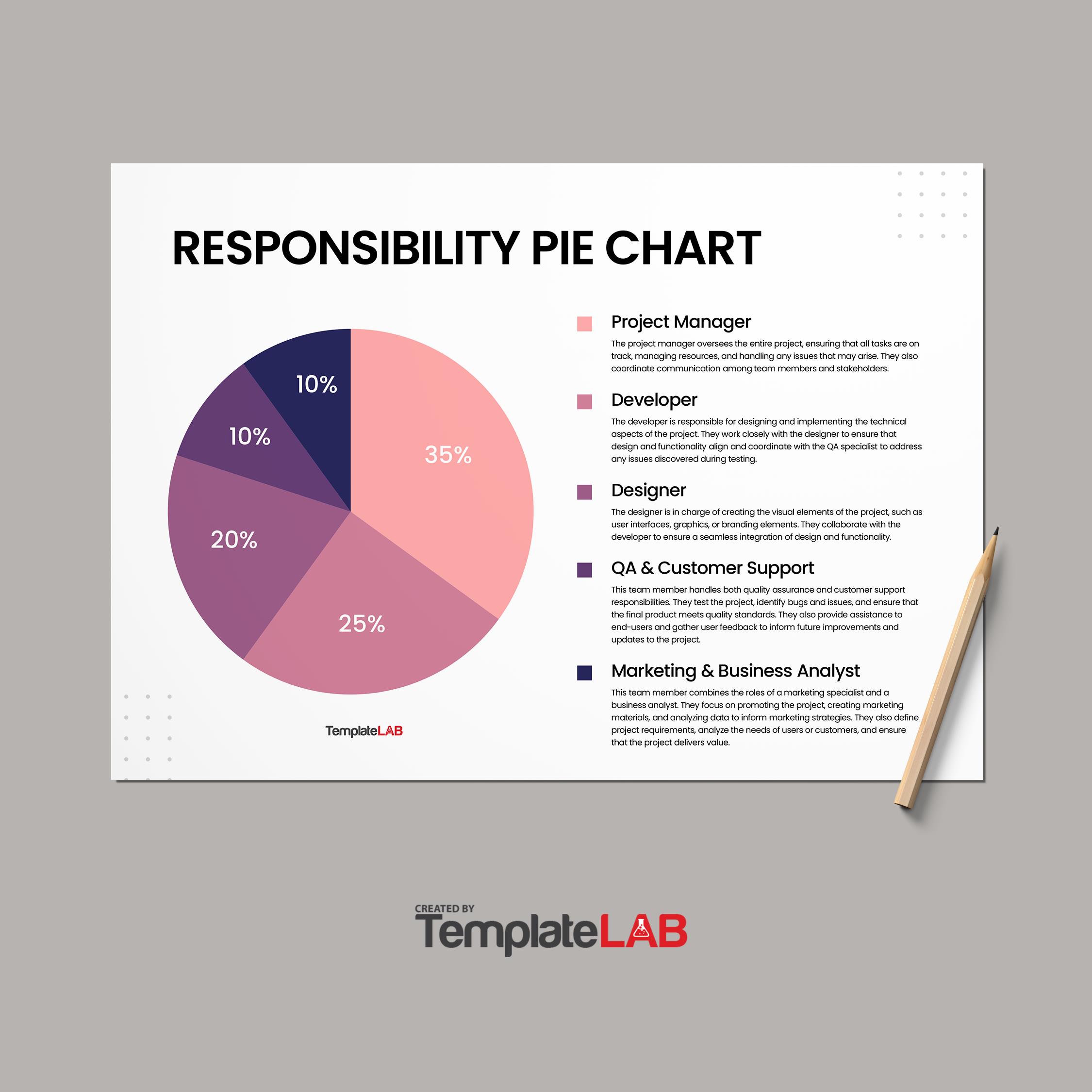
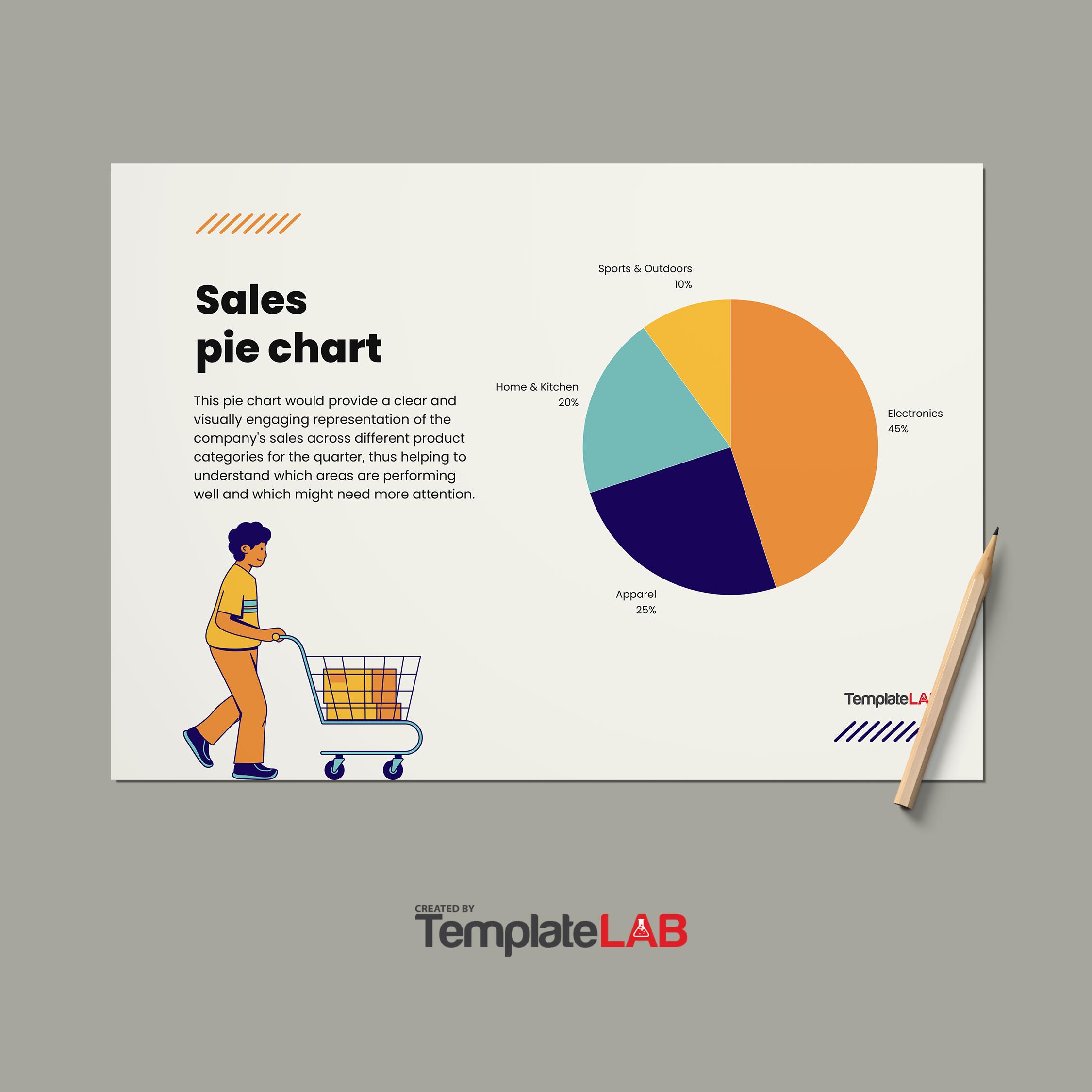
A pie chart is a ready-to-use diagram for organizing and displaying data by the percentage of a total. It is a chart representing the entirety of the data with a circle. Inside this circle are sections, or “slices” that symbolize the different categories within the data.
This allows users to see the difference and relationship to different dimensions (like bananas, apples, pears, strawberries, etc.) within a particular context. The numerical data of each slice is typically divided into percentages of the overall sum of the chart. This means that each slice represents the value’s percentage or number. –
Pie charts can be a useful tool for information display and comparison, especially if the goal is to compare the size of a slice to the entire pie rather than to compare slices individually.
When Is a Pie Chart Used?
Pie charts are used when working with categorized or grouped input data. These charts are the ones that are chosen for presentations and are often used in offices, schools, and other organizations to convey data.
Using a pie chart is a good option when there are less than six pieces of recorded information and it is not necessary to address any changes in the data. If the data falls into multiple categories, a pie chart can be used to compare them while designating a different color for each category.
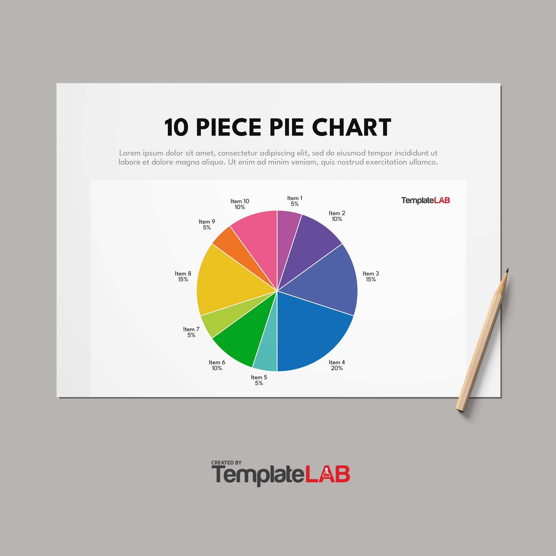
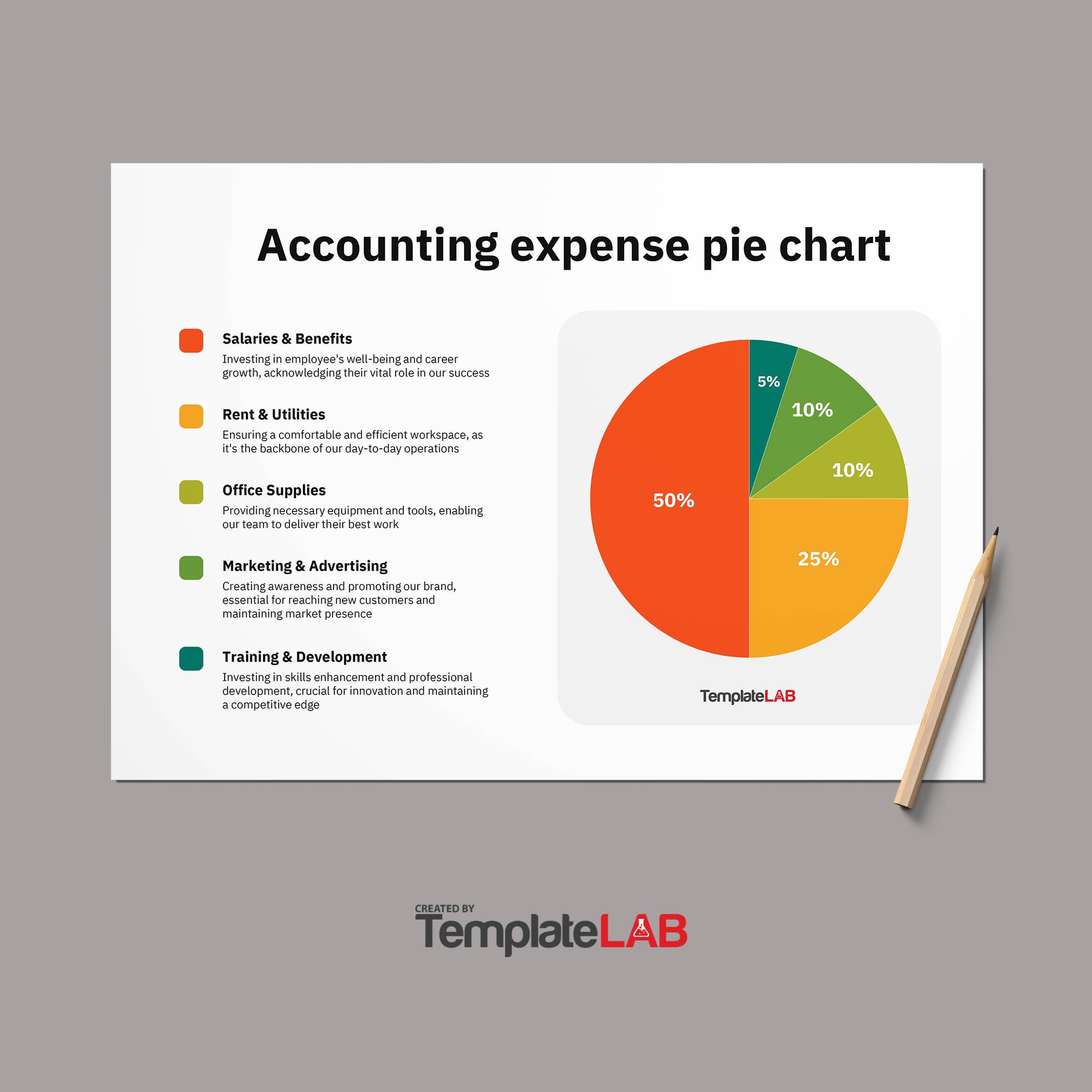
Pie charts are used to display the percentage of a total. All divisions of the pie must add up to 100%. Each slice or section will display its percentage of the whole.
Pie charts are simple to understand and easy to read, making them useful tools for displaying different components of data.
This makes them the most effective type of visual for illustrating a part-to-whole relationship. One sign that a pie chart might be the right solution for you is when you’re able to apply a percentage to your data. In other words, if you can categorize your data into “percent of” or “part of” a whole, a pie chart is the way to go.
Pie Chart Examples
Four of The Best Practices When Using a Pie Chart
Pie charts are one of the most popular and most despised charts in the business world. If it’s used incorrectly, the visual depiction can become deceiving. Let’s go through a few ways to avoid errors and make the most out of your pie chart.
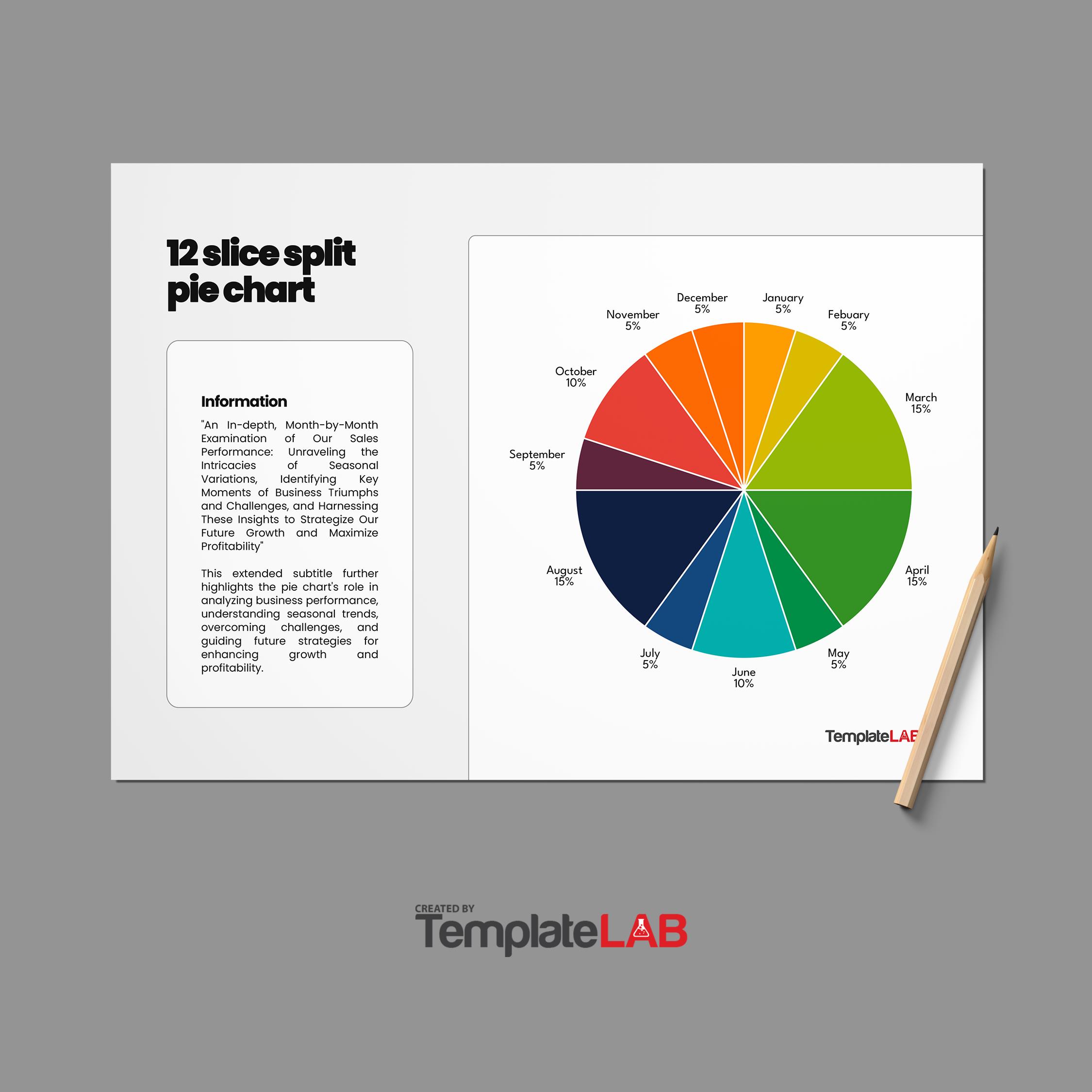
- Don’t use more than 6 sections. Pie charts with more than six slices might be hard to follow. Additionally, having smaller slices next to each other makes it difficult to see the difference in their size. It might also be difficult finding different colors for all the slices.
There are varying opinions on this, but if you have more categories than six, you might want to consider using a different sort of chart. Another choice is to combine little slices into a single “other” slice that is grey or dull in hue. - Organize your sections in a clockwise motion from biggest to smallest. Users can better understand the data if the slices are presented in size order. When there are categories with values that are quite comparable, a common ordering that goes from the largest slice to the smallest slice is really helpful.
It is also a good idea to plot slices from a direction that is easily understandable when deciding where to begin a chart. Typically, visualization tools begin from the top or the right.
Starting from the top seems more logical because it corresponds to how we read from top to bottom and how we think about the development of time on a clock or watch face, even if starting from the right has a mathematical grounding in terms of standards on measuring angles. - Avoid using 3-D pie charts. The areas, arc lengths, and angles of the slices must all point to an appropriate representation of the input data to read a pie chart correctly. While minimizing 3-D effects is a good idea for any plot, pie charts require extra attention. The size of each slice relative to the entire set of data can easily be distorted by constricting or expanding the circle or by adding extra depth.
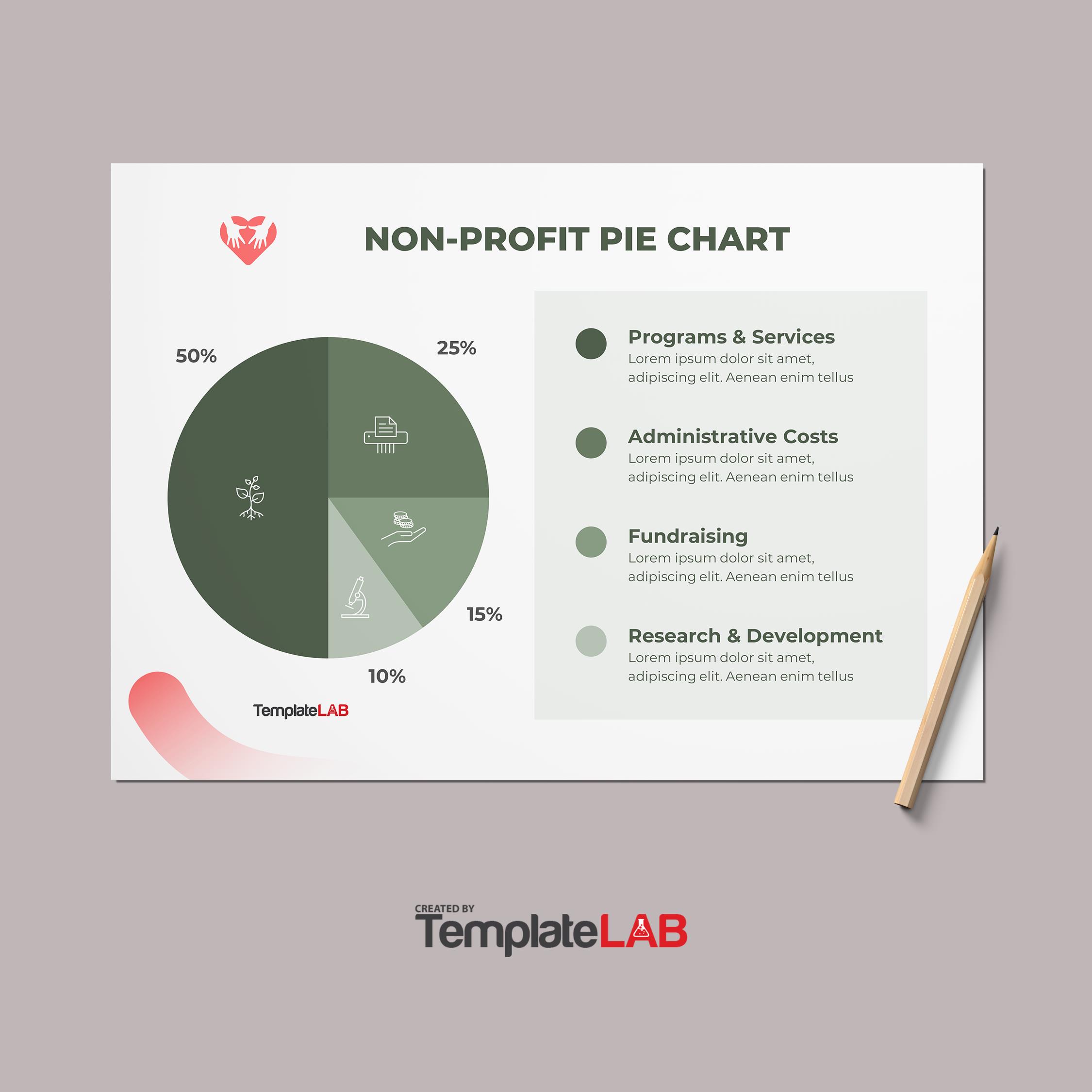
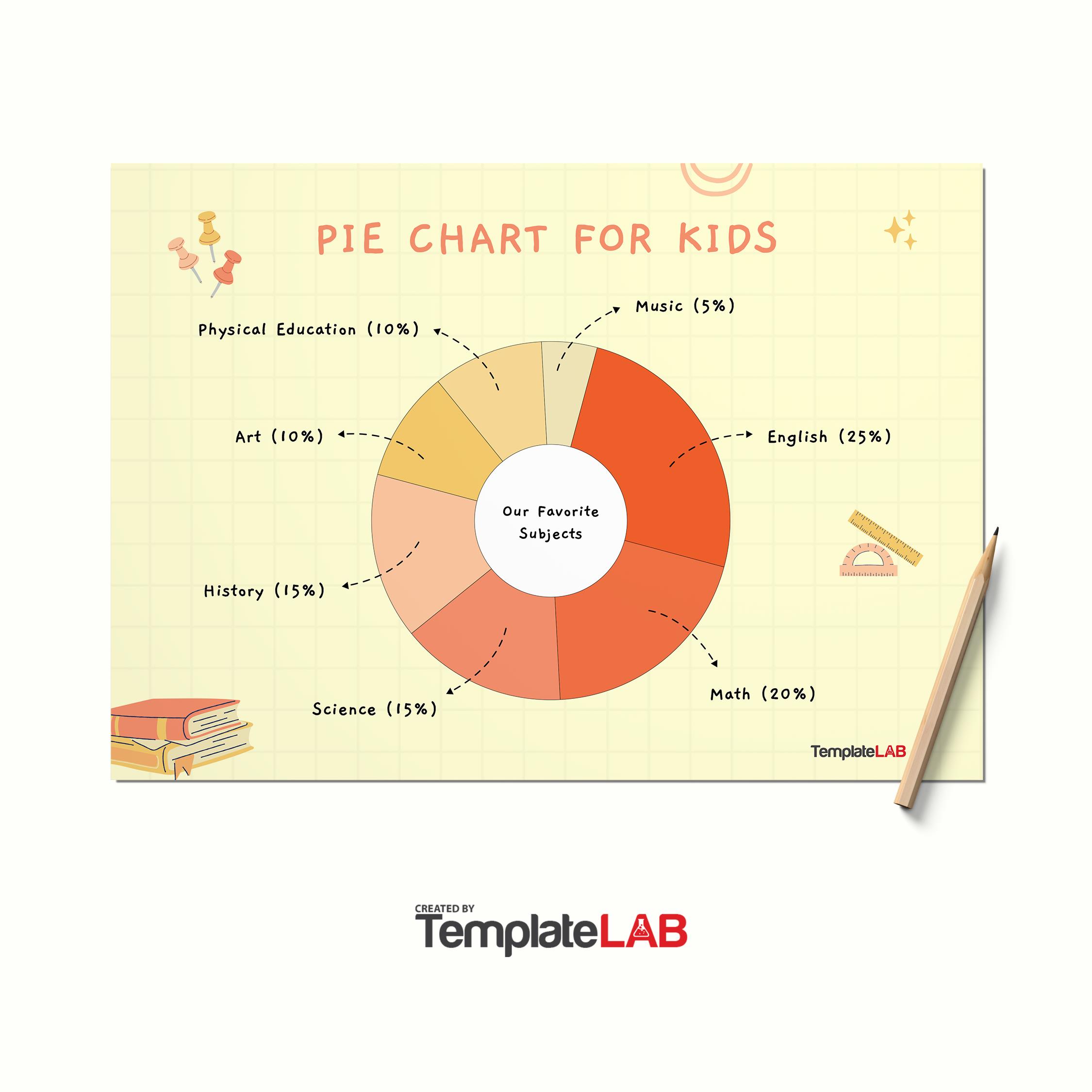
- Use annotations. Outside of simple fractions like 1/2 (50%), 1/3 (33%), and 1/4 (25%), it is quite challenging to understand precise ratios. This is where annotations come in. Annotations are like containers for text blocks, percentages, and other custom content.
They provide a more precise judgment of the proportions of each slice, making it easy for a user to understand. For this reason, most pie or donut chart templates include annotations.
How To Make a Pie Chart
There are several different ways to create your own pie chart template. The first, and most common way is to use Excel. Here are our three best options for creating your simple pie chart design and the steps you need to take to create your own:
Excel
- Open the spreadsheet that contains the data for your pie chart.
- Highlight the data you want in your pie chart.
- Choose your pie chart by clicking Insert > Insert 2D Pie, 3D Pie, or Donut Chart.
- To make any adjustments, click the chart and then the icons next to the chart as follows:
- To edit axis titles or data labels, click on Chart Elements.
- To edit the colors or the style of the chart, click on chart styles.
- To show or hide different data in your chart, click Chart Filters.
Tip: The pie chart’s pie slices can be highlighted by being clicked and dragged outward.
PowerPoint
Open a new PowerPoint presentation and click on the first slide. Select the pie chart you wish to include in and edit your slide by clicking Insert > Chart > Pie.
When creating a pie chart on a PowerPoint slide, the chart appears on the slide and the data for the chart appears in a worksheet window.
You can then replace the placeholder data with your data in the worksheet window.
- To make any adjustments, click the chart and then the icons adjacent to the chart as follows:
- Click Chart Elements to format, show, or hide elements such as axis names or data labels.
- Use the Chart Styles to instantly alter the chart’s color or design.
- Click Chart Filters to reveal or conceal the data in your chart.
Tip: If the worksheet window doesn’t show, select the chart and select Chart Tools Design > Edit Data and the window will pop up to the left.
Word
Open a new Word document and paste all the data you want into your pie chart.
Click Insert > Chart > Pie Chart Template
- Then double-click the pie chart you wish to select.
- A spreadsheet will appear with placeholder data that you can now replace with your own data.
- To make any adjustments, click on the chart and then the icons next to the chart as follows:
- Click Chart Elements to format, show, or hide elements such as axis names or data labels.
- Use the Chart Styles to instantly alter the chart’s color or design.
- Click Chart Filters to reveal or conceal the data in your chart.
- Click the Layout Options button to decide how to organize the chart and text in your document.
Tip: You can highlight individual slices of the pie by dragging them out
Pie Graph Charts
How To Design Pie Chart Templates
To design a clear, accurate, and visually appealing pie chart, there are some basic guidelines you need to follow.
Here are 9 steps to ensuring a successful pie chart:
Step 1 – Start with a template or create your own pie chart. There are several different options for choosing the right pie chart design for you. If you’ve got the time, you can customize your pie chart using Microsoft Office. However, if you lack the time and creativity, you can download a pie chart template to help get you started.
Step 2 – Decide what you want to illustrate with your pie chart. Gathering the data you require to quickly and easily represent the information is the key to creating a pie chart that makes sense to your audience.
Step 3 – Choose a meaningful and relevant title. It’s important to label your pie chart and include the source and date of your data.
Step 4 – Enter your data into your pie chart template. The data you have gathered can then be entered into your pie chart template, where you will see your chart come to life.
Step 5 – Order your slices by size or category. It makes it easier for users to read your pie chart if it’s arranged in a specific order. This means that you could either arrange your slices by size (largest to smallest) or by following a logical numerical or alphabetical sequence.
Step 6 – Use consistent and contrasting colors. This makes it easier for viewers to discern between the different slices and highlights the size of each slice, making it easier to understand the graph.
Step 7 – Avoid using too many texts and figures. Having a lot of information shown on your pie chart defeats the purpose. Pie charts demonstrate a summarized set of data that is easy to understand. Adding text, legends, lines, fonts, or too many annotations can make the chart more difficult to read.
Step 8 – Avoid using distracting elements. Borders, backgrounds, shadows, or other icons could make the chart confusing and difficult to read.
Step 9 – Share your pie chart. Now it’s time to present your pie chart to your intended audience. You can download your finished pie chart in JPEG, PNG, PDF, HTML5, PPTx, GIF, or MP4 format.
Alternatively, you can create a special online download link for your project that you can share with your colleagues, post on social media, print, or send emails. Your link can be password-protected and either public or private. This is a fantastic method for maintaining interactive elements on your chart so that users may access your data.
When Should a Pie Chart Be Avoided?
Pie chart templates should not be used to depict continuous or complex data sets when there are many categories (more than six) as we discussed above, or where the variations between the categories are small or inconsequential.
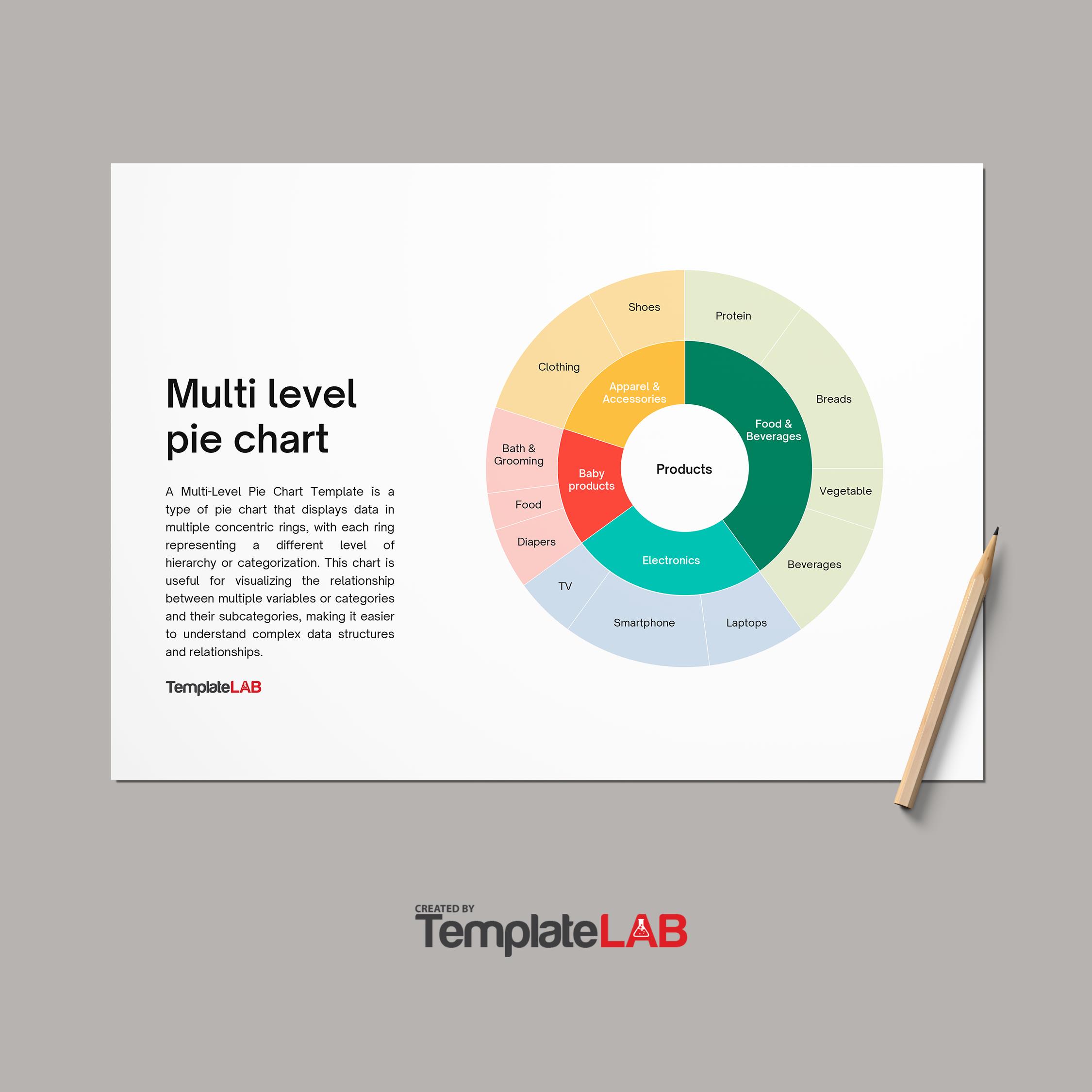
Pie graphs or charts that display data with negative values, zero values, or numerous levels of hierarchy can potentially be misleading or confusing. Pie charts, particularly those that contain 3D effects, exploding slices, or donut holes, can also produce visual clutter and distortion.
What Are Some Alternatives To Pie Charts?
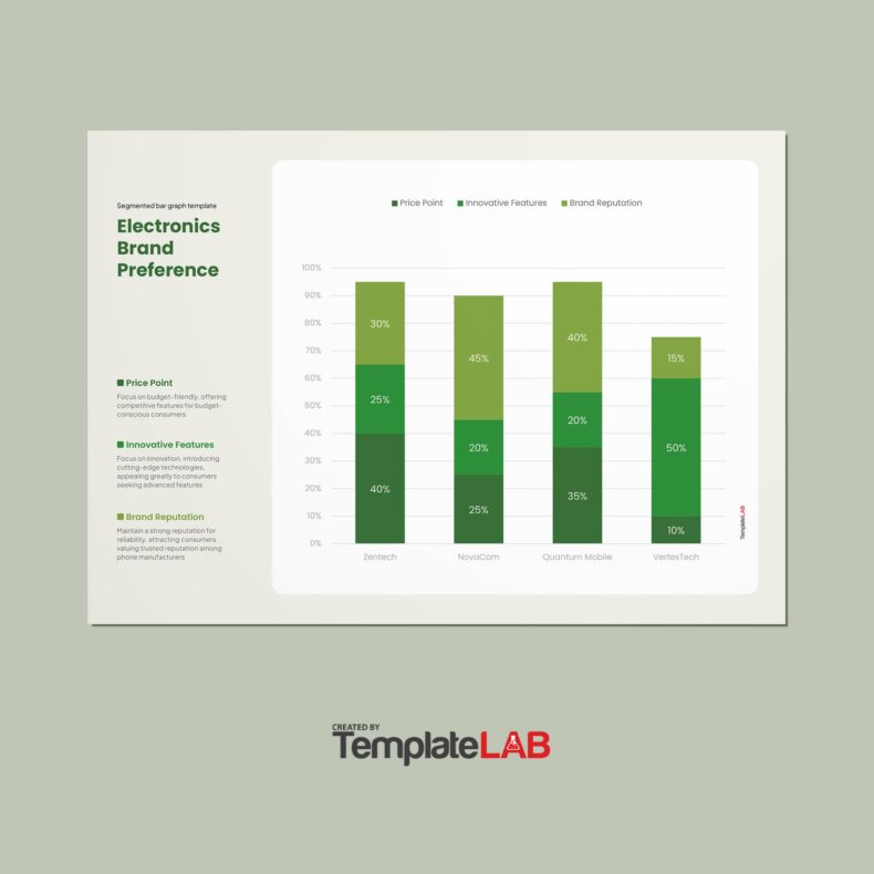
Pie charts are not always the best option when demonstrating a set of data. If your data has numerous categories, negative values, or zero values, you can use a bar chart or table instead of a pie chart.
If your data has numerous levels of hierarchy or displays changes over time, you may choose to use a stacked bar chart or stacked area chart rather than a pie chart.
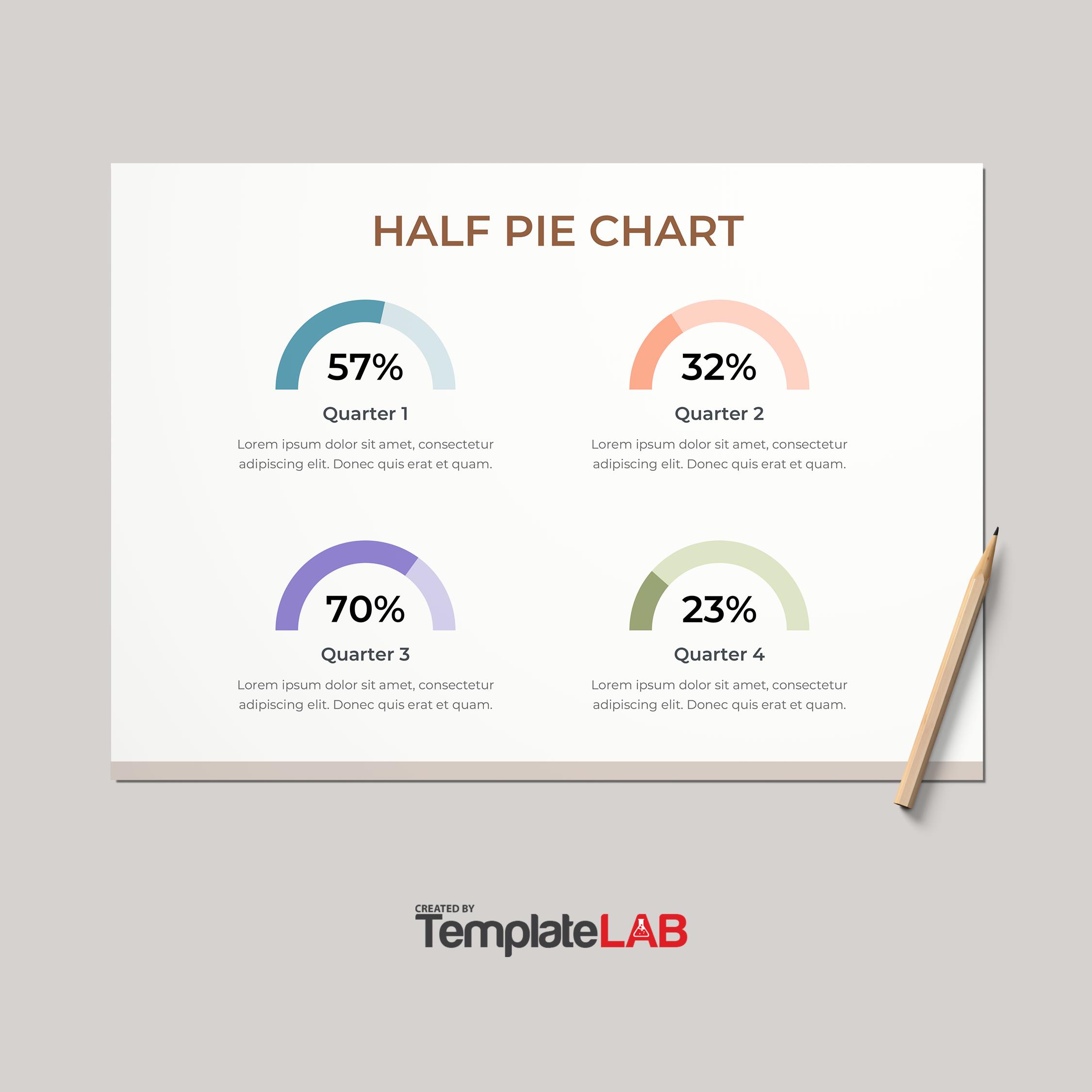
If your data has complex or nested structures, you can substitute a pie chart for a tree map or a sunburst chart. If your data contains different scales or ranges, you can use a half-pie chart or a polar area chart instead of a pie chart.
Conclusion
If you’re looking to summarize a complicated subject or highlight an analysis, using a chart or graph makes it easy for users to understand what they’re looking at.
Pie charts are one of the best methods for visualizing certain sets of data. However, they do not work for all sets. Pie chart data should make up the smaller parts of a whole value. Thus ensuring an accurate representation of the amount of each section or slice.

