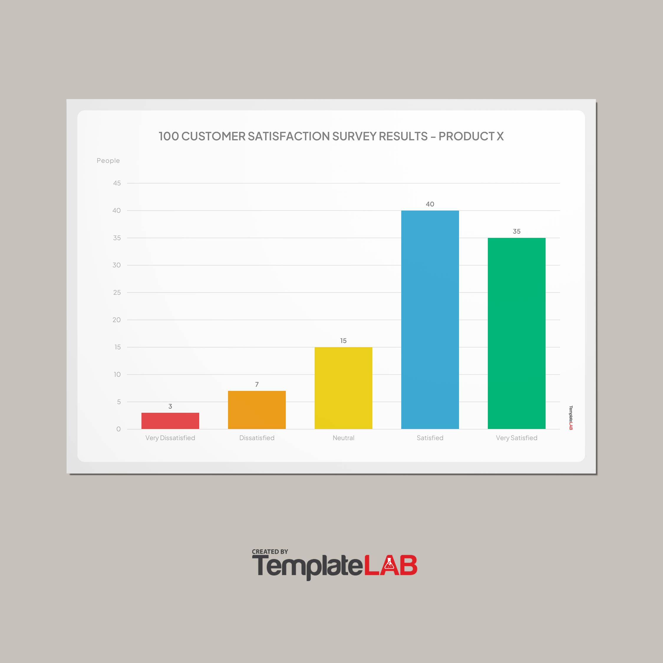
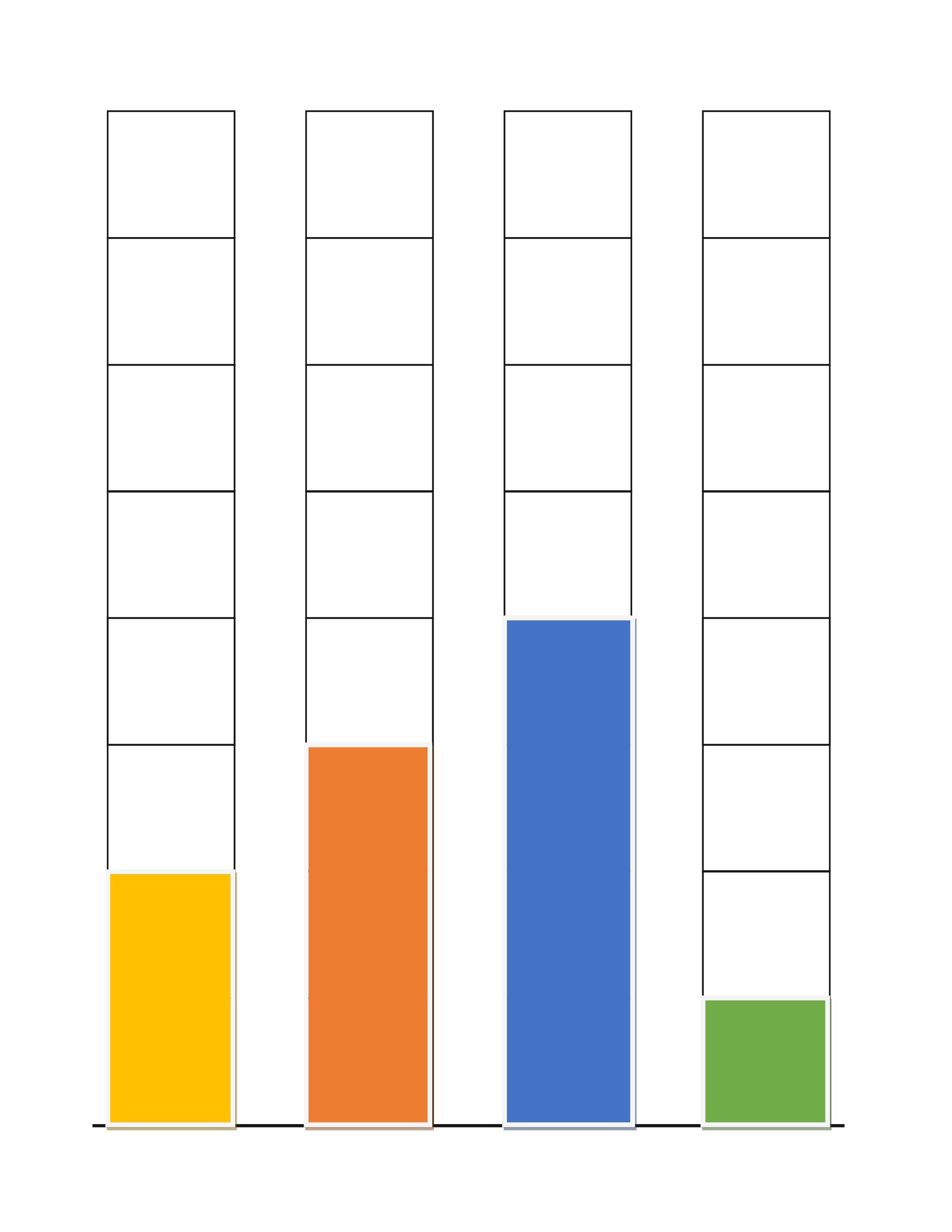
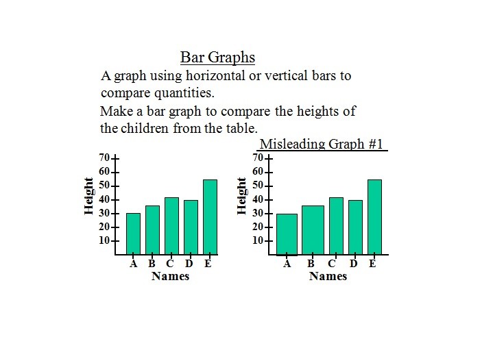
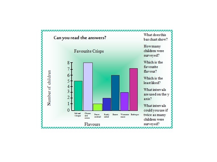
When you look at the dictionary, you’ll see the definition of a bar graph. It’s a diagram that makes use of bars of equal widths. These bars represent data so you can compare among categories.
It’s a great way to present data in an intellectual and organized way. You can make a bar graph that’s vertical or horizontal.
Table of Contents
A lot of people don’t know how to make a bar graph, but it’s quite easy. You can make it on your computer or even download a template from here. The important thing to remember is that these types of graphs have key attributes:
- They should make it easy for you to compare data simply and professionally.
- They should lay out the relationship of the data in the x and y-axes.
- They should allow you to present changes and trends effectively.
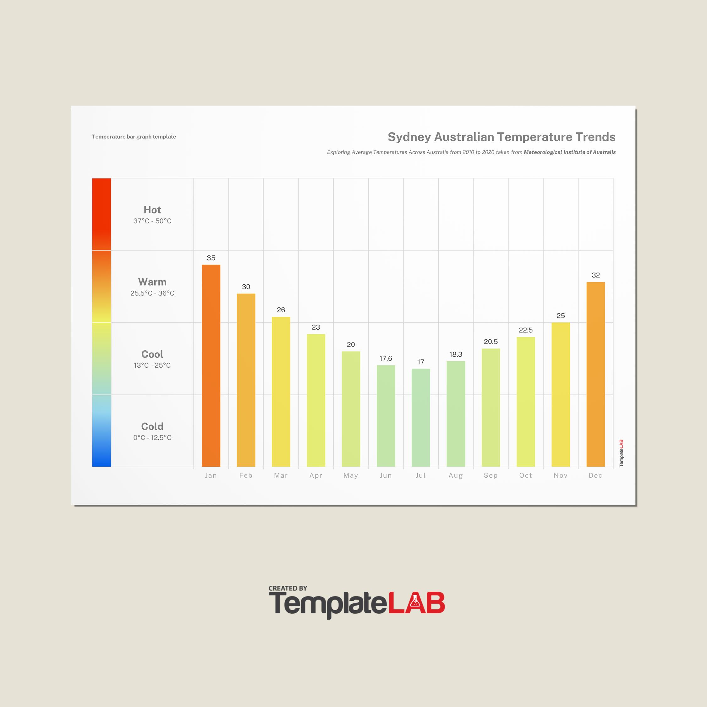
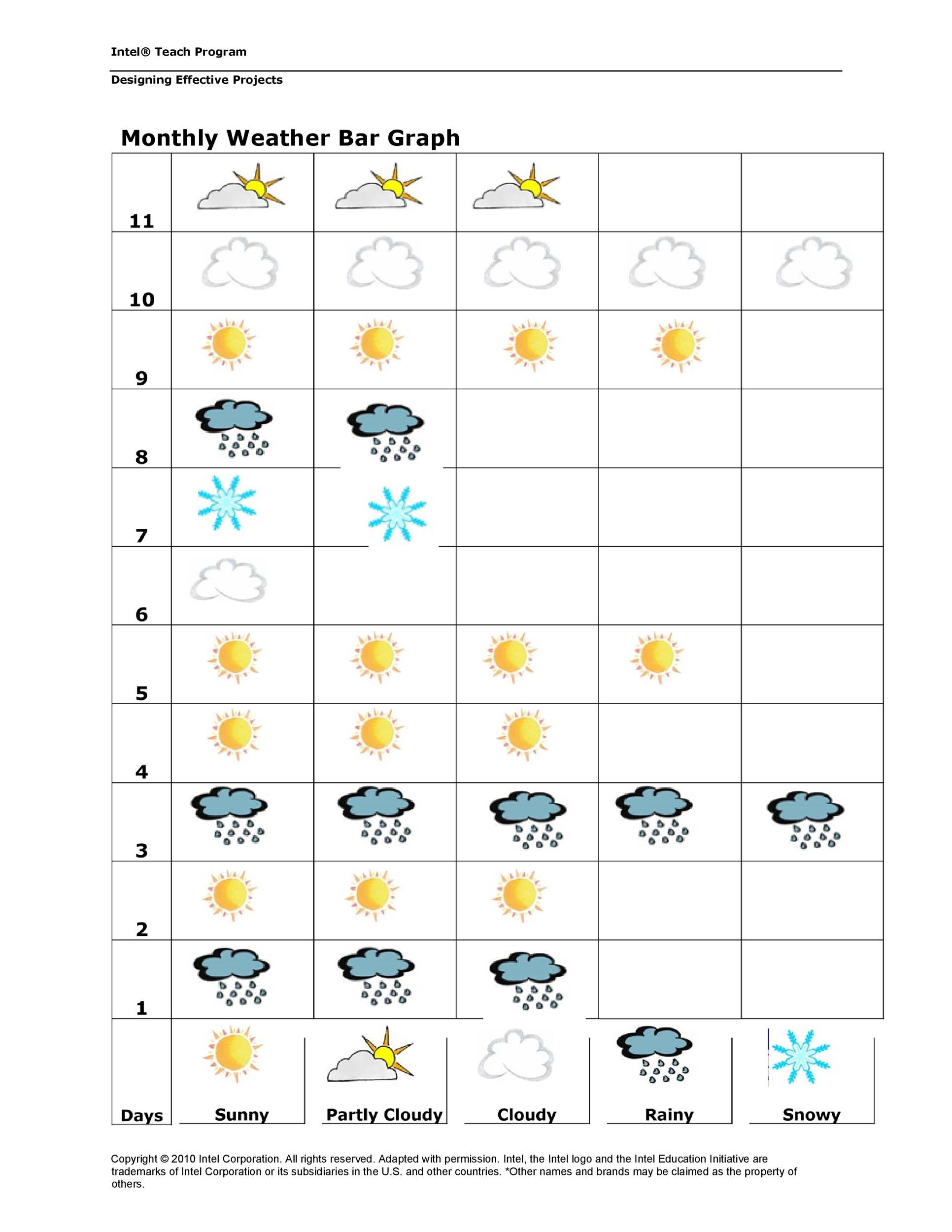
Bar graphs are very useful in particular fields. For instance, you can create a graph to track the changes in weather. By doing this, you can easily compare the bars and see the daily, weekly or monthly changes.
These types of graphs have been around for a long time now. They haven’t changed much because simple as they are, they’re still extremely effective. Back in the year 1785, a man named Joseph Priestley published a graph with horizontal bars.
According to the history, after about 20, a man named William Playfair used this graph too. He used it to present the patterns of import and export in Scotland. This was the first time numerical figures got incorporated in such a graph.
Then in the following years, philosophers and mathematicians started using these graphs too. They used the bar graphs to represent their theories in different ways. So as you can see, no matter how simple they seem, they’re quite popular. Until now, you can still use these graphs to present information interestingly.
Bar Graph Templates
Types of bar graph templates
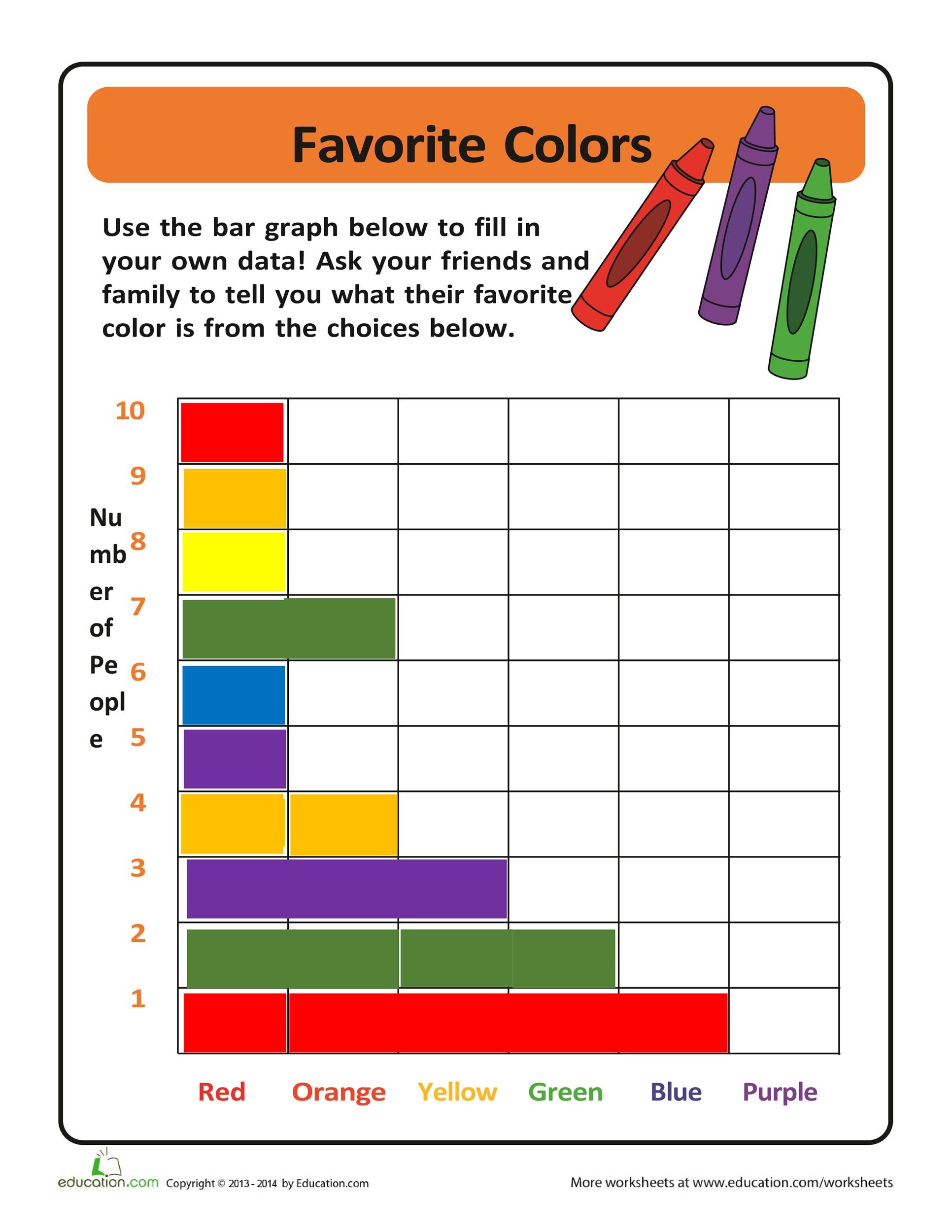
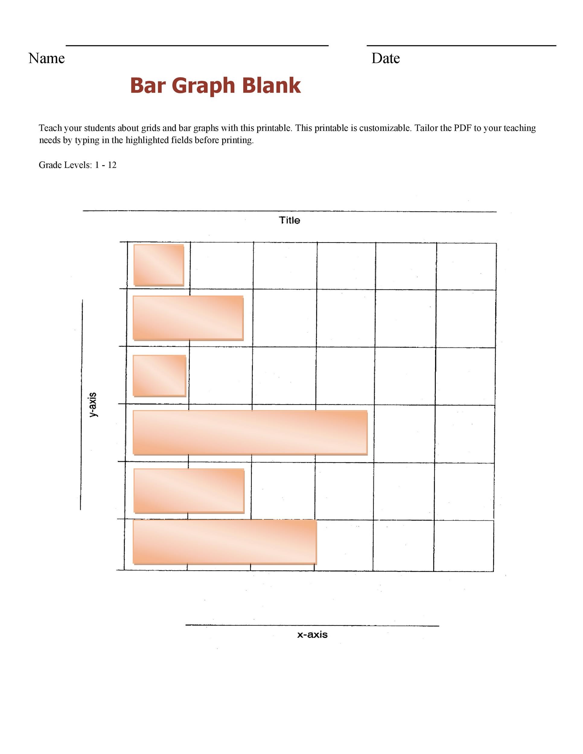
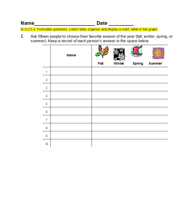
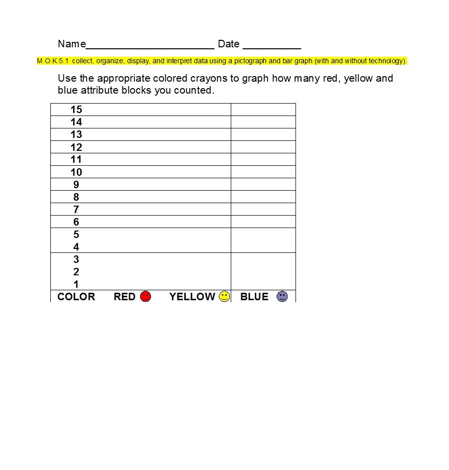
Creating bar graph templates will benefit you a lot for different reasons. For instance, you can use them as an interesting way to teach students. Using the templates, you can ask your children to tally and compare data.
Such templates can help develop survey skills. They accomplish this by allowing you to create the bars according to the information at hand. There are different types of templates you can create. Choose one which will suit your needs. You can make graphs for:
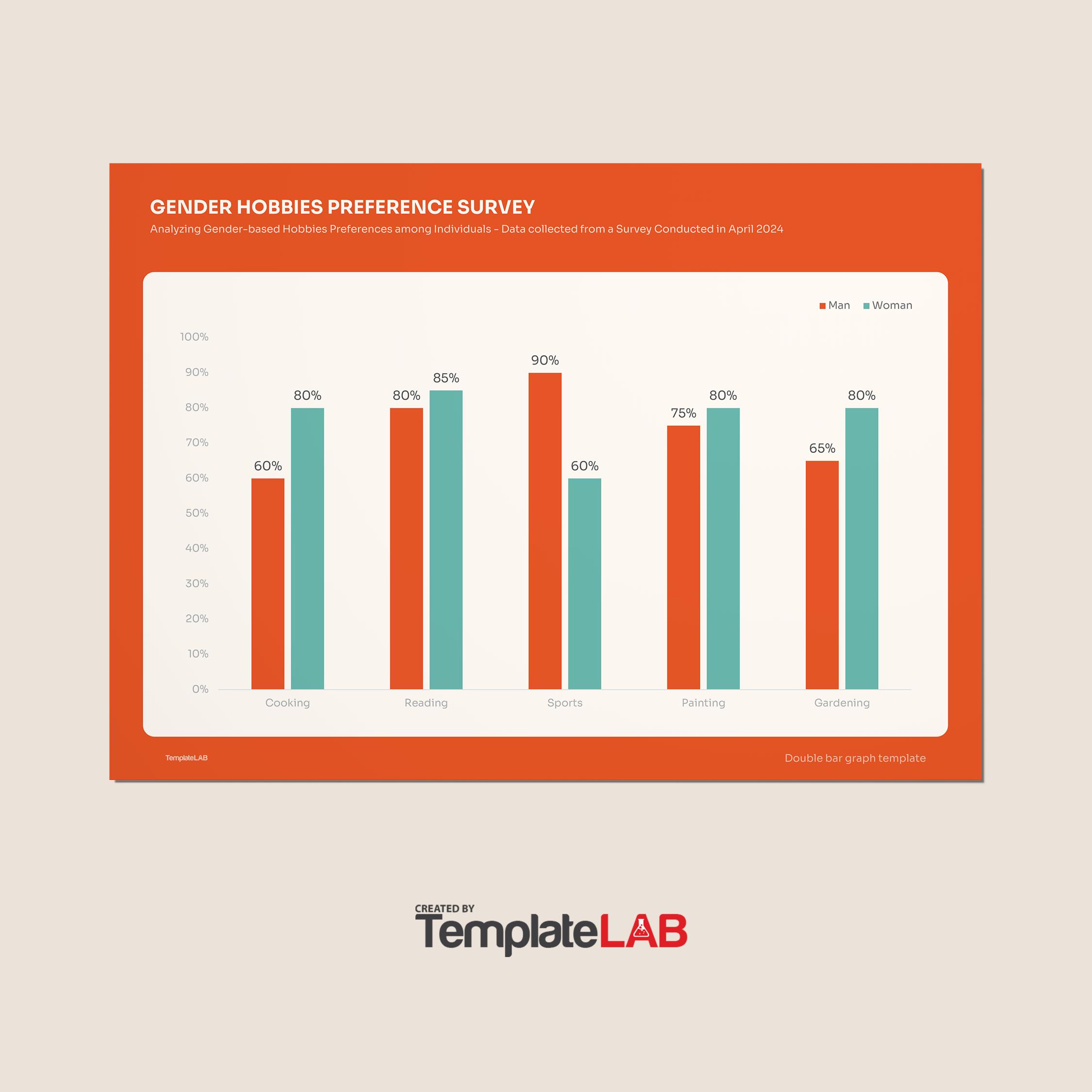
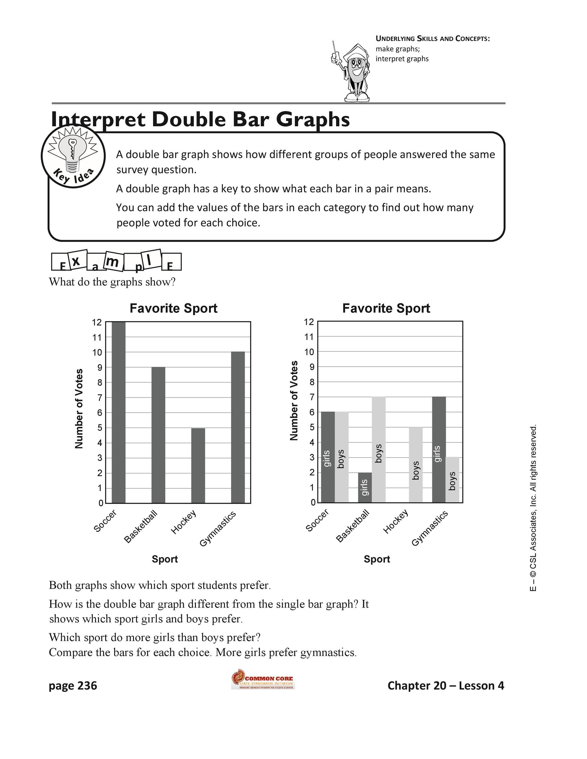
Double Bar Graphs
The benefits of using bar graph templates
Before we learn how to make a bar graph, let’s first go through the benefits of using it. A bar graph has different names. You can call it a bar chart, column chart or a multiple column charts.
No matter what name you use, it should serve the same purpose. It’s a graph which you use to represent data using bars.
Typically, people use these graphs to show comparisons between values. You use a bar to represent each of the values. You plot the groups or categories on the horizontal or x-axis.
Then you plot the numerical or quantitative scale on the vertical or y-axis. You can use such graphs to plot discrete, continuous or discontinuous data. Here are some benefits of using such graphs:
- Represent data easily
If you want to represent data simply and easily, use a bar graph. In doing this, you can diagrammatically show your values and data. These graphs are extremely useful in representing data which have distinct units.
They’re also very useful in making comparisons or presenting differences between variables. When you have countable variables, data or facts, such graphs can be very valuable too. When you use them, the data becomes clearer and more understandable. - Represent frequency
Some studies have shown that bar graphs are the most popular method of displaying data. This is because you can use them to represent frequency simply and easily too.
With bar graphs, you can break down the data to show the frequency of each category. - Very easy to create
This is another excellent benefit of these graphs. You can easily prepare bar graph template then plot the data when you have it. A complete graph would include the title, the scale, and all the labels.
Usually, creating this graph requires three simple steps. First, determine the groups of values for the axes. Then make the scale which you’ll use to establish the numerical data. Finally, decide on the style, color, and settings of your bars. - Widely-used and versatile
As we’ve said, these graphs are very popular. There are different types of bar graph templates you can create. Because of this, you can enjoy its versatility. You can use the graphs for different purposes.
Different people and different industries use these graphs. You can use them in different types of settings. These include the educational setting, industrial, business, retail, and more.
Use the graphs to demonstrate comparisons and differences between values. This will make it easier for your readers to understand your data.
Bar Graph Worksheets
Some tips for making a bar graph template
You can make a bar graph to go with your presentations, infographics, reports, and more. If you have to present data, you should think of a way to represent it interestingly.
If you give people numbers to analyze, they might just look at you with a glassy expression in their eyes.
To avoid this, keep them engaged by making a bar graph. One which compares or analyzes the data you have better. If you’re wondering how to make a bar graph, we’ve got you covered. Here, we’ll go through some tips to help guide you:
- Launch your program
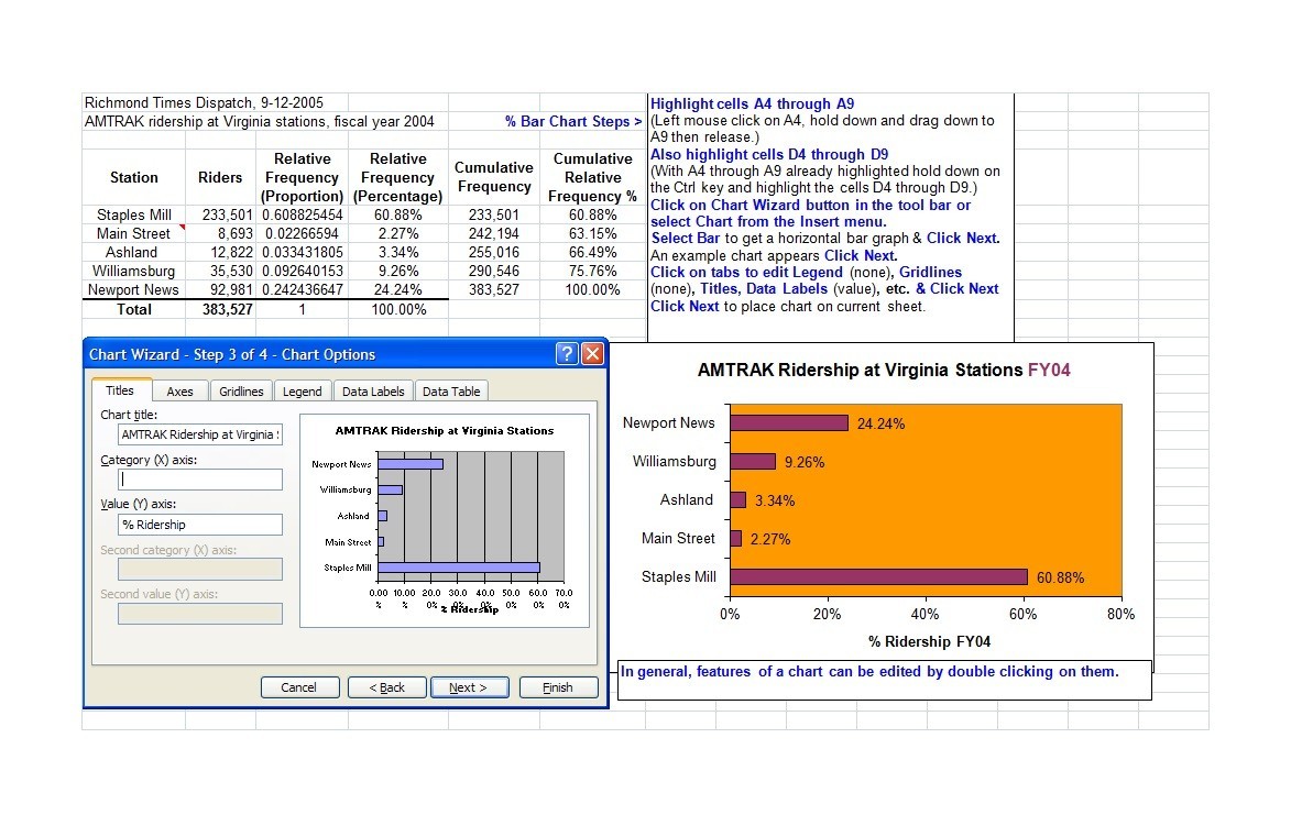
You can use different programs and software to create bar graphs. Create a basic template then save the file. Do these, so you don’t have to keep on making a template each time you need one. After you’ve saved the template file, you can start customizing your graph. - Search for ideas or templates online
Nowadays, you can find everything online. From simple templates to complex ones, there’s something for everyone.
If you don’t want to make a bar graph yourself, you can download a template here. Just make sure you save the file in a secure location.
You may want to create the template yourself, but you don’t know how. In this case, search for ideas online. You’ll find a lot of bar graph examples online to use as a reference. - Input your data
Once you’ve created your template, it’s time to input your data. Decide the category or group to place on the x-axis. Then decide what numerical values or scale to place on the y-axis. Make sure to add all the labels as well as the values. - Place your bars
After you’ve inputted all the information around the graph, it’s time to plot the bars. When creating your bars, make sure to check your data carefully. Do this so that you can plot the values accurately.
There’s nothing worse than presenting a graph with inaccurate data. Then you won’t be able to give the readers all the correct information. - Personalize the colors and fonts
When you’re done plotting the bars, you can start customizing your graph. Personalize the colors, styles, and fonts of your graph. Modify them according to the theme of the data you’re representing.
If you want, you may even add some graphics or images to make the graph more appealing.
As soon as you’re through with your graph, don’t forget to save the file. Also, save it using a different file name from your template. Then if needed, print out your graph and share it with the right people.
Which bar graph template should you use?
There are many different types of graphs you can create to present data. You can use bar graphs when you have ranked (ordinal) or demographic (nominal) data. Use them to display data visually to make it easier for readers to understand.
When you’re presenting ranked data, it’s best to arrange the categories sequentially. Do this to improve the readability of the graph. But for demographic data, you should organize the categories in the correct order all the time.
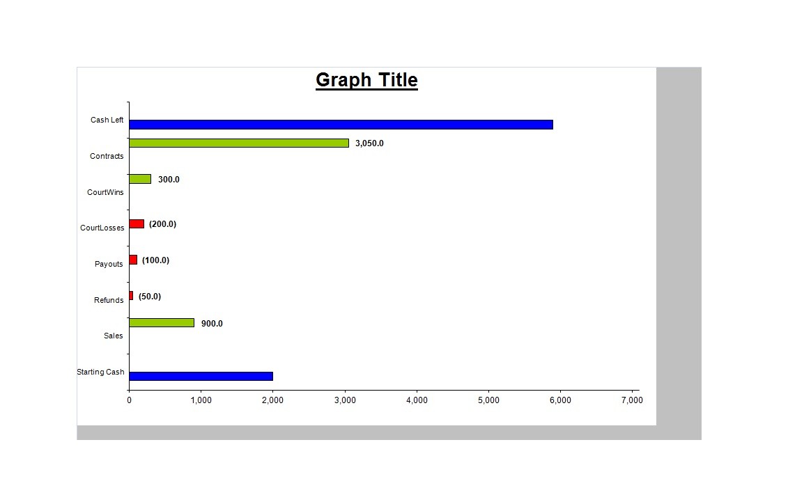
You can also use bar graphs to present negative data. To do this, just extend your graph below the x-axis. When you do this, you can display the negative values in a way other graphs can’t do.
When you use a vertical graph, you typically won’t place a scale on the x-axis. It should only represent the data’s categories. In the y-axis, you can set a scale. Then the heights of the bars should be in proportion to the size of its category.
However, this might be quite problematic if you have disproportionate data values. So when formatting, keep this in mind.
Another great thing about these graphs is that they come in different forms. You can choose which form to use when you want to create a graph. You can use these forms of bar graphs:
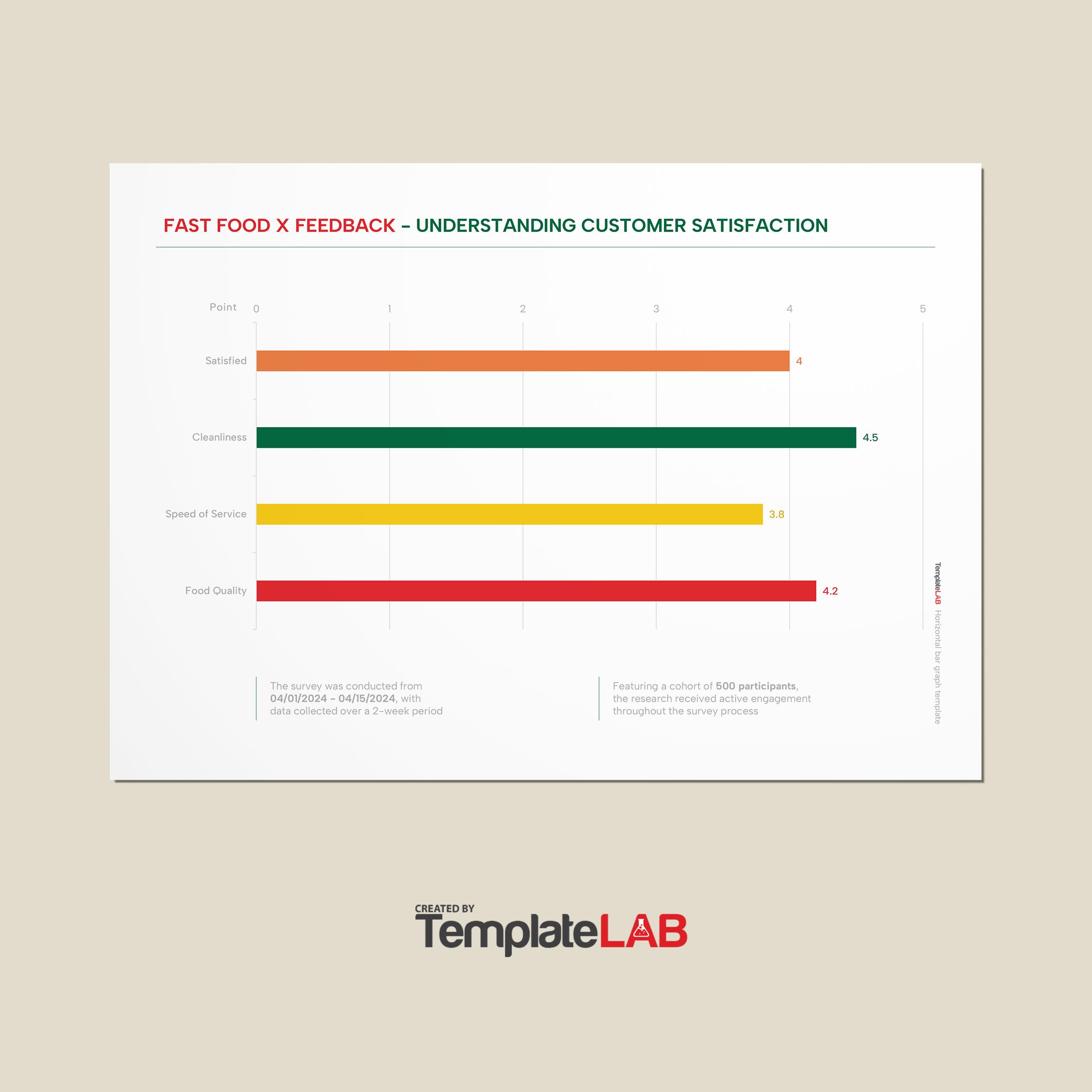
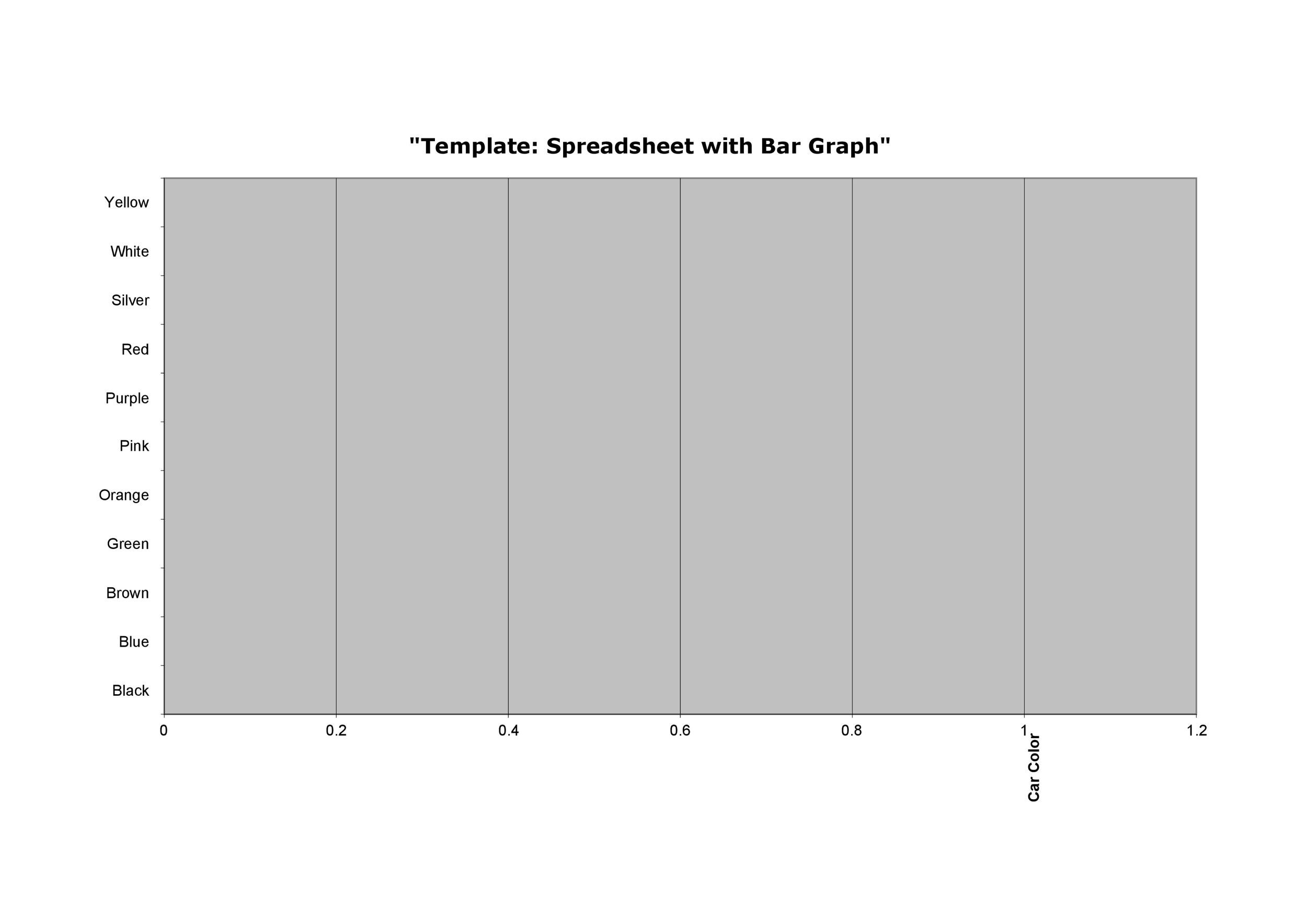
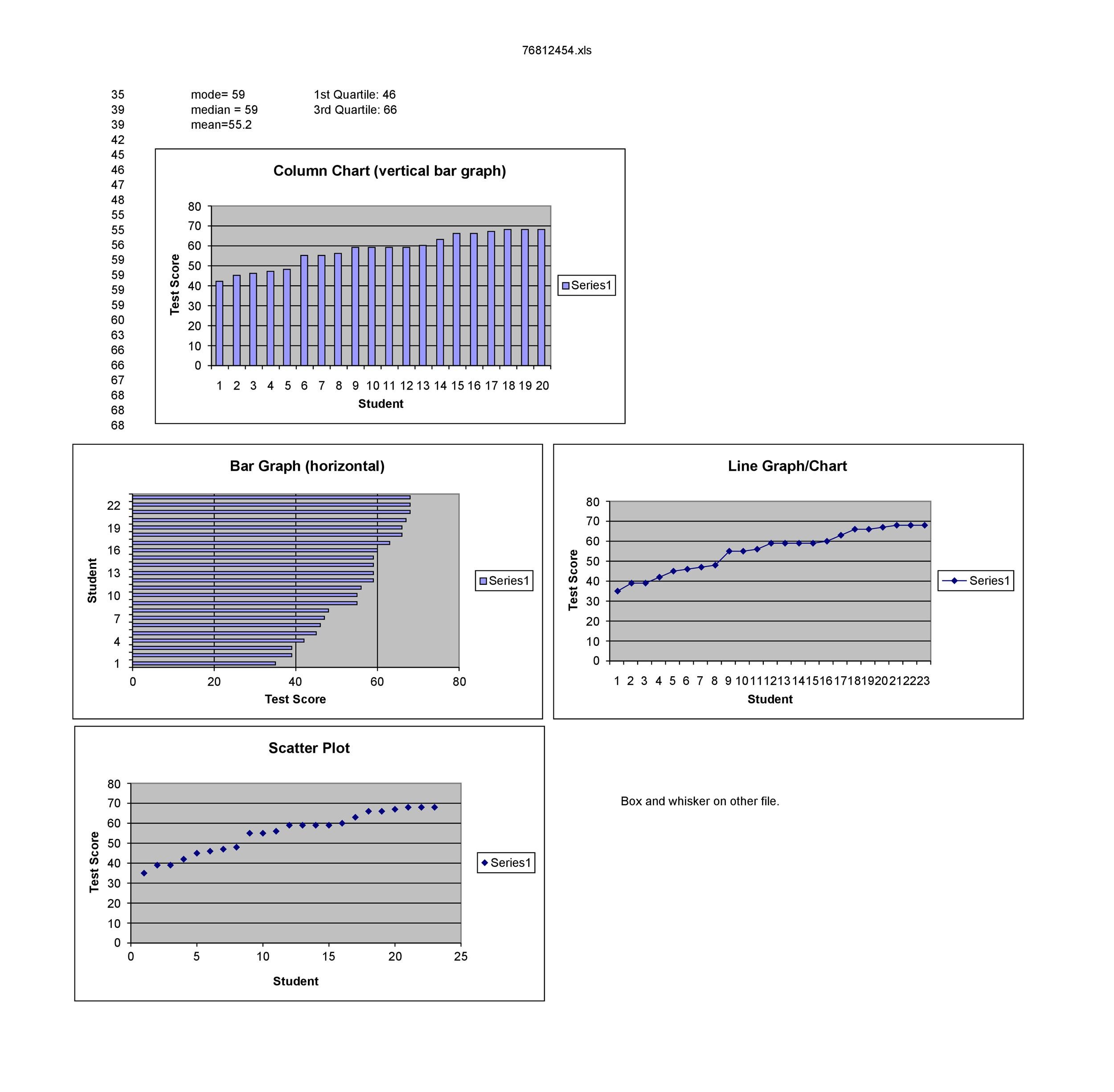
- Horizontal or vertical
These graphs have the same basic structure. The only difference is the horizontal or vertical orientation of the bars. When you make graphs using these forms, you need to remember one thing.
One axis should have the categories while the other axis has the scale. The placement of these labels would depend on the orientation of the bars.
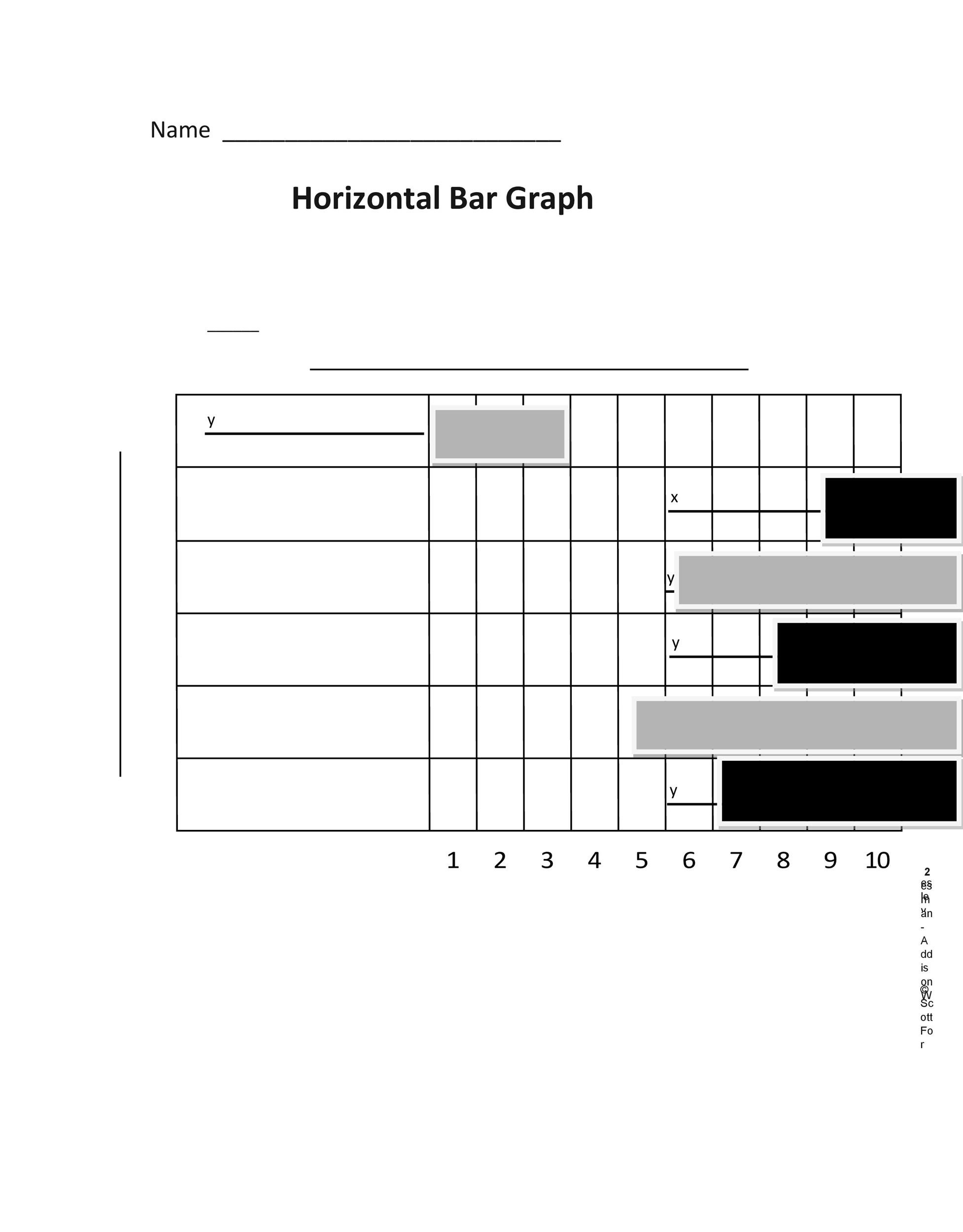
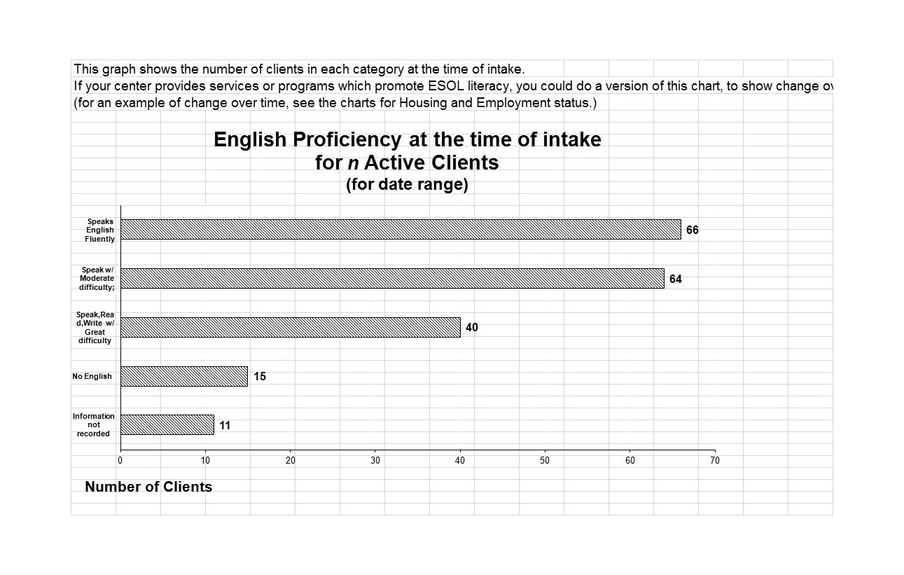
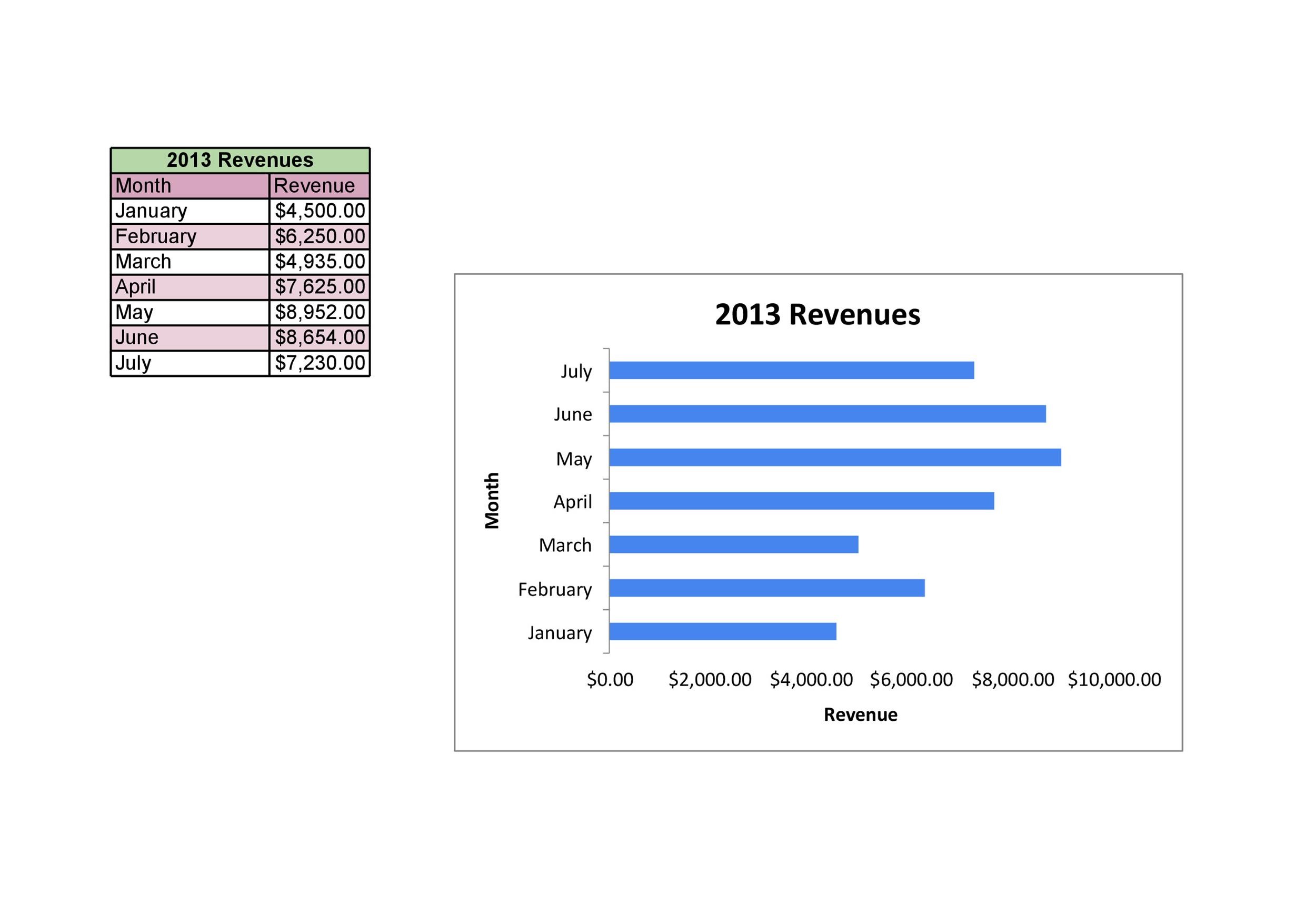
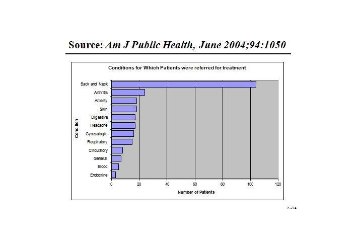
Horizontal bar graphs are handy when you have categories with long names. Vertical bar graphs are ideal to use when you have a lot of categories to plot. - Stacked
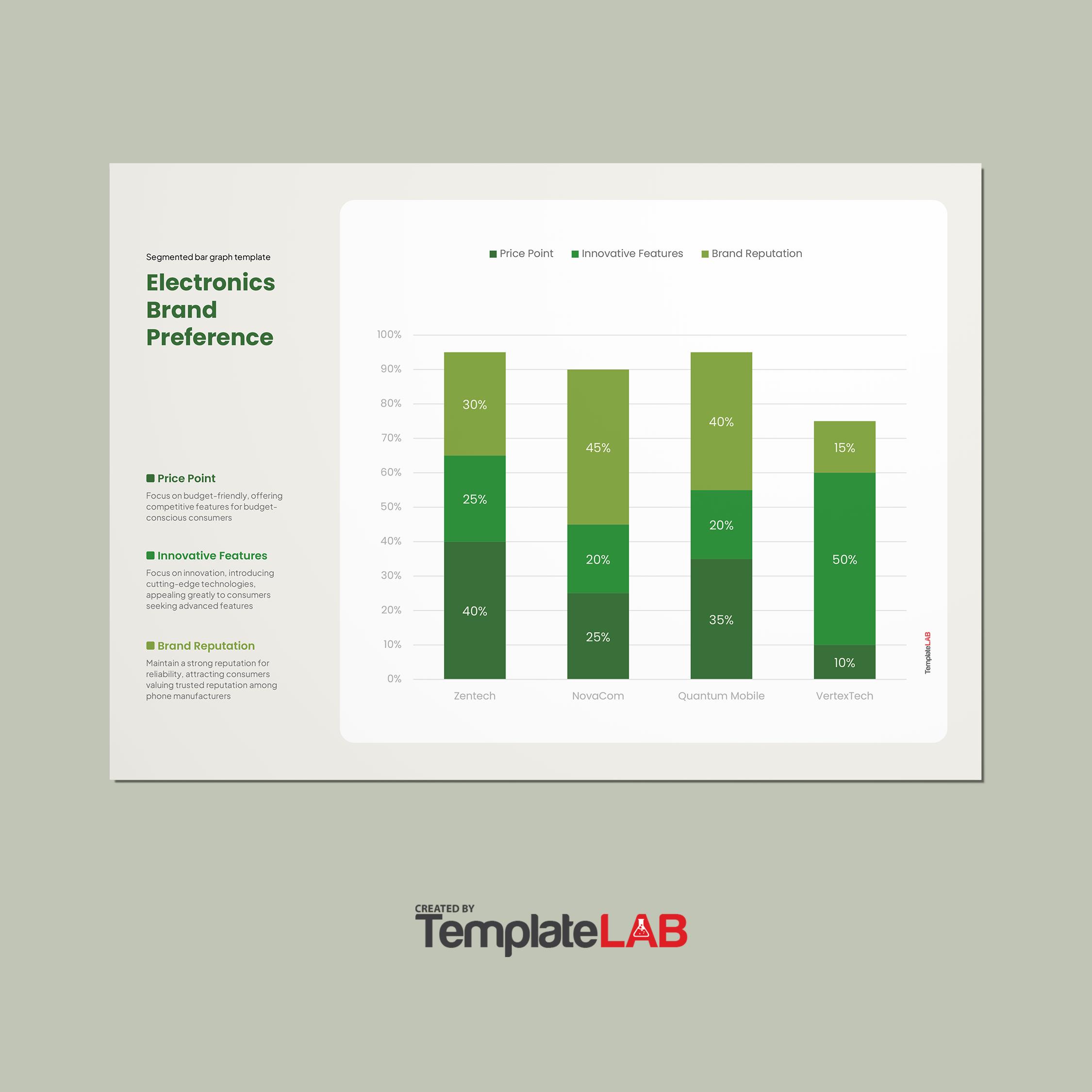
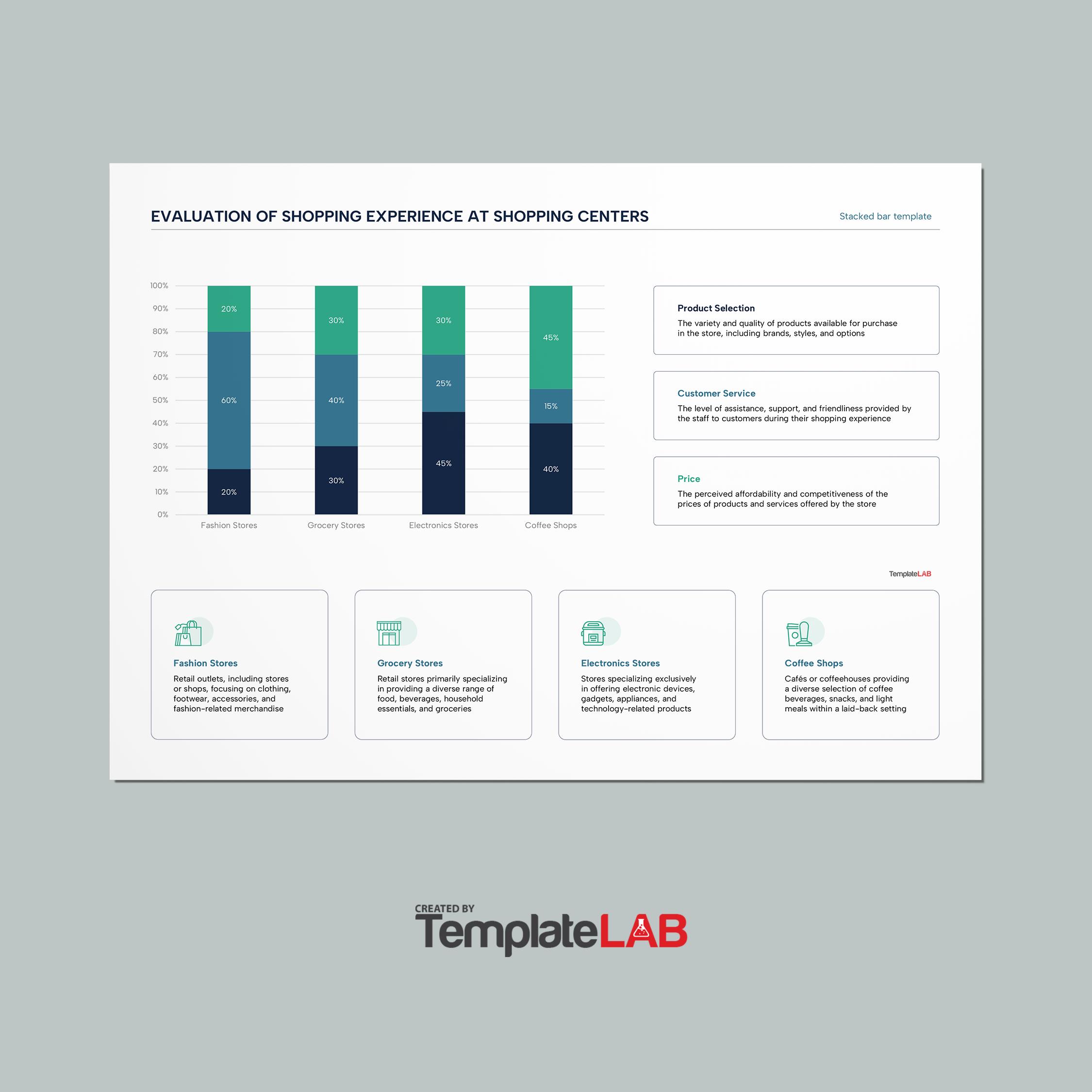
Use a stacked bar graph if you need to present the answers of sub-groups. With these graphs, you can break down the categories. Do this to see the proportion of the responses which the groups represent.
The name of this form of bar graph comes from the fact that you stack the bars. The bars represent the categories, and you stack them on top of each other in a single column.
You can even stack them side by side in the case of a horizontal version. The tallest bar represents the whole category. On the other hand, the smaller ones indicate the sub-groups. - Grouped
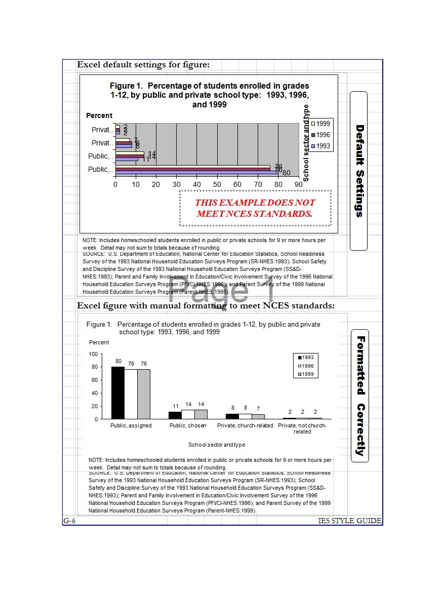
Grouped bar graphs are very similar to stacked ones. But here, the sub-categories have their separate bars. When you consider comparative sizes, it’s much easier to see them in grouped graphs.
But if you have several sub-categories, it might not be ideal to use such graphs.
The type and form of the bar graph to use would depend on the nature of the data you want to present. We’ve already established that bar graphs are excellent at representing information visually. But there’s more to consider than just creating the template and plotting the data.
You can use bar graphs if you’re looking for a flexible way to present your data. As you can see, you may use the different types and the various forms. You first need to know the data you will plot on the graph.
Then you can decide which style to use. You can make your graph or even download one from here.
If you have ranked or demographic data, it’s best to use such graphs. Before you share the graph though, make sure to check it first. If you don’t think that it conveys the message you want to share, choose a different graph to use.
But you may also think it’s already clear and comprehensive. Then you can start sharing your graph to your readers.

