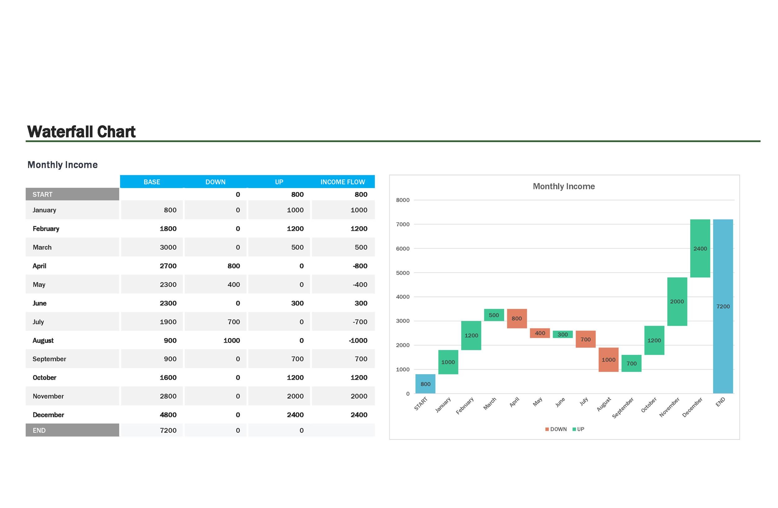
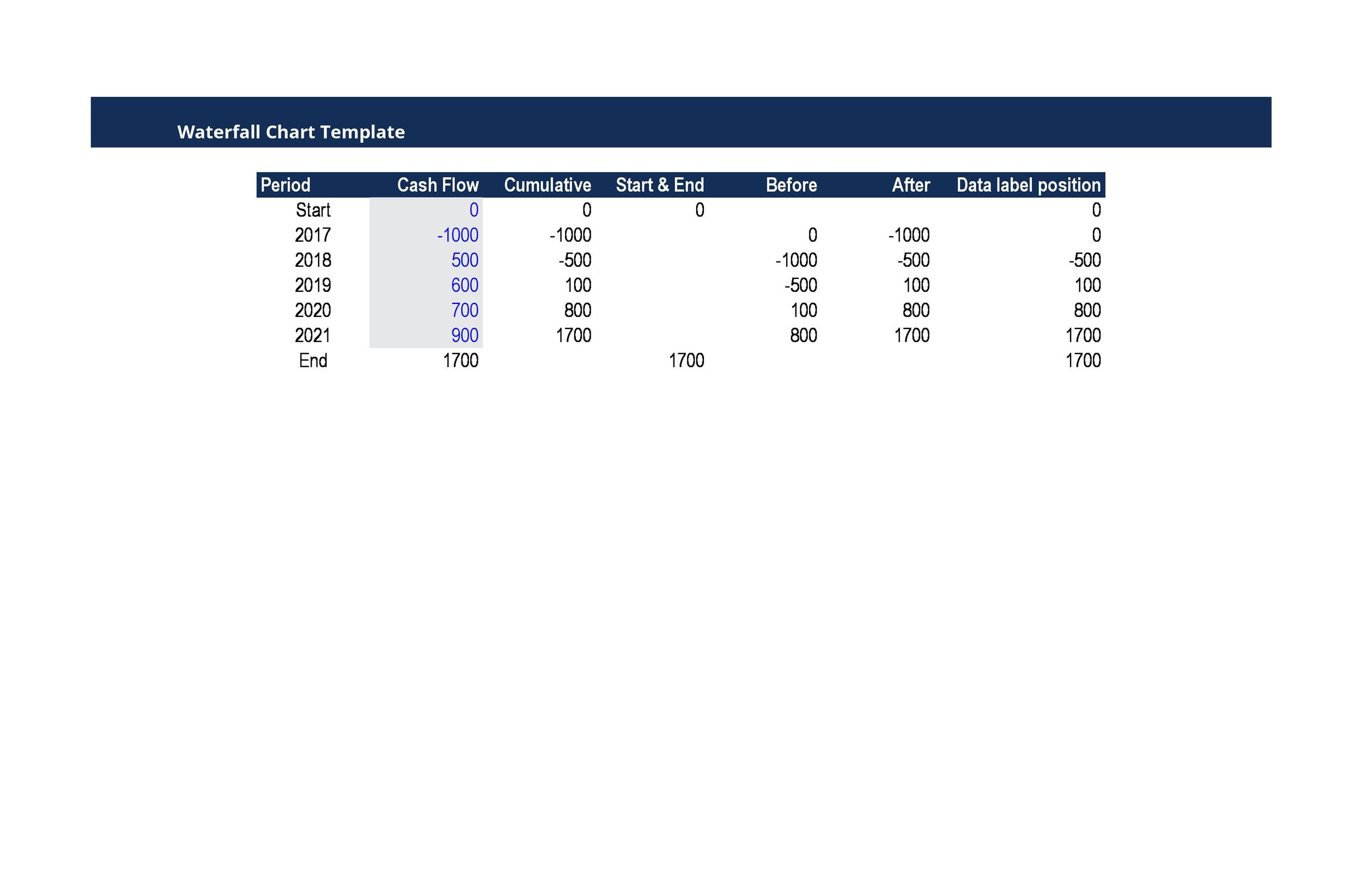
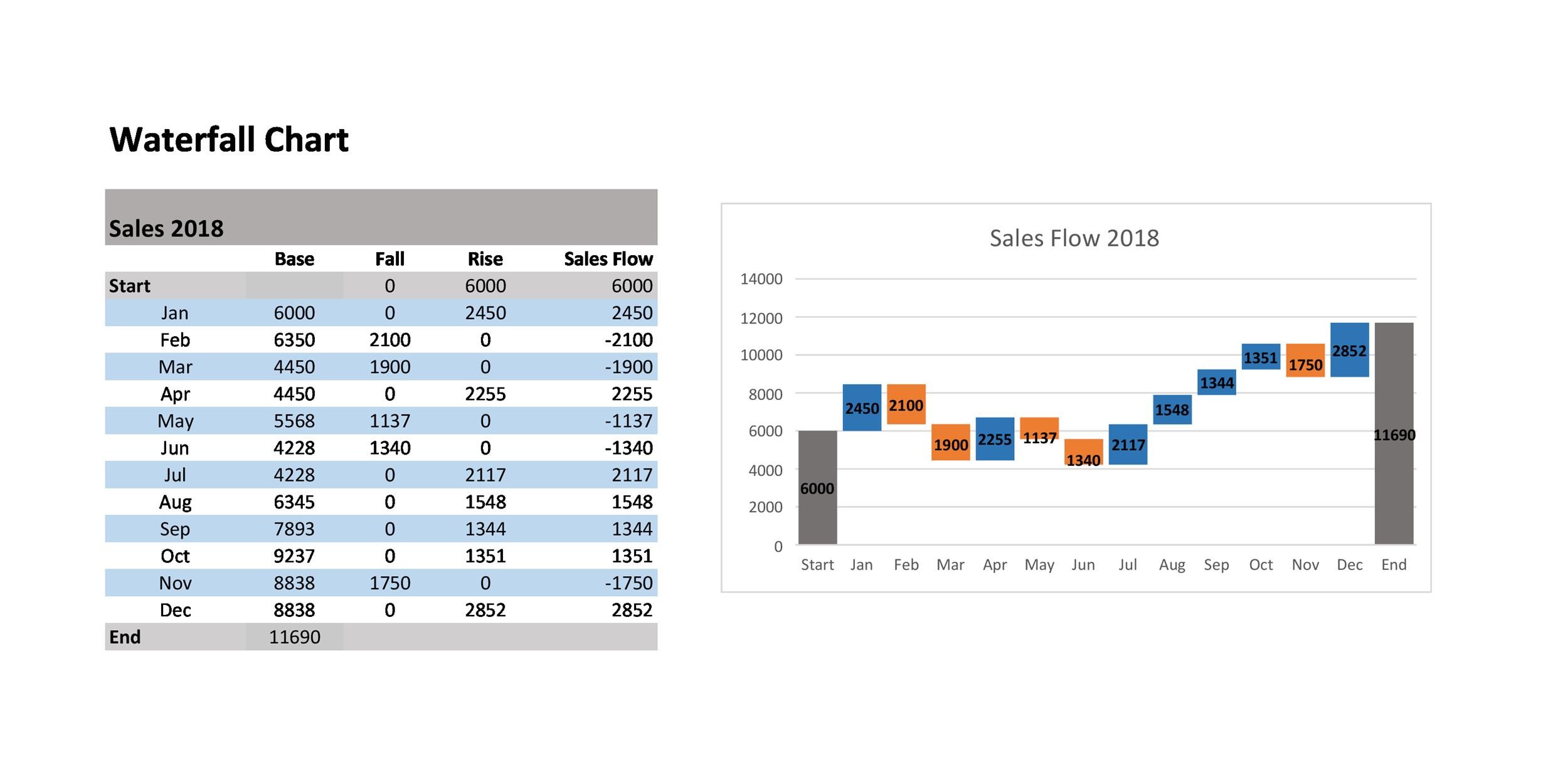
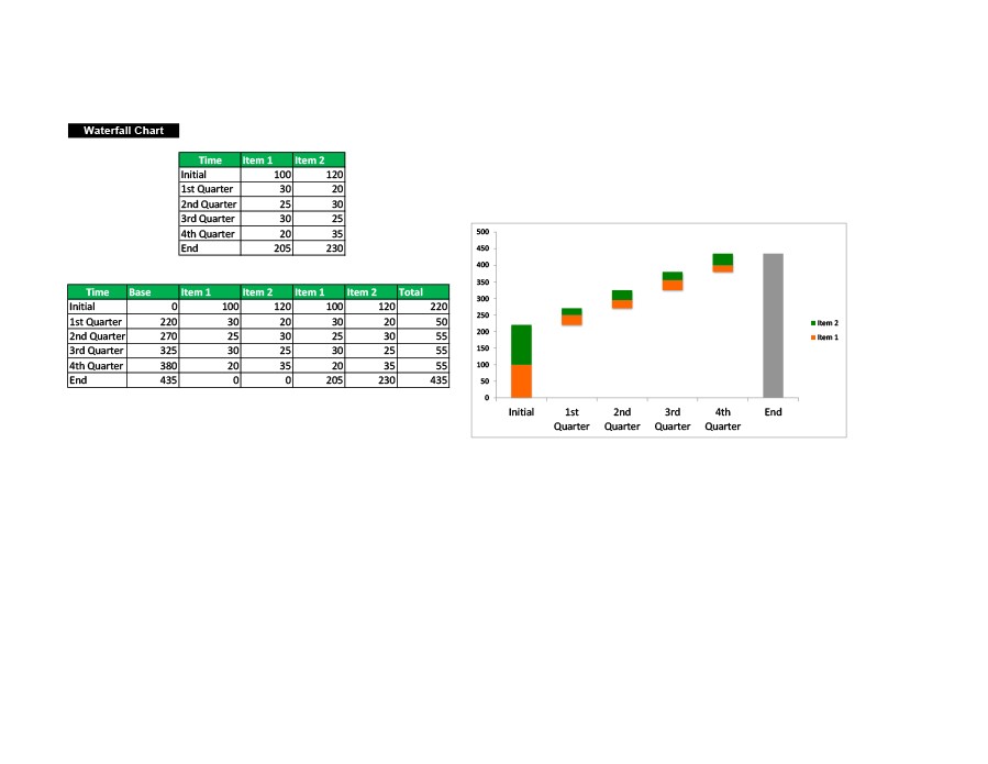
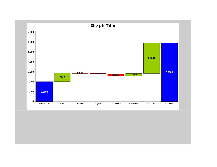
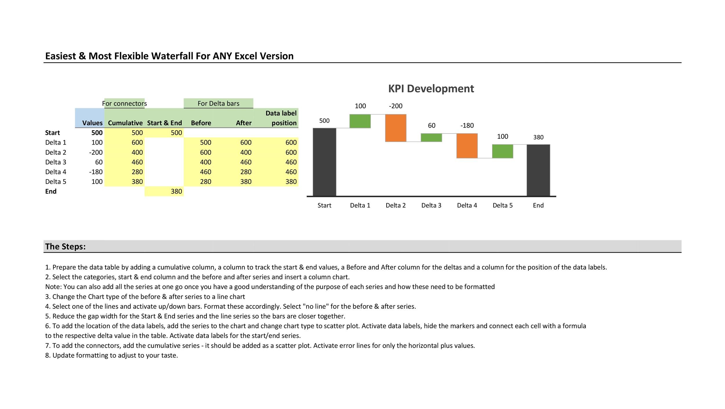
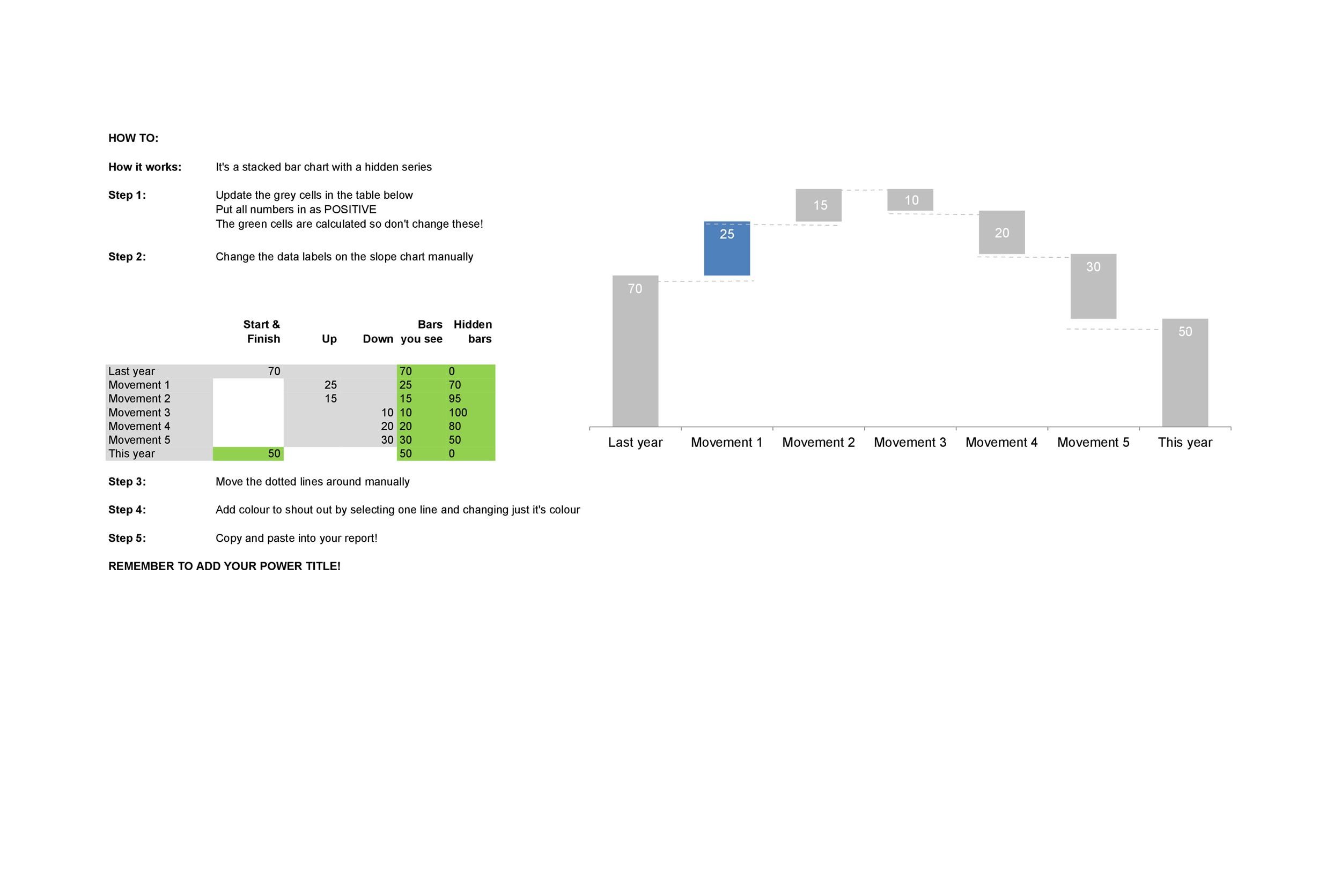
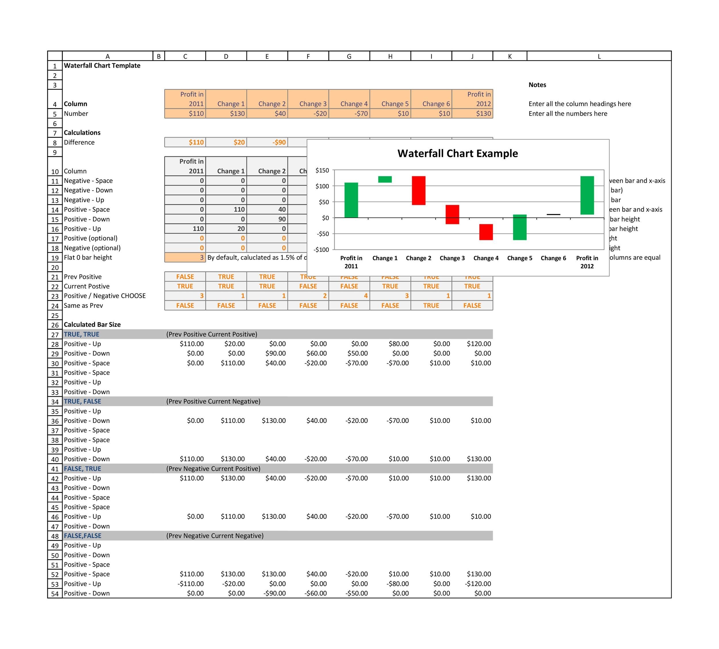
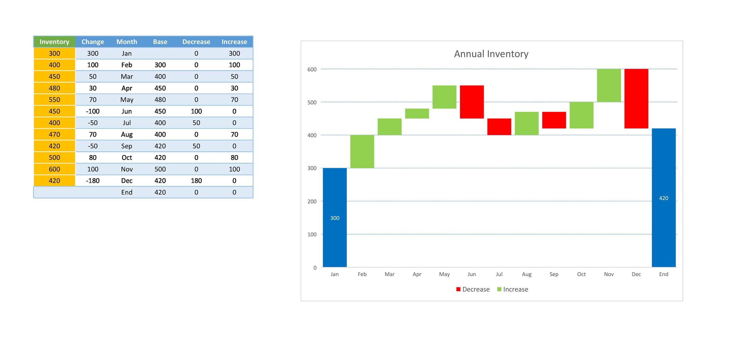
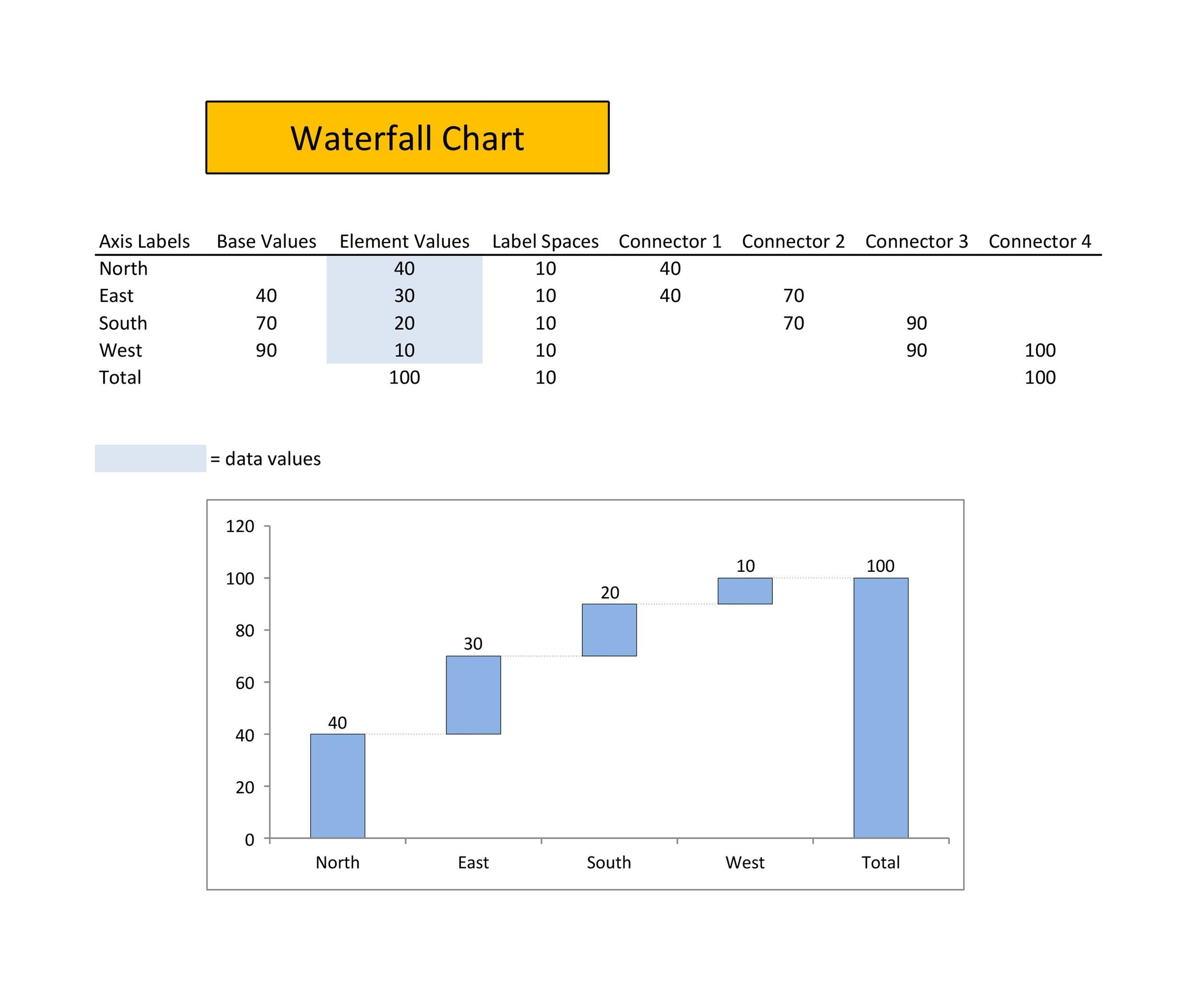
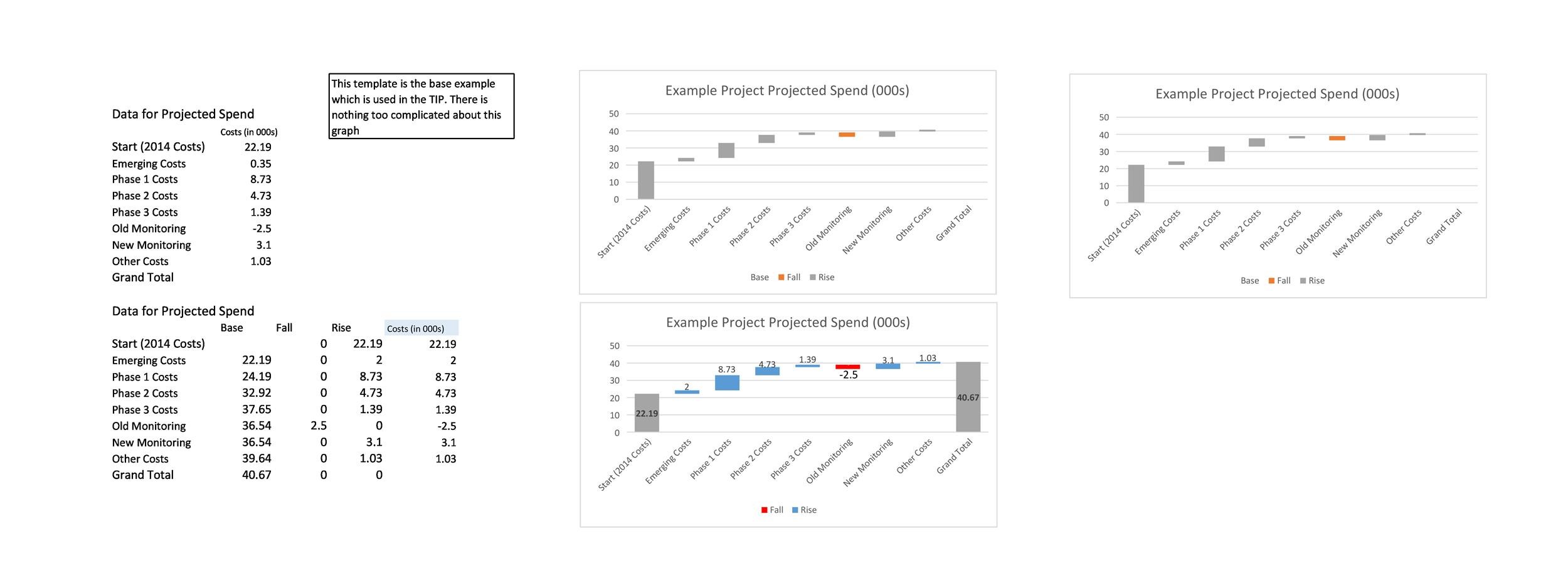
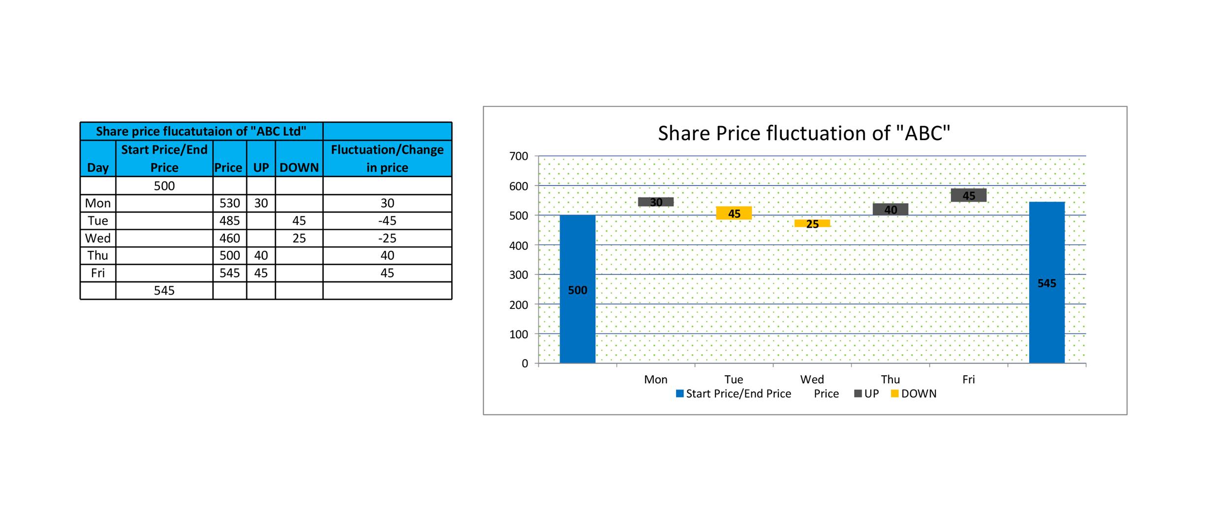
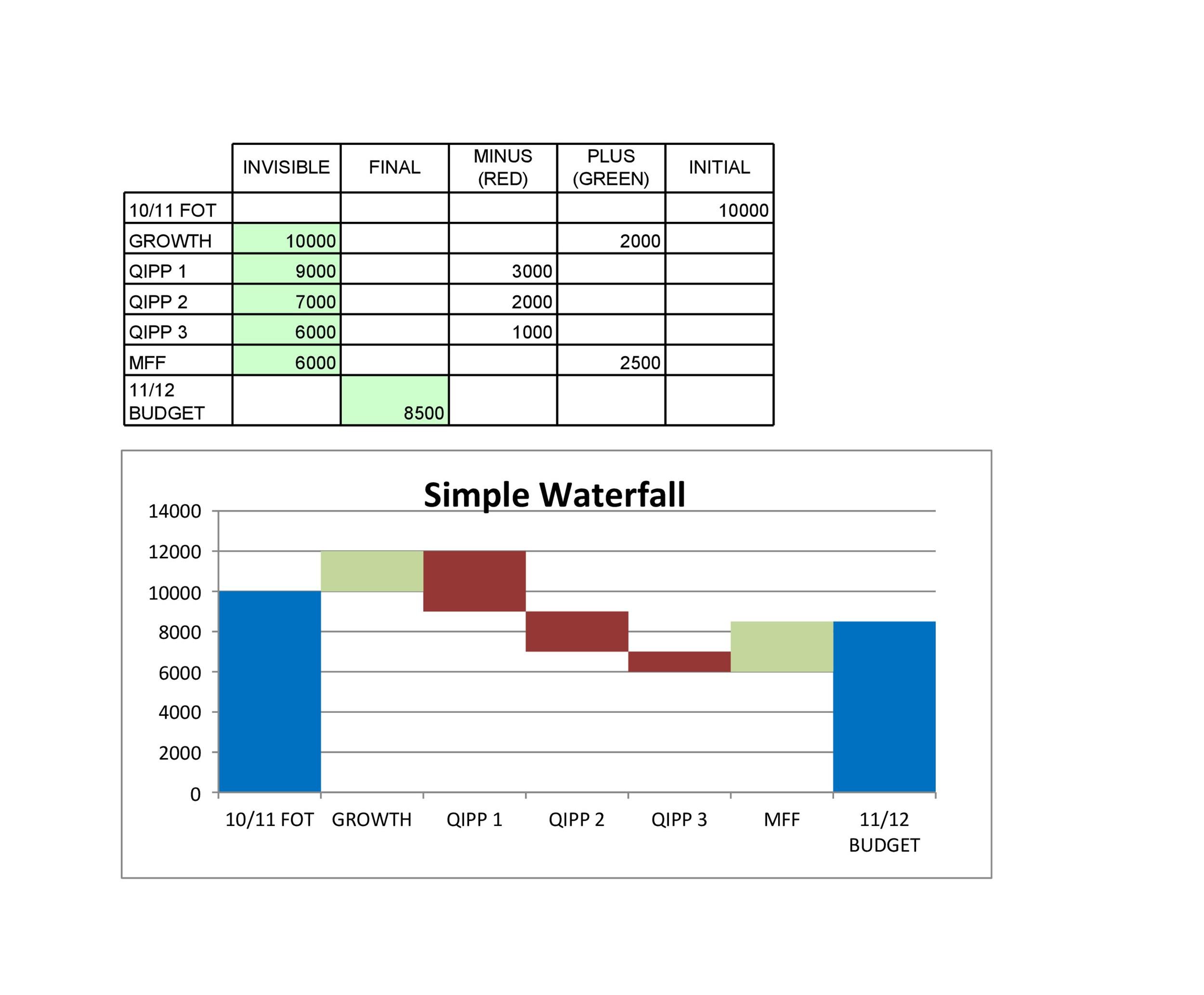
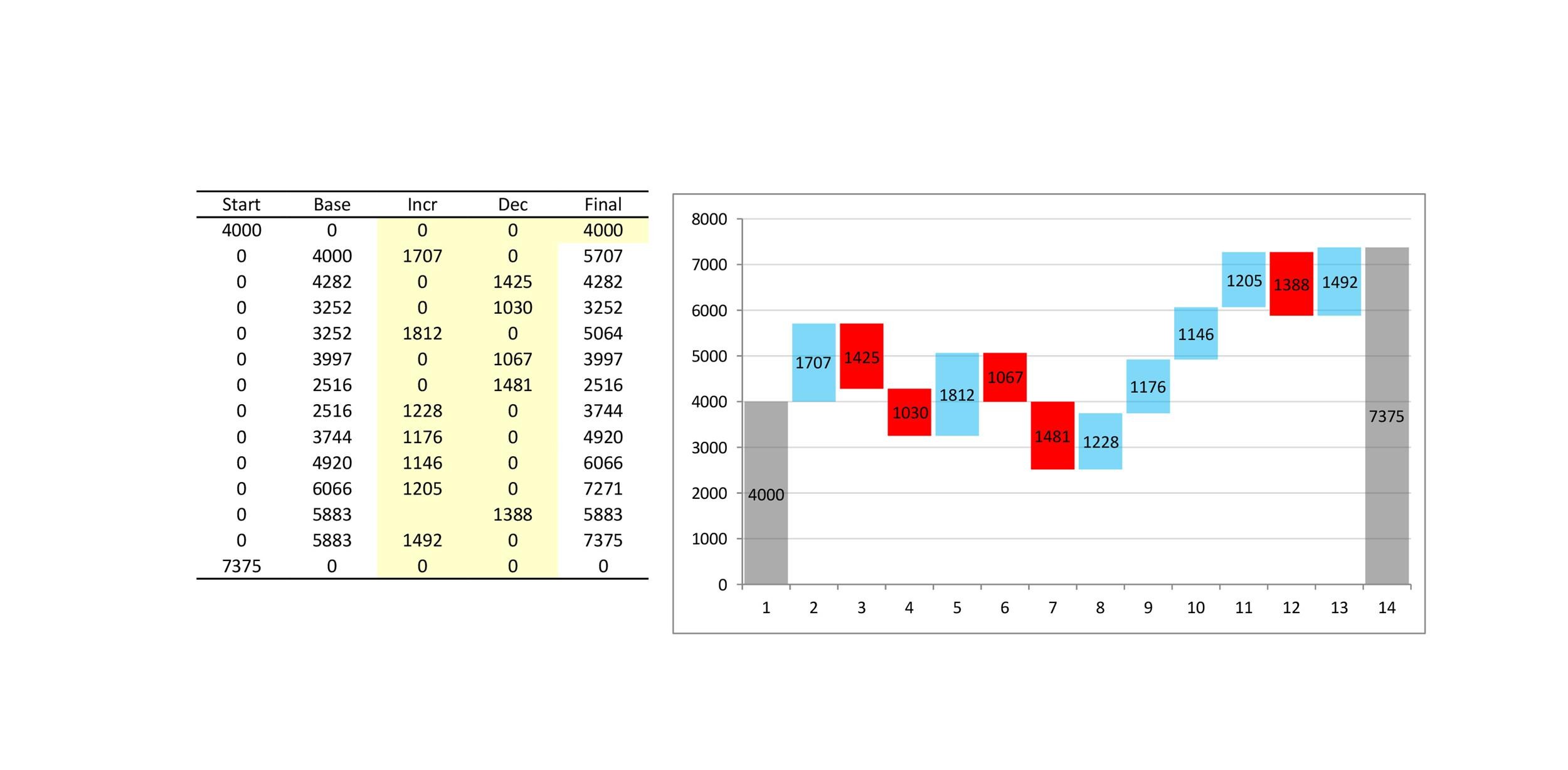
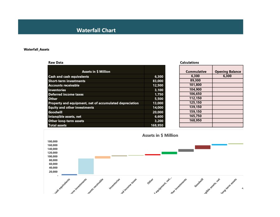
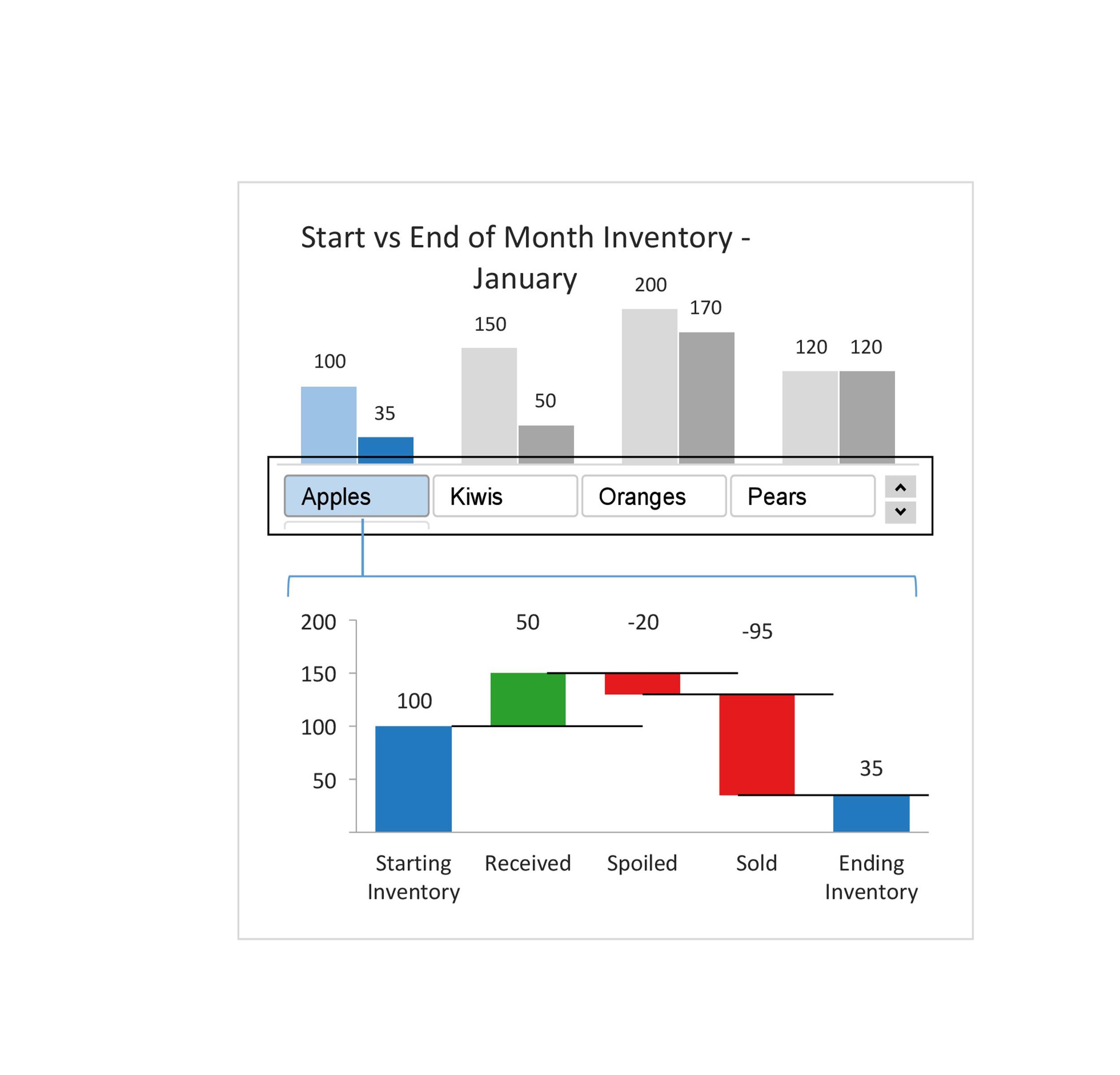
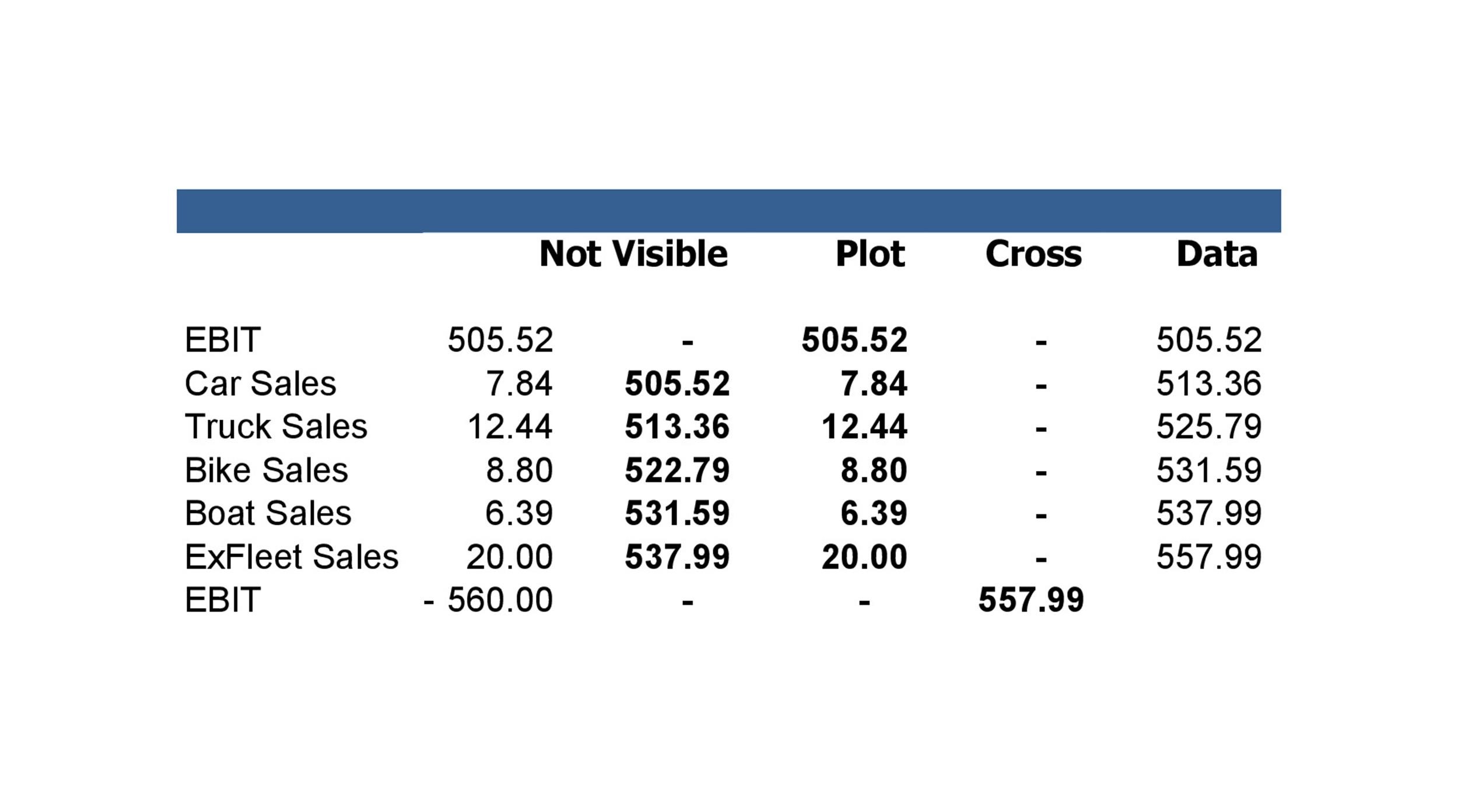
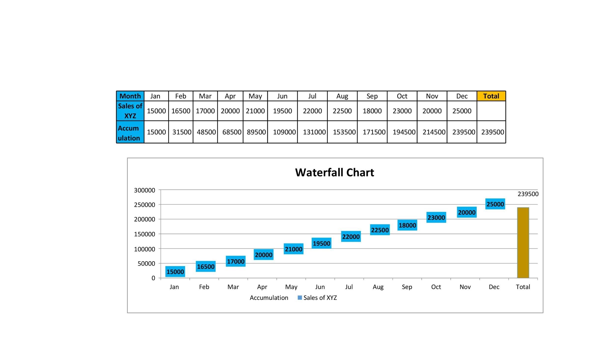
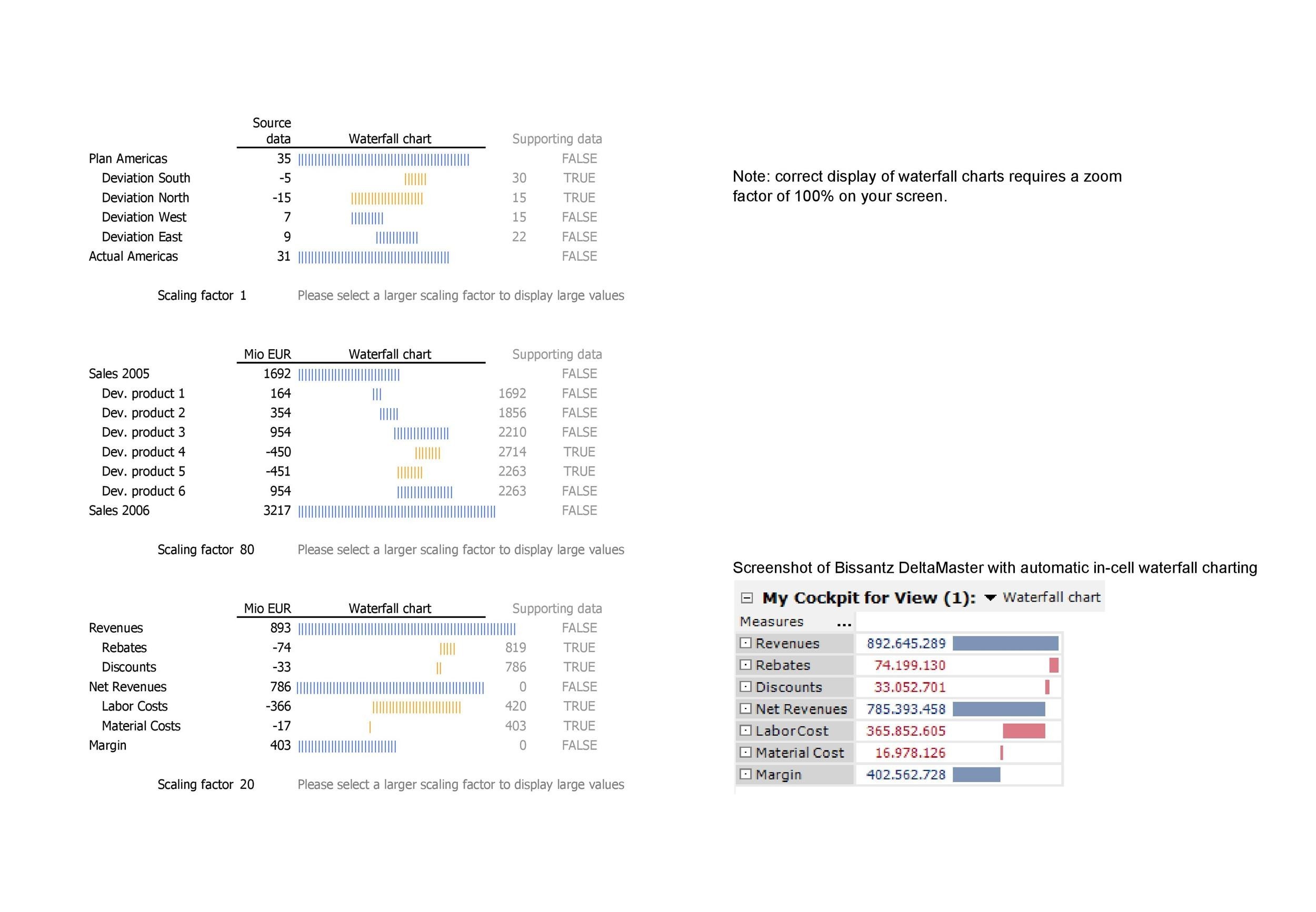
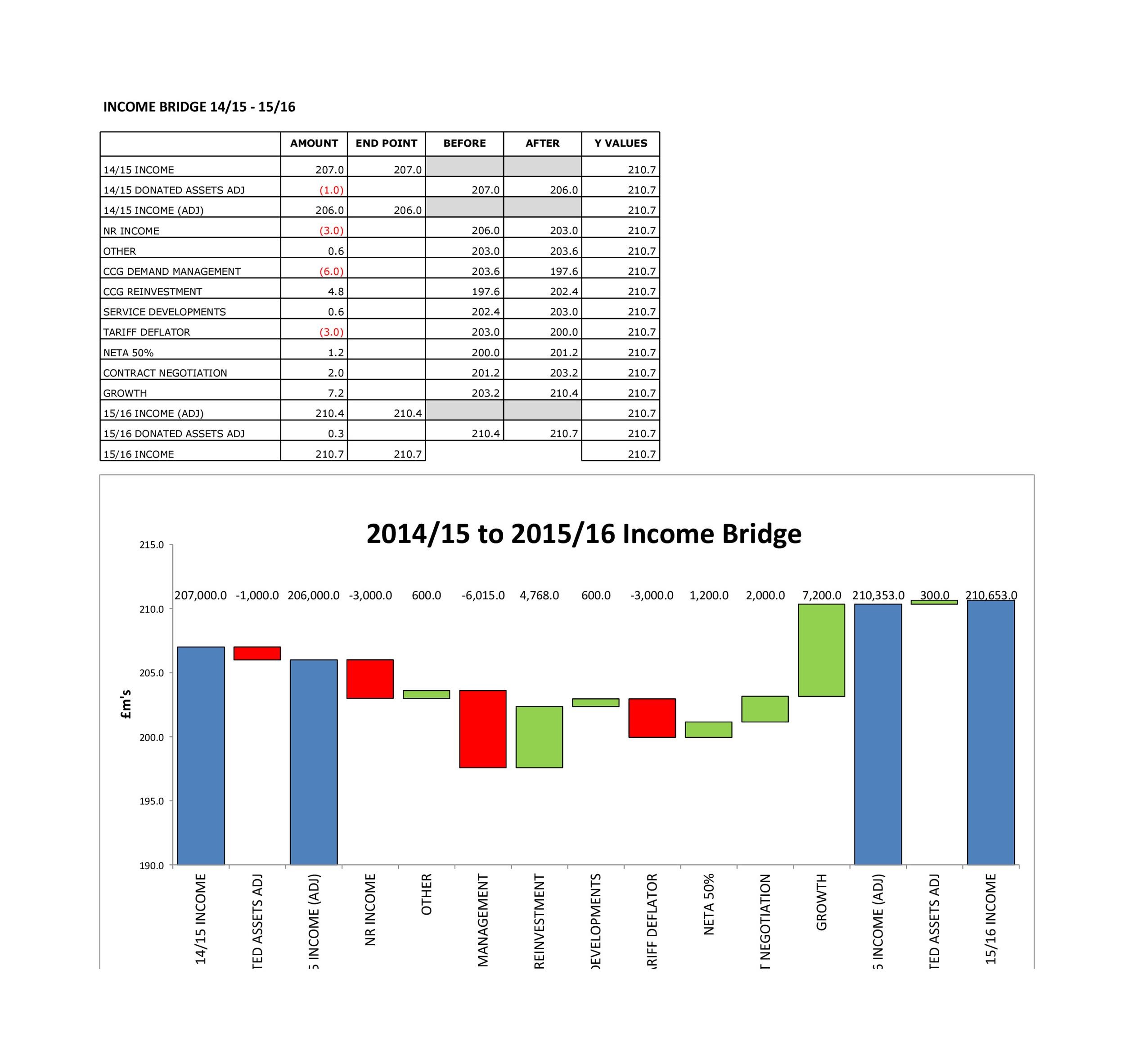
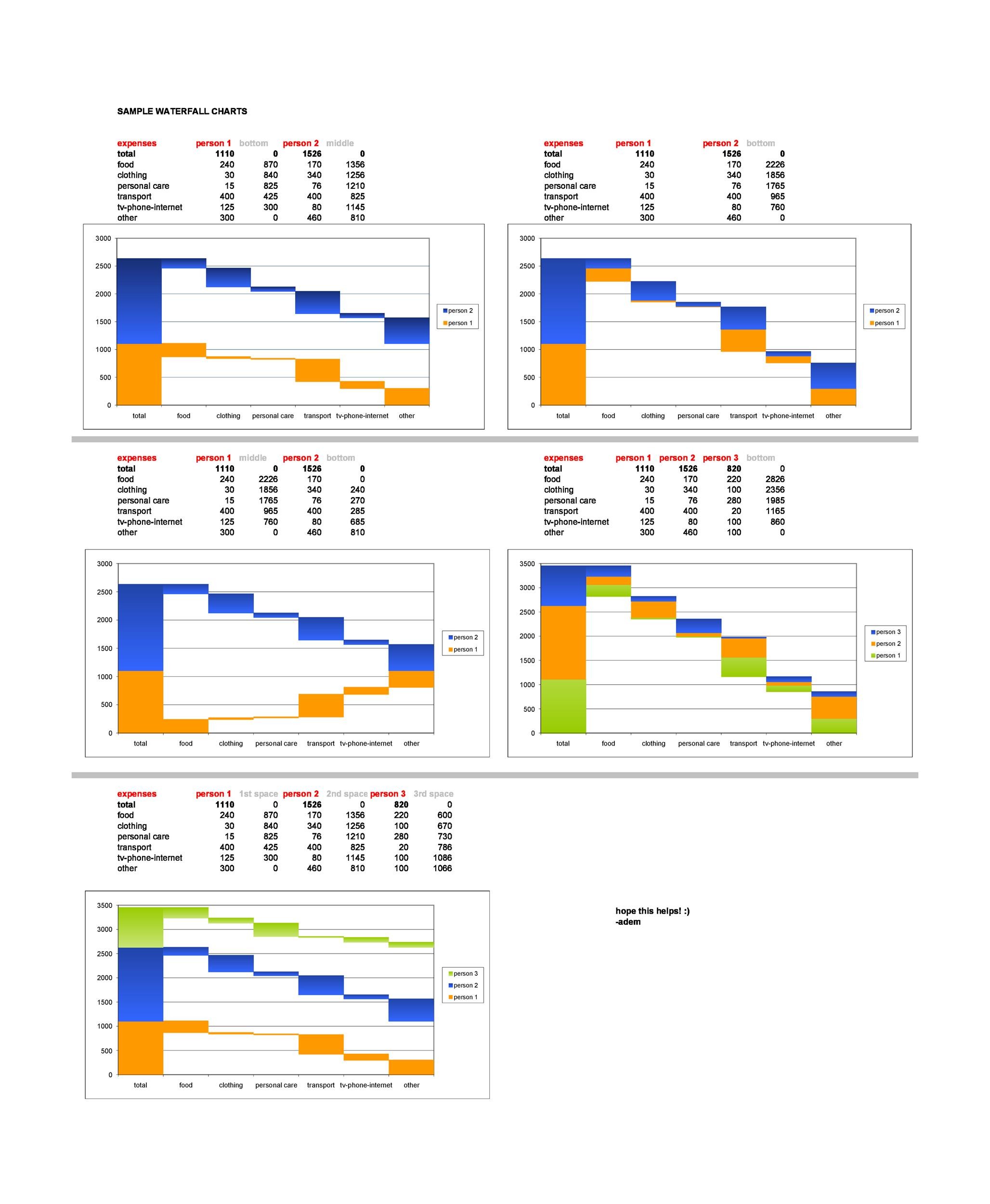
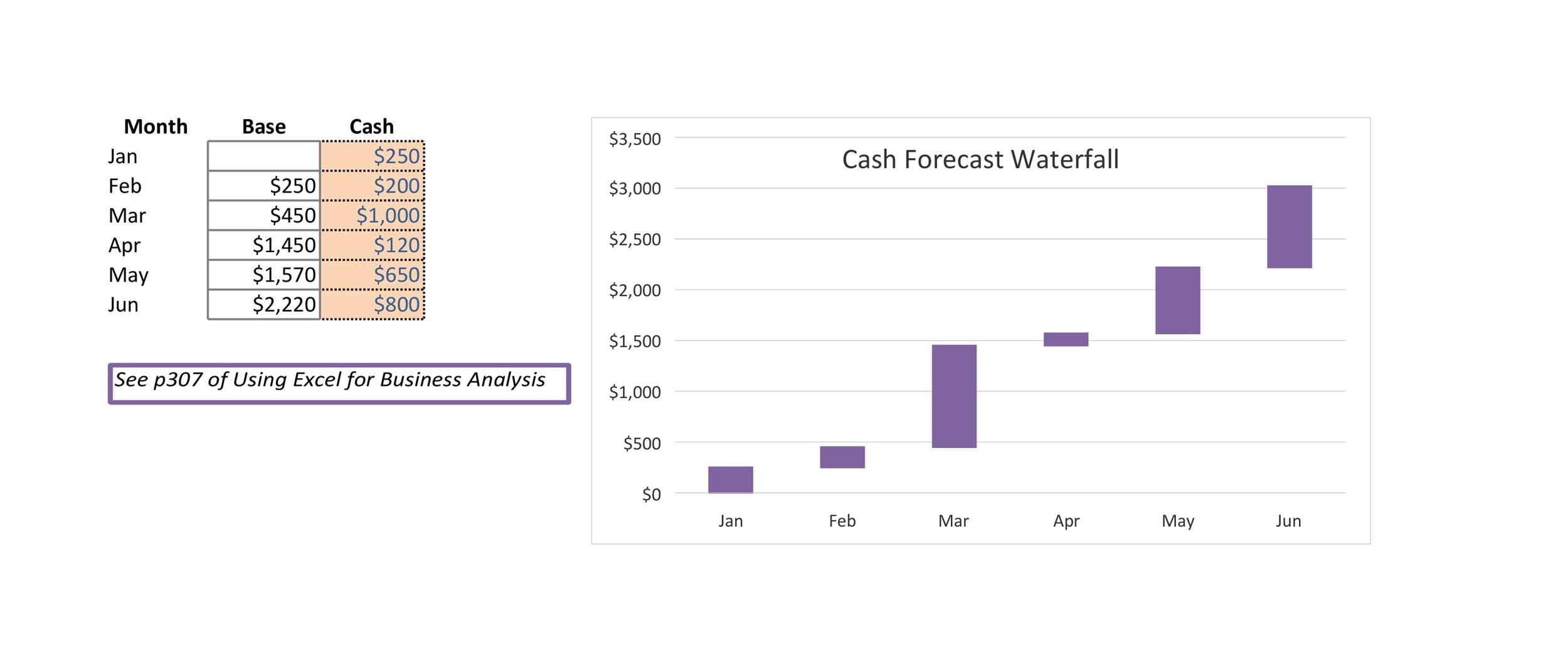
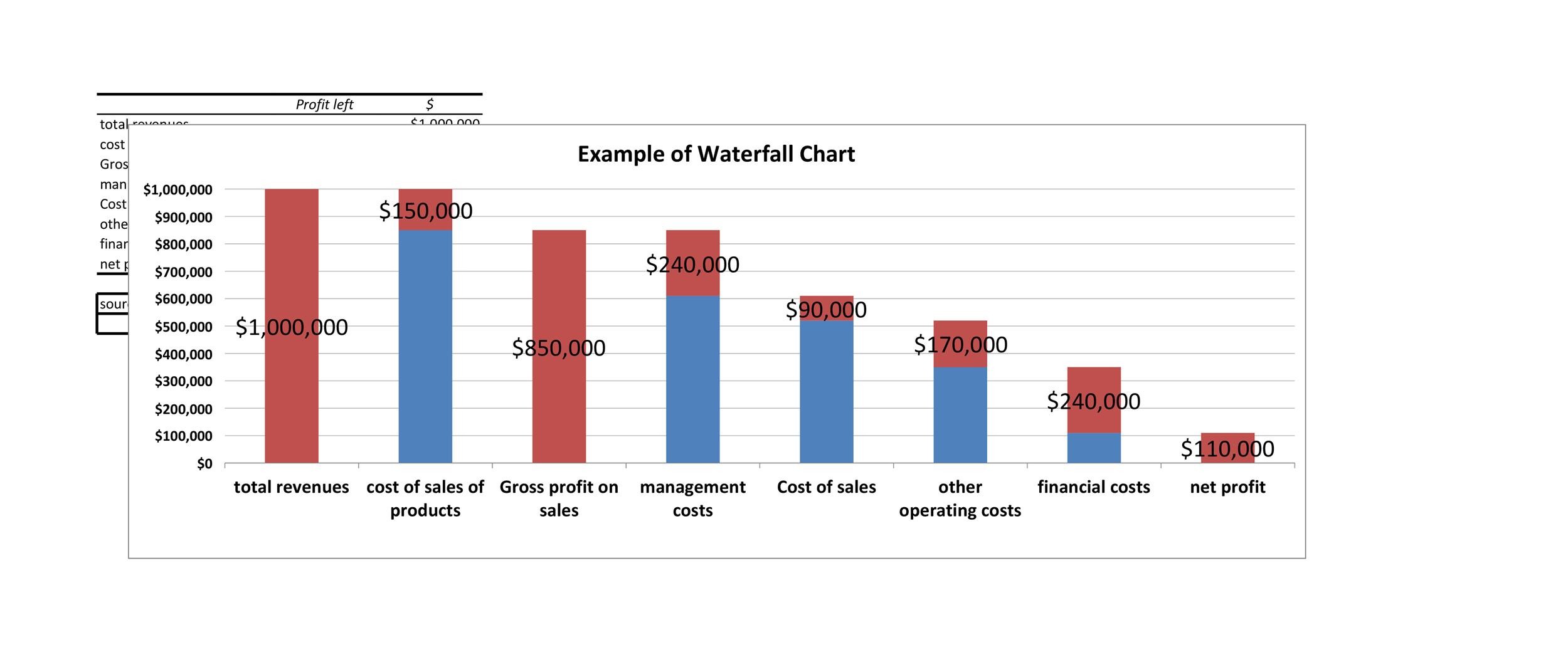
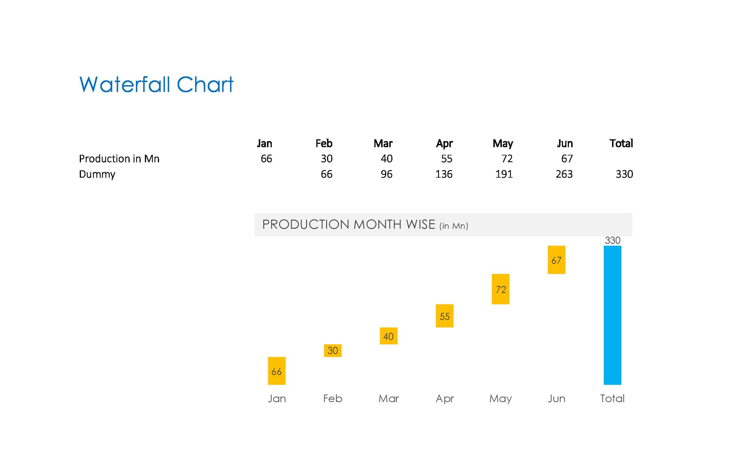
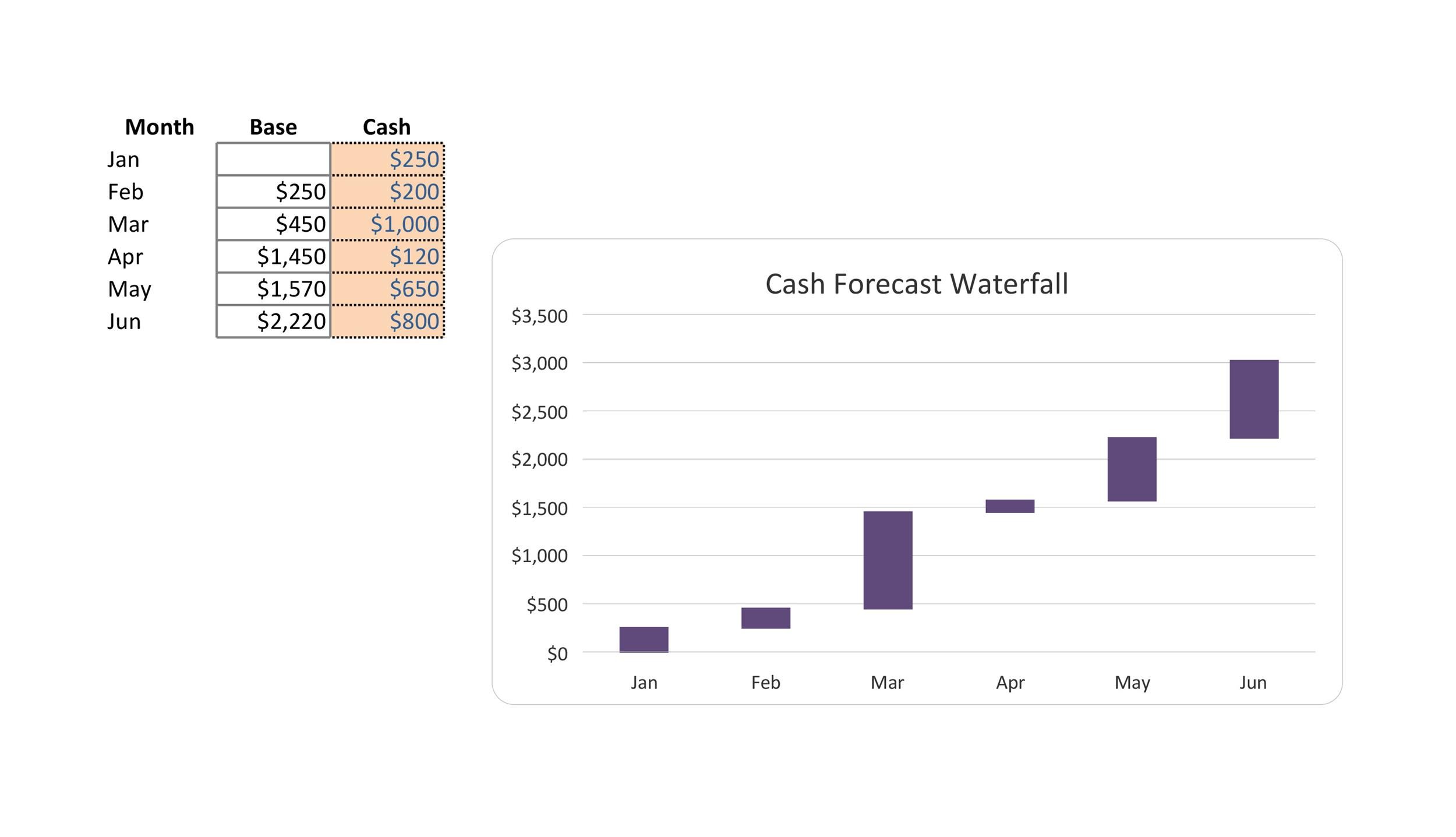
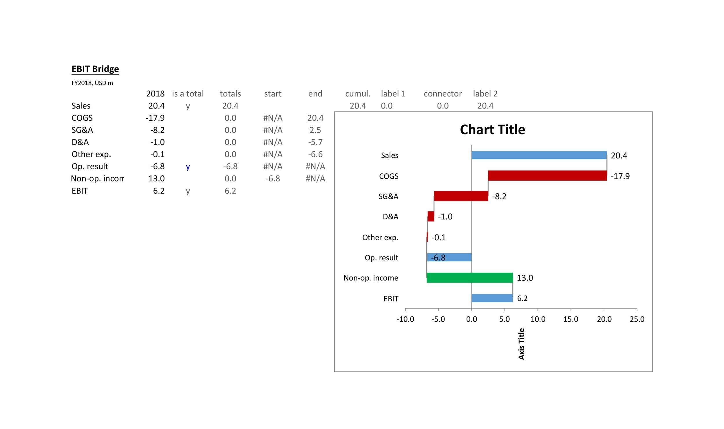
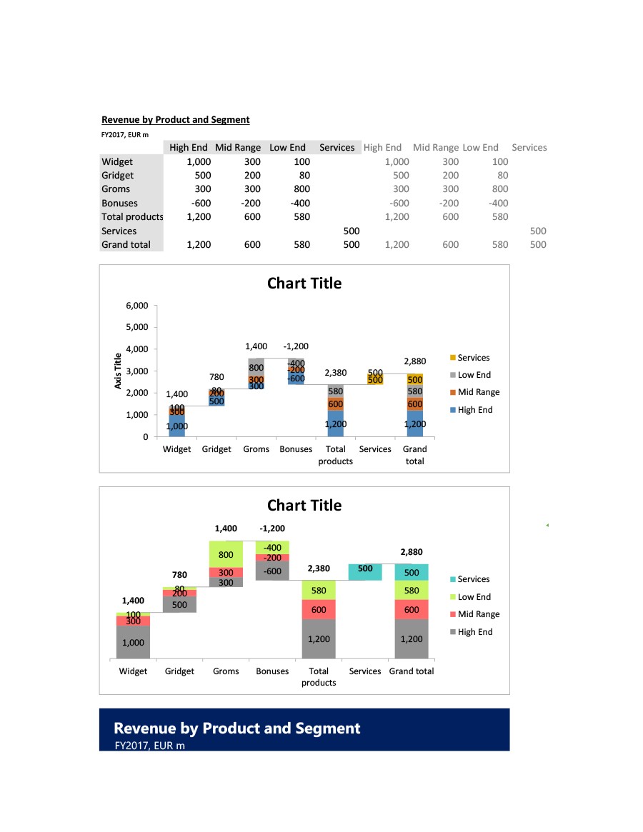
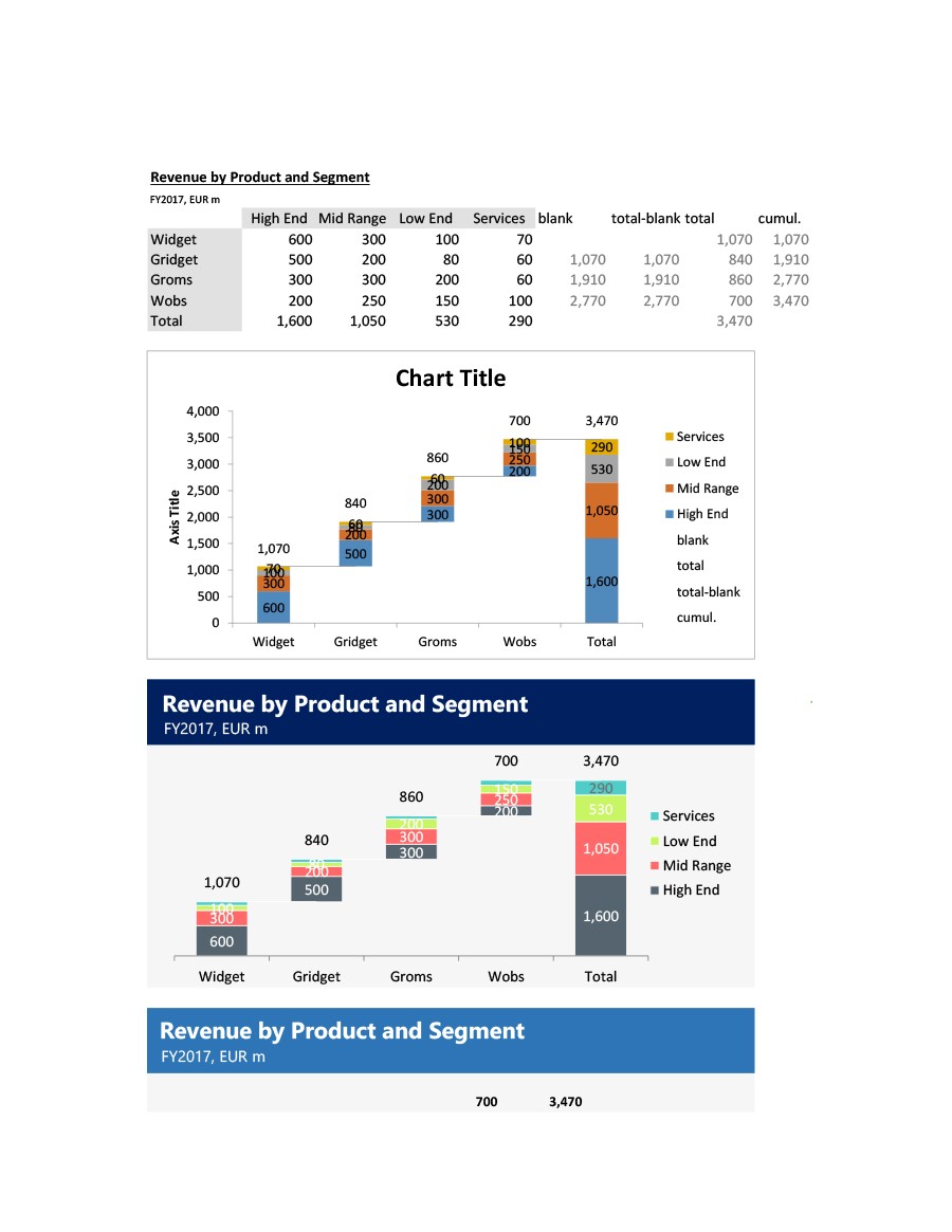
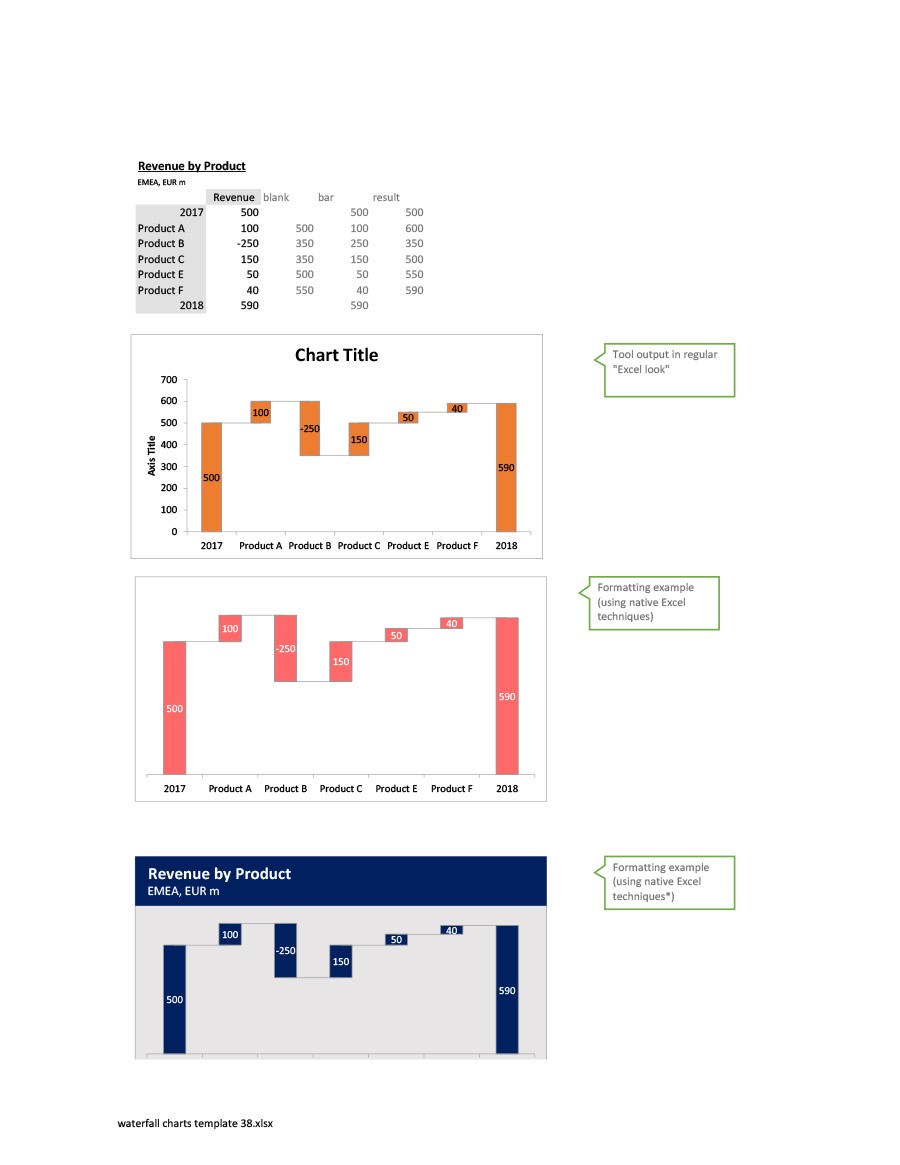
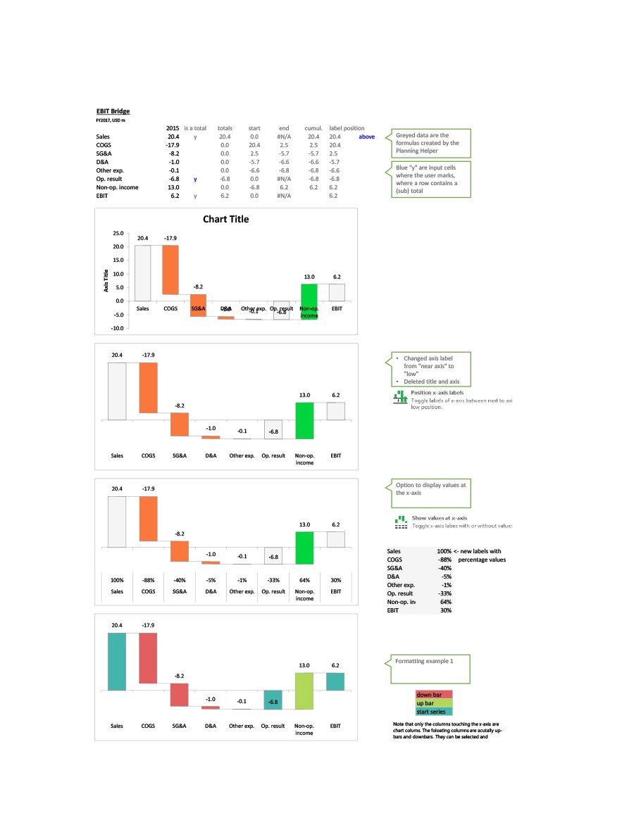
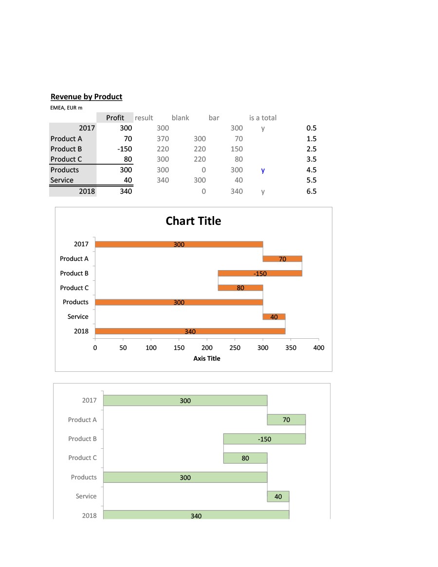
Use a waterfall charts template to portray how an initial value gets affected by a series of intermediate positive or negative values over a period of time. A typical chart usually contains initial and final values represented as whole columns while intermediate values appear as floating columns that begin based on the value of the previous column. This is best demonstrated by the chart itself.
Table of Contents
- 1 Waterfall Chart Templates
- 2 What is a waterfall charts template?
- 3 Waterfall Charts in Excel
- 4 When do you need a waterfall charts template?
- 5 The benefits of using a waterfall charts template
- 6 Waterfall Chart Samples
- 7 Tips for making a waterfall charts template in Excel
- 8 Waterfall Chart Samples
- 9 Customizing your waterfall charts template
Waterfall Chart Templates
What is a waterfall charts template?
The waterfall charts template is also called a bridge chart, a waterfall graph, a bridge graph, flying bricks chart, a cascade chart, net profit waterfall chart, and even as a Mario chart because it somewhat resembles the popular video game.
Whatever name you use, this is a versatile tool in providing a visual representation of negative and positive alterations to a certain value for a given time. In a waterfall chart Excel template, you represent the start and end values by columns with separate positive or negative adjustments shown as floating columns or steps.
Waterfall charts Excel can vary slightly. For instance, there are charts with lines between the columns which give the chart a bridge-like appearance. Other people leave the intermediate columns floating. The use of waterfall charts gained popularity in the 20th century. The organization for management consulting of McKinsey & Company introduced these charts which they used in their presentations to their clients.
They were further popularized by Ethan M. Rasiel, a McKinsey associate who used the charts in his corporate analysis book published in 1999 entitled “The McKinsey Way.” Although a waterfall chart Excel template can show changes in value for a certain period of time, it can also show changes in relation to previous periods or other measurement milestones.
Every step of the chart always leads to the final results and demonstrate how you reached them. What makes this chart so effective and popular is the simplicity of its construction, even in the analysis of complex information. This means that people will always use it in different applications for a long time.
Waterfall Charts in Excel
When do you need a waterfall charts template?
You can use the waterfall chart template for various settings from trying to visualize statements to going through voluminous amounts of information about the census. Here are some scenarios where this chart may be of use:
- Analysis of inventory and sales over time
- Comparison of competitors.
- Comparison of product earnings
- Creation of executive dashboards.
- Evaluating profit
- For the documentation of contracts.
- Highlighting the value of a product over time
- Illustrating the growth of employees
- Keeping track of consulting jobs.
- Showing the changes in the budget over time
- To demonstrate changes which have occurred from one period of time to another in terms of operating costs.
- Tracking retail inventory.
- Visualizing loss and profit statements.
The benefits of using a waterfall charts template
The simple and a flexible format of a waterfall chart can have a lasting impact when used to present your data. This is one of the main reasons why it has become a popular way of business presentations or sharing your data for some other purpose. Aside from this, there more benefits in using such charts too:
- You can customize the chart as you need.
- Depending upon the scenario, you can make the charts as simple or as elaborate as you prefer.
- You can use the charts for the purpose of analytics, especially when explaining or presenting the gradual value changes of a specific item.
- You can use the chart to study different types of data for various purposes.
Waterfall Chart Samples
Tips for making a waterfall charts template in Excel
For those who don’t want to sweat or work too much, the most convenient way to have their own waterfall chart Excel is to download one. But if you’re one of those who wants to go through the process of creating their own template, then, by all means, do so. It can demonstrate your innovative skills.
Here are some tips you may want to consider. These instructions will assist you with your chart design whether you use a Mac or a PC.
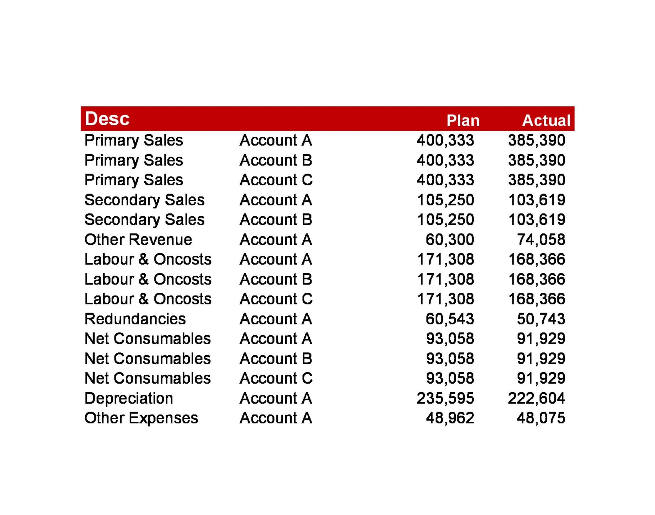
Create a table format for the representation of the set of data
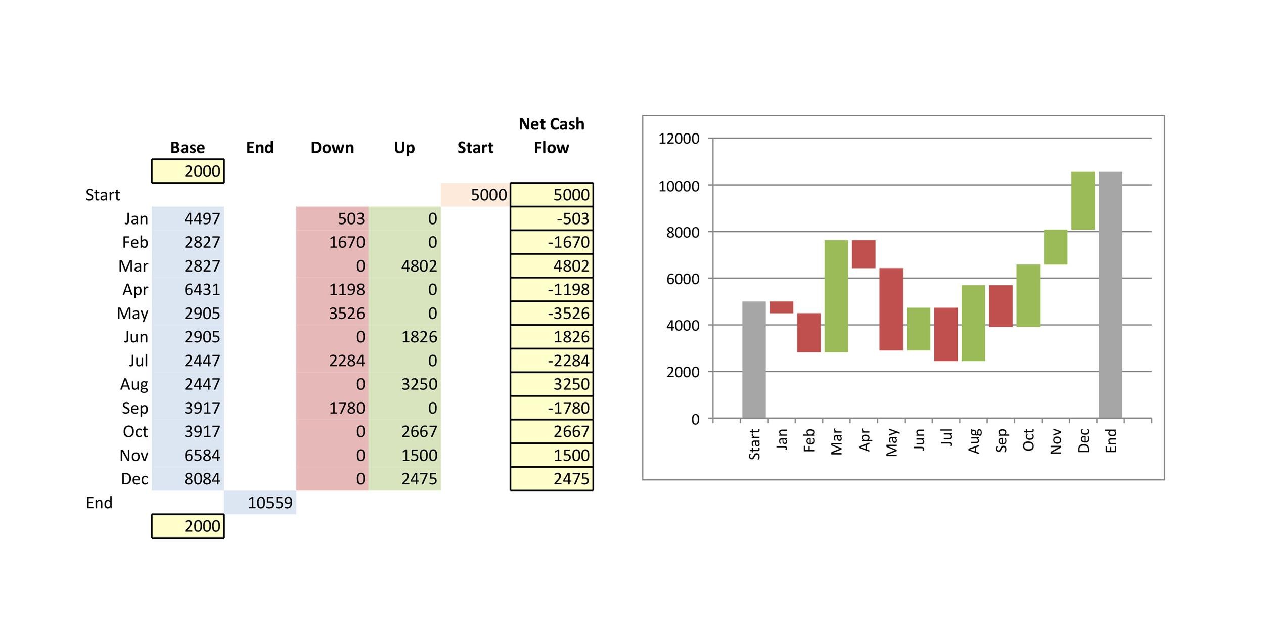
To make things simpler, you can start with a waterfall chart template for your monthly income. You will have different numbers based on negative and positive income for every month.
- Start with the first column which is the sales number.
- Add three more columns to your chart and name them “up,” “down,” and “base.” The column entitled base serves as your starting point for both the down and up income flow in the chart.
- In the column entitled “down, enter all negative income. In the column entitled “up,” enter all positive income.
- Make sure you have “start” rows and “end” rows where you can see the total values for the whole year.
Add the required formulas
If you’re not familiar with Excel, this could be an intimidating step and the entries here may look like alien symbols to you. Actually, with a little practice, it isn’t that difficult even for beginners.
- Input the formulas in the first cell of each column.
- Using the fill tool, copy the formula throughout the whole column.
- Drag the tool to the very end of each column as this copies the formula.
- Use the same tool to drag the formula all the way down to the very end of each column repeatedly until you’ve copied it into all of the required columns.
Make the data table into a chart with columns
- First, highlight the information to include in the waterfall chart, including headers. Don’t include the column entitled “income flow.”
- Locate the Insert tab in the menu.
- Click on “chart” and choose “stacked chart.”
Convert the stacked chart into a waterfall chart
- Click the Base series, right click then select “Format Data Series.”
- Click Fill in the menu and “No Fill” in the drop-down menu for colors.
- Repeat the same steps for the “Line” section.
- Right click on the “Base” in your legend and select “Delete.”
- You just created a simple waterfall chart Excel.
Waterfall Chart Samples
Customizing your waterfall charts template
Depending upon the kind of information you want to visualize, every waterfall charts template slightly differs in appearance from the others. Generally, every chart always includes these features:
- Floating columns
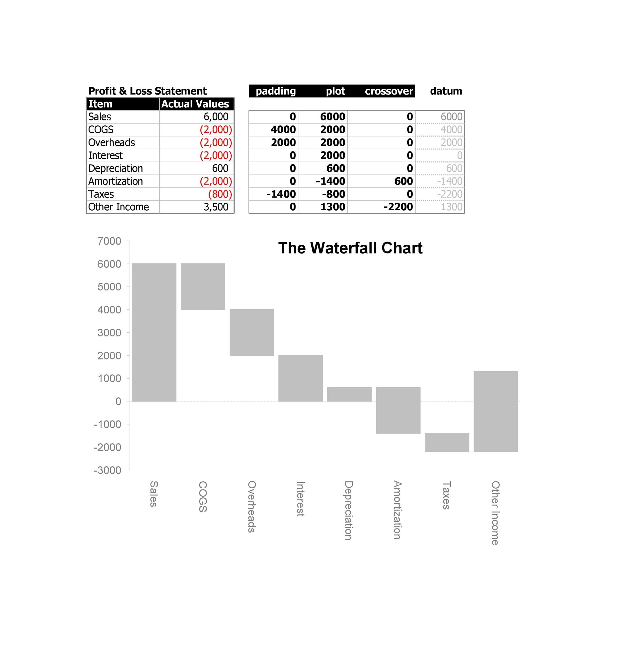
Also referred to as plot or plotted values, these columns provide a quick visual representation of a specific value’s status for over time. Floating columns represent the negative and positive alterations made to a starting value. - Spacers
Every column in a waterfall chart doesn’t start with a zero value so you need to offset them by a margin known as a spacer or a padding. - Connector lines
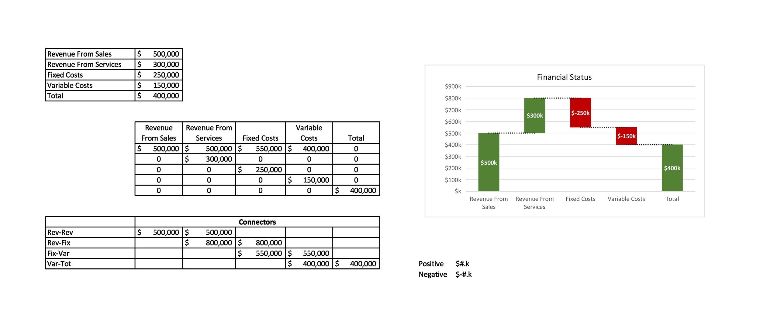
Also called datum, you use these to show how the floating columns relate to each other. Even though this is an optional feature, the connector lines may be a beneficial addition to enhance the appearance of your waterfall chart. - Color Coding
Adding distinct colors to the varying column types makes it easier to distinguish negative from positive values. This also provides a quick look at the movement over a specific period of time. - Crossover
Depending on the plotted values, there are instances when the values may move across the x-axis. For instance, you can create a waterfall chart for a profit-and-loss statement. Let’s say that you peg the first value at 1,000 and the second value at -2,000.
Here, part of the floating column is below the x-axis and another part is above. Thus, you have a crossover. This is a significant aspect of the chart as it automatically adjusts to show the movement across the x-axis.
A waterfall chart Excel template Which presents only the basics may turn out to be drab and boring. But you can make it livelier and more interesting by adding color, a couple of details to provide context, and a title. Here are some tips to make this happen:
Make your chart more noticeable
- Choose the Down series, right-click, and choose “Format Data Series.”
- Choose Fill and choose whichever color you prefer.
- Repeat these steps with the Line option.
- Repeat the entire process with the Up column. Choose a color.
- Make sure that you color code the start columns and your end columns individually. Choose different colors so they stand out.
Eliminate white space
- Double click one of the columns and choose “Format Data Series.”
- Click “Options” in the menu.
- For the value of the “Series Overlap,” change it to 100%. For the value of the “Gap Width,” change it to 15%.
Add labels and titles
- To add data labels, right click on a column then choose “Add Data Labels.”
- For the formatting of the labels, choose a label, right click then choose “Format Data Labels” from the drop-down list.
- Using the same pane, change the label’s position, add a little color, and change the size of the numbers too.
- For the title, click on the chart and find “chart options.”.
- Click the title box of the chart to give your chart a name.

