Most projects usually involve the use of a timeline diagram, a tool that provides an easy-to-comprehend history of the project. Based on this, the readers can determine ongoing patterns and trends. The timeline also plays a major part in project management. For instance, it’s used to illustrate deadlines, milestones, and other important events and dates over the duration of the project. It clearly ties the goals of the project to the important dates. In addition, it also allows project managers to make annotations on the document to show the actual progress of the project.
Timeline Templates


What is a timeline template?
A timeline is a presentation of the chronological sequence of events along a line that allows the readers to quickly understand the relationships between the different events. Some timeline examples have a tabular chronology, while others have yearly paragraphs. Some are even purely conceptual.
Timelines are frequently used to illustrate infographics by combining graphic images and text to make better presentations. Timeline templates are visual aids that show the passage of time and can include diagrams, visual elements, and text.
Types of timeline templates
To make a timeline, you can choose from many kinds of templates. Before choosing the template to use, it’s important to consider the data that you want to visualize. For instance, do you plan to create a history timeline template or a wedding timeline template? Should the events in the timeline strictly flow in chronological order? The type of timeline depends on the data. Here are the various types to choose from:
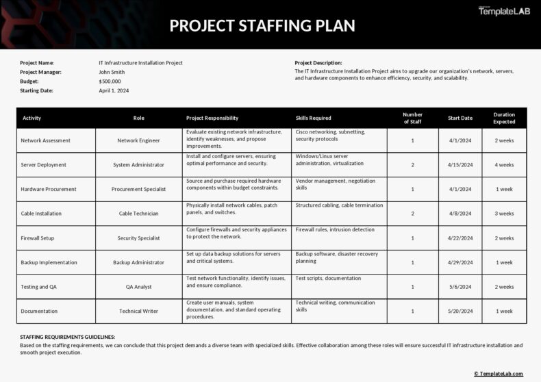
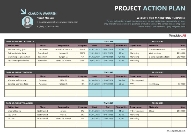
- Gantt chart. Also called a horizontal bar chart, this is a template that visualizes how you will keep track of a project. The cascading horizontal bar chart contains all of the project tasks and how they’re related to each other as the project moves forward. Many project managers consider this as the ideal timeline when they need to coordinate dates, durations, resources, and tasks, whether the scale is big or small.
- Vertical bar chart. This proves useful in keeping track of time against amounts like a timeline that measures money collected for an event or even growth. Over time, the vertical bars will grow taller as the amounts of money increase on the y-axis. The upward movement helps you visualize the gain quickly. A vertical bar chart timeline is very useful for finance teams and business analysts.
- Chronological chart. This is a timeline that visualizes the events in a specific arrangement or succession order over a given time period. The events in the chart should follow a precise order, starting with the first event on the left side and the most recent ones on the right. This is an effective chart to display historical events.
- Static timeline. Both the chronological and vertical charts are types of static timelines since the information they provide doesn’t change or move. Since you present the data at the same time, there’s no need to analyze an entry to get more details.
- Interactive timeline. Also called a dynamic timeline, the chart enables the readers to scroll, change, or move through the data in real-time. It also allows for interaction with complex information to discover new insights. This is an ideal chart for projects that last for several months as it involves huge amounts of data to analyze for the purpose of identifying patterns and trends.
Timeline Examples


Who can use timeline templates?
Because of its ease in sharing data, a timeline graphic is now used in several industries. A visual timeline, for instance, shares more details with just one look compared to blocks of text. It’s a valuable tool in event management, business and marketing, and project planning. A timeline helps in the visualization of complex data. From business scenarios to historical events, it helps with visualization to make complex information easy to understand. Here are the people who can take advantage of timelines:
- Students and teachers. Because of their practicality, timelines have become an essential part of the classroom. They allow students to actively engage in the learning process while making it easier for them to memorize dates and events, understand information, and visualize the chronological order of historical trends or events.
- Project managers. Timelines are very useful in project management for team members to visually keep track of projects and see how each event relates to the others. Take, for instance, a Gantt chart, one if not the most popular timelines used by project managers. With this chart, they can plan all of the tasks so that complex projects become easier to organize and manage.
- Business analysts. Using interactive timelines, analysts can sift through large amounts of complex information to uncover useful insights. This enables them to easily identify patterns and trends and present these in a more comprehensible way. They can also use timeline templates to map out the beginning to end of a project by creating an analyst calendar.
- Historians. When studying history, timelines also prove their worth because historians can use them to illustrate the changes that occur over time and effectively show the chronology of certain events. From this, historians can use timelines to show what happens, when, and how much time passes between events.
How do I create a timeline?
Creating a timeline is possible in different ways. If you want to make a graphical representation of a sequence of tasks or events, use a SmartArt graphic timeline. After creating the draft of the timeline, you can add more details, change colors and layouts, or apply preferred styles. Here are tips for making a timeline template:
- Decide what the timeline will show. Timelines must have titles that identify the project or event they intend to illustrate. Place the appropriate title at the top of the template.
- Create the timeline. Decide which part you want to create first. If it’s for a project, specify the date when the work will start and when it should get completed. For this, create a horizontal bar in the middle of the template. Add the start and end dates of each event starting from the one on the left.
- Decide the timeline’s scale. Based on the total duration of the time to illustrate, divide the timeline into equal sections. Use small vertical lines or dashes and label them accordingly. For instance, if you have a timeline that covers one year, divide it into months. Divide one day into hours and so on.
- Missing time. If there’s a span of time with no activity, bypass one of the segments in the timeline to indicate a time gap.
- Add the events. Whenever events occur or tasks get completed, indicate these using small points or circles along the line. Connect a vertical line and extend it from the bottom or top depending on how much space there is in the template. At the end of the vertical line, draw a box and write the name of the task or event to complete.
- Add visual elements. Adding graphics and images to illustrate events is a good idea, as these add clarity while increasing the visual appearance of the timeline.
Timeline Samples


How to make a timeline template Microsoft Word
Another alternative to creating a timeline is through Microsoft Word. This program shows you how to create professional timelines using the popular text processing tool. Here are the steps:
Launch the program
- There is a choice to either open a new document or an existing template.
- In the menu bar, click the Insert tab > SmartArt. This gives the option to select from various SmartArt Graphics. To create a timeline, select one of the templates and click Process > Simple timeline.
- Try different templates and styles to see which one is best.
Add the data
- After selecting the Simple timeline, you will see 3 placeholders and milestones.
- Click the Milestones [Text] or use the text pane. Using the latter allows you to add more milestones easily.
- Click Enter for to add more bullet points. Word automatically adjusts the font size depending on how many events or how much text you input.
- The milestones are horizontally positioned on the axis with the same distance between them no matter how many dates you added.
Customize the timeline
- One excellent feature of Word is that it offers several ways to style the timeline. The way you set font properties, colors, and more will affect the whole overview of the timeline. A client may request to have their font type and brand colors on the timeline template. You can adjust all of these details easily with just a couple of clicks.
- SmartArt also offers various templates to change the appearance of the timeline. In the menu bar, click SmartArt Design and open the menu for SmartArt Styles to browse the other options.
Adjust the font properties for the events
- With Word, you can change the font style, font color, font weight, and other properties using Rich Text Formatting. Choose the text you want to change and use the Rich Text Editor to change the fonts.
Change the positions and colors of the milestones
- Select any of the milestones on your timeline by clicking on the right button of the mouse. This opens a menu from which you can edit the outline color, fill color, and other properties of the milestone selected.
- Word also allows you to use Drag and Drop to move the positions of the milestones, horizontally or vertically. Repositioning milestones closer to their descriptive texts makes it easier to make the right connections between the images and text.
How to use project timeline template in Excel
A project timeline template is a visual representation of the chronological sequence of tasks or events in a project. It involves a series of tasks assigned to teams or individuals that need to get completed within a set time period. With Excel, you can create a timeline template using two methods:
Use SmartArt tools
Using SmartArt tools is the best option when you need to create a basic and simple project timeline in Excel. Here are the steps to do this:
- Click Insert tab on the task panel at the top.
- Click Insert a SmartArt Graphic.
- Select
- Look for the Basic Timeline chart type and click it.
- Edit the text as needed to reflect the information in the project timeline.
You can add as many fields as needed in the SmartArt text box. Do this by hitting Enter in the text pane to open a dialog box. Excel also allows you to change the SmartArt timeline layout after inserting text. You can change it to a basic bar chart, line chart, or a stacked bar chart.
Try experimenting with the different color schemes for charts in the SmartArt Design tab. Using the SmartArt graphic tool is ideal for high-level project timelines where you can display all of the significant milestones of the project. But this might not be enough to display all of the activities and tasks that lead up to those milestones. In such a case, you can opt for the second method.
Scatter plot chart
These are charts that show very complex data points at a single glance. To do this, first lay the basis for the chart by creating a data table with the basic information that may include due dates, milestone or task names, priority levels, and other relevant information. When adding the dates to the timeline, make sure to format the cells to show the correct format for the date. Generate a scatter plot chart by following these steps:
- Click and drag the data table to select it
- Click Insert in the top menu
- Click Scatter chart icon
- Choose the layout of the chart
After creating the scatter plot chart, start formatting it to show the data of your timeline clearly. Here are the steps:
- Select the chart
- Click Chart Design on the task pane on top
- Click Add Chart Element icon
- Add a Data Label and Data Callout
- Edit the title of the chart
Continue experimenting to customize the chart further. Although this chart is a bit more intricate than SmartArt graphics, it might not be the best choice for horizontal timelines.