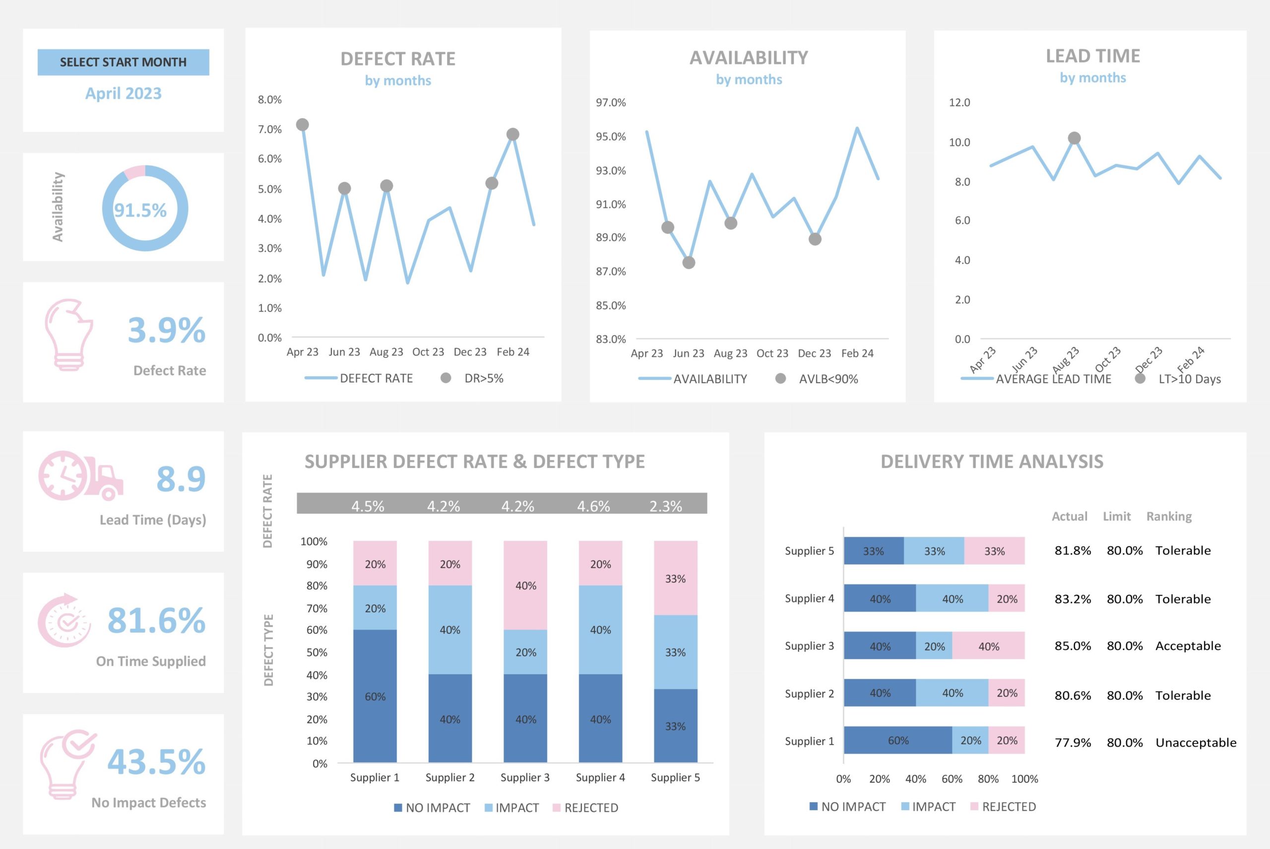
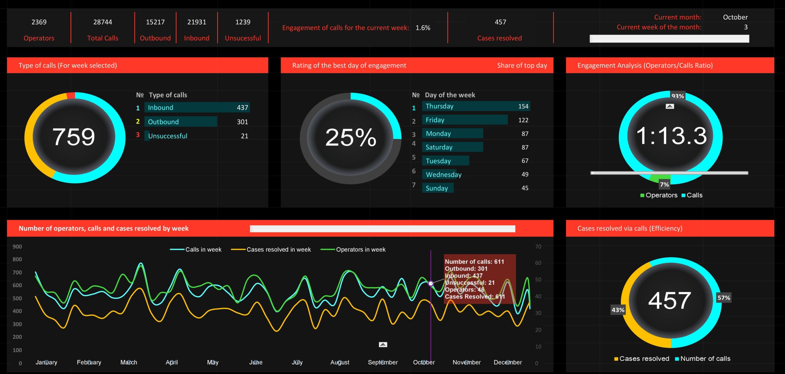
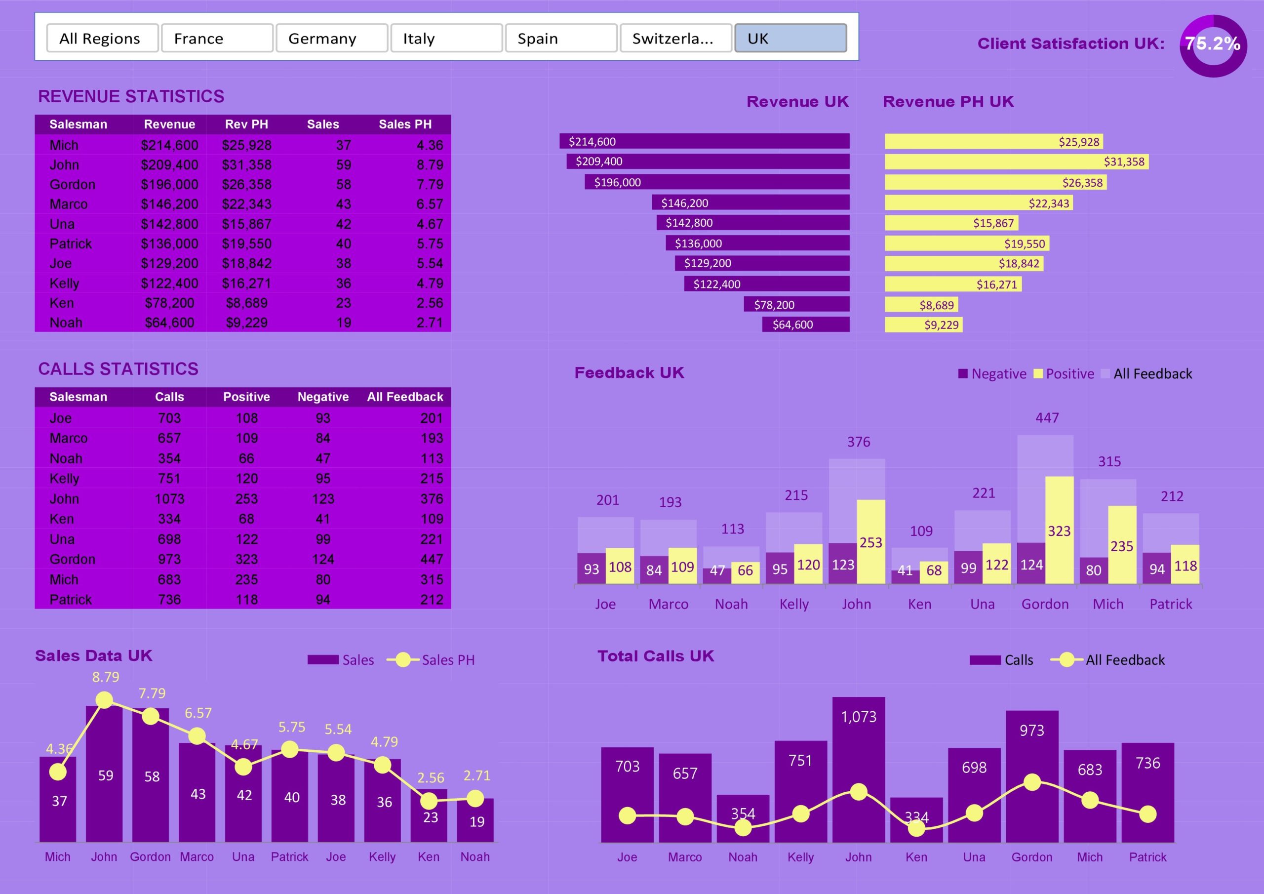
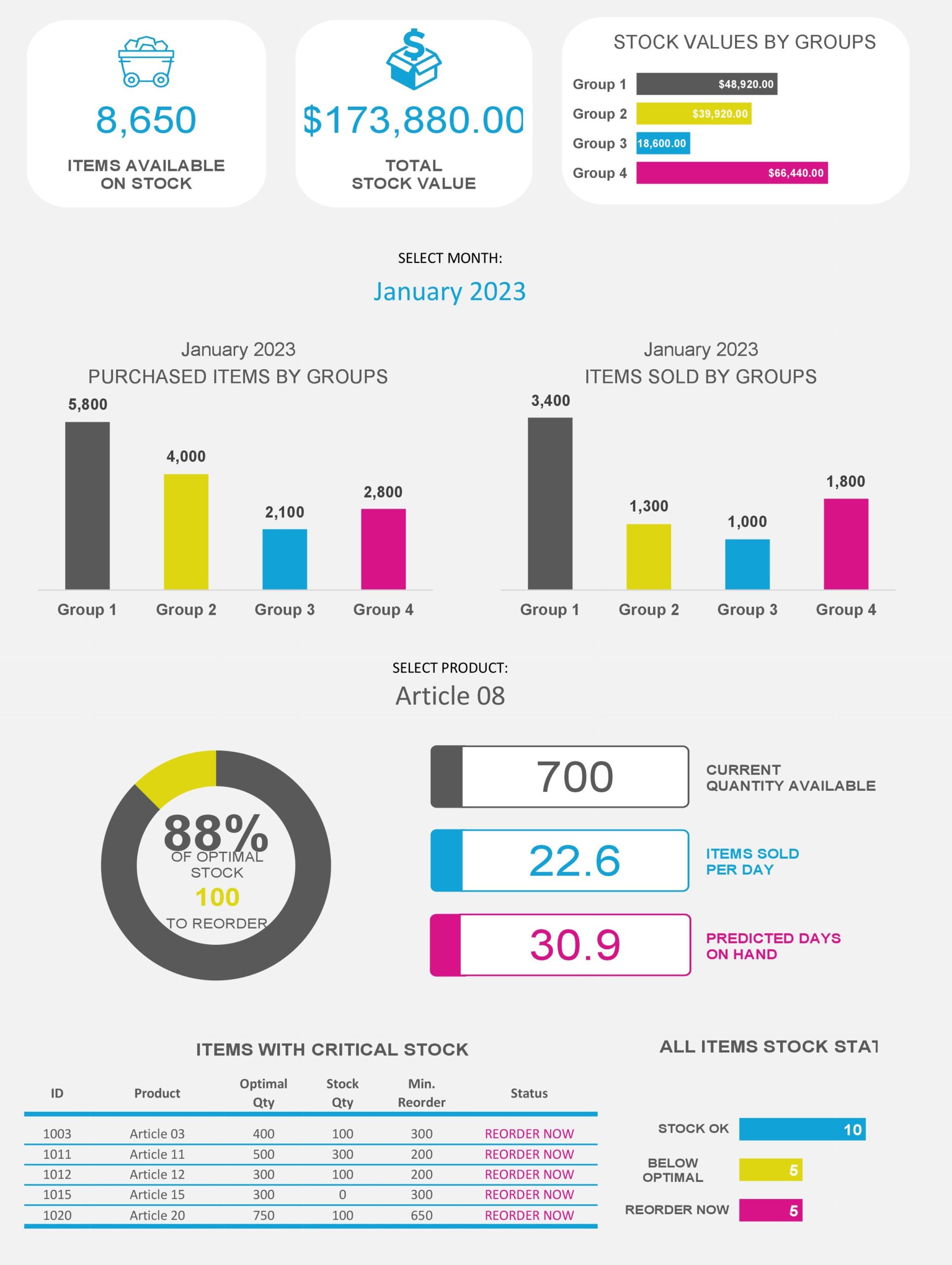
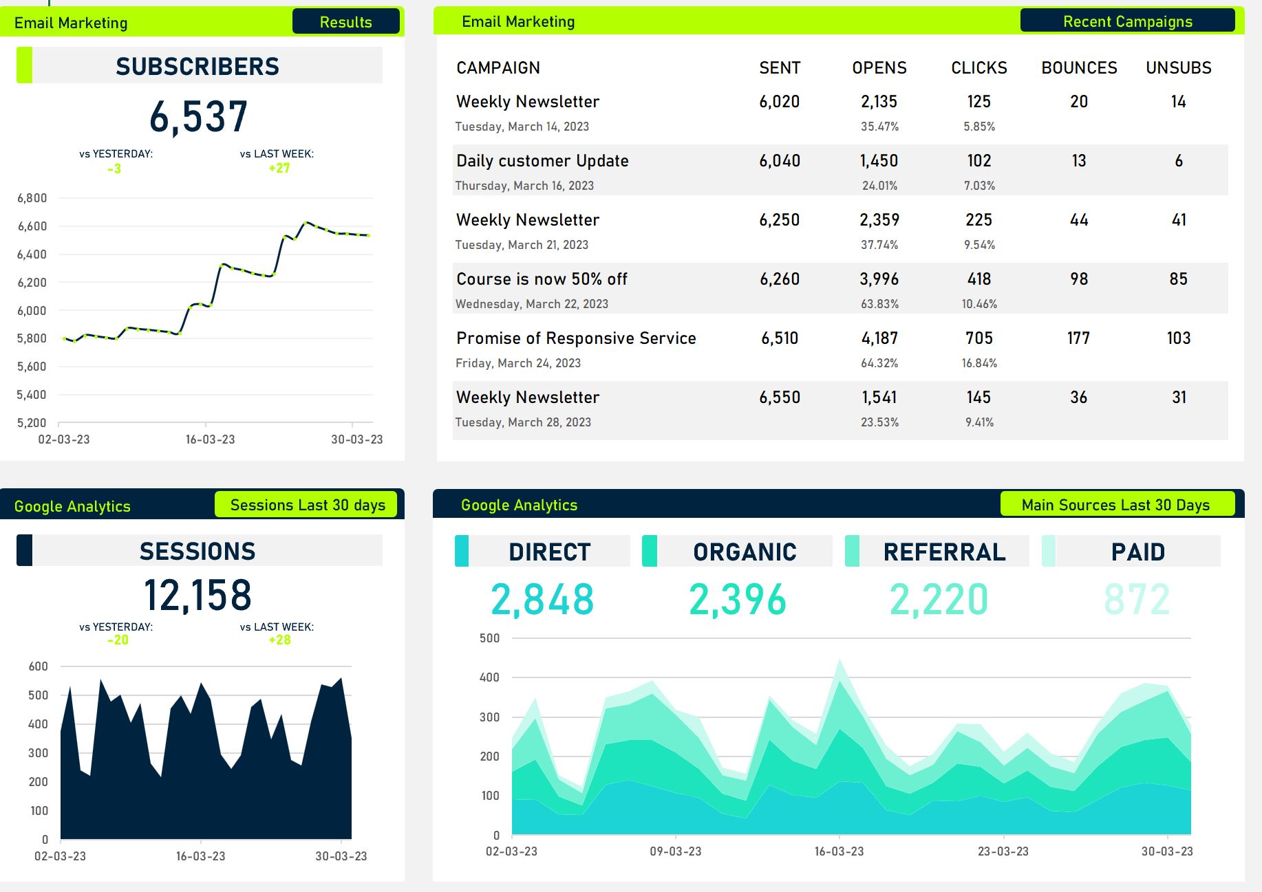
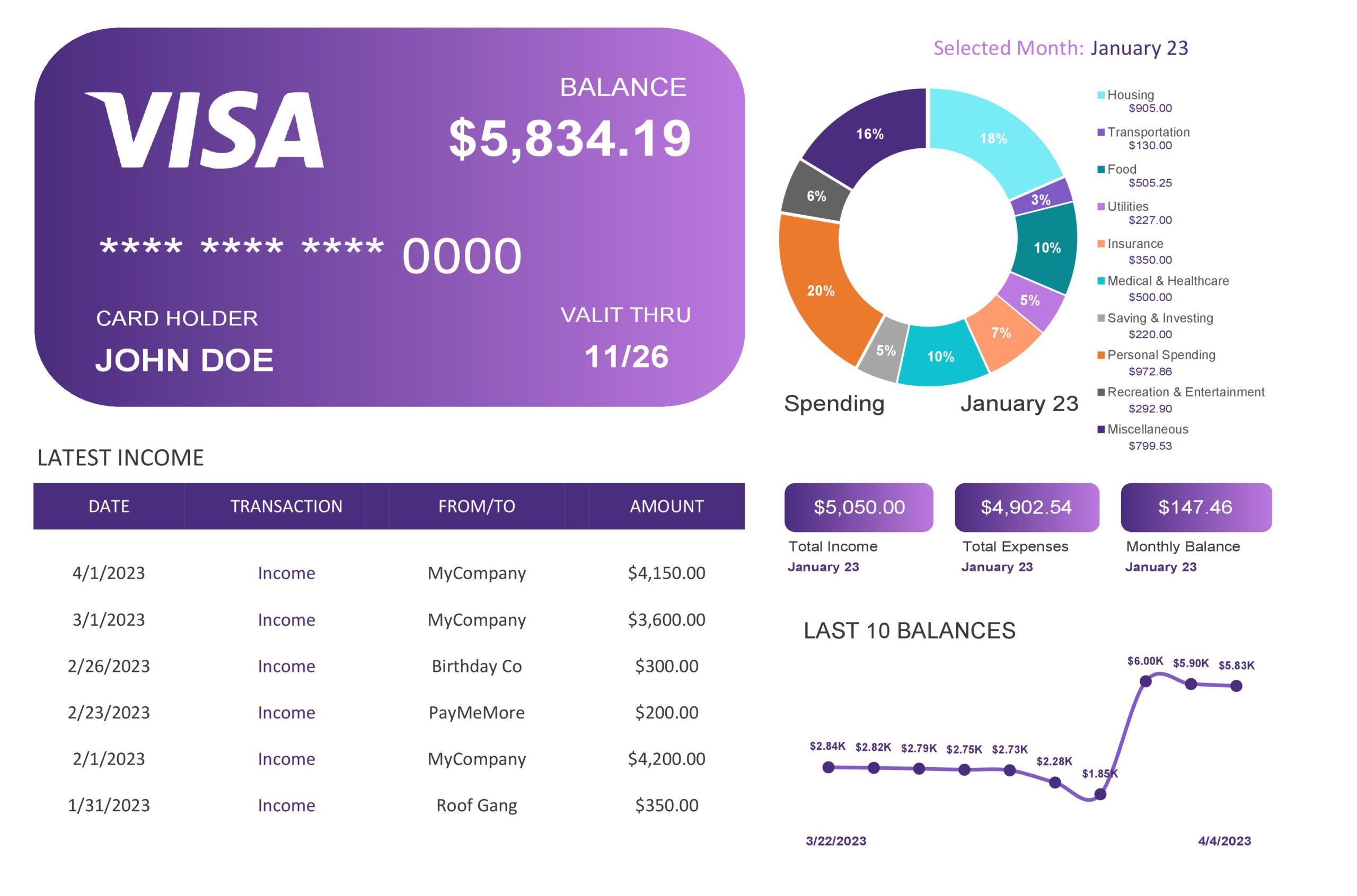
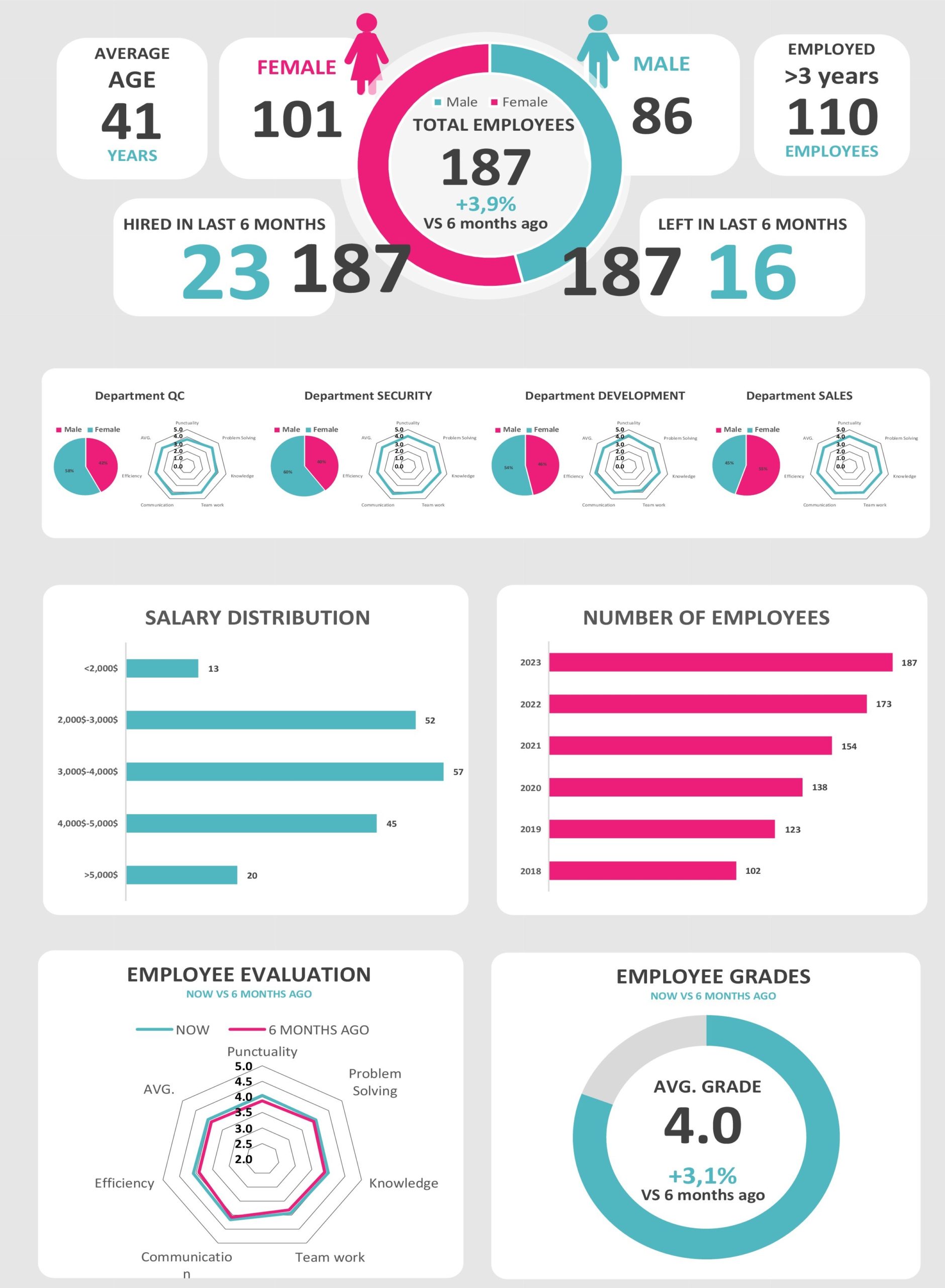
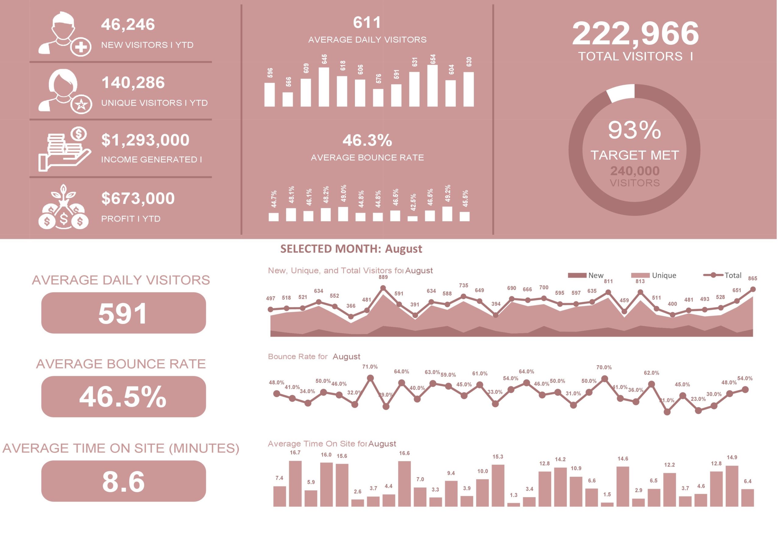
In a data-driven world, information is the most expensive commodity. But for it to have value, it must be the right information presented in the best possible manner. Gathering the data to produce the right information can be very challenging. This is the reason why Excel dashboards templates have become valuable as you can use these to consolidate valuable information into a summary.
Table of Contents
Excel Dashboard Templates
What is an Excel dashboard?
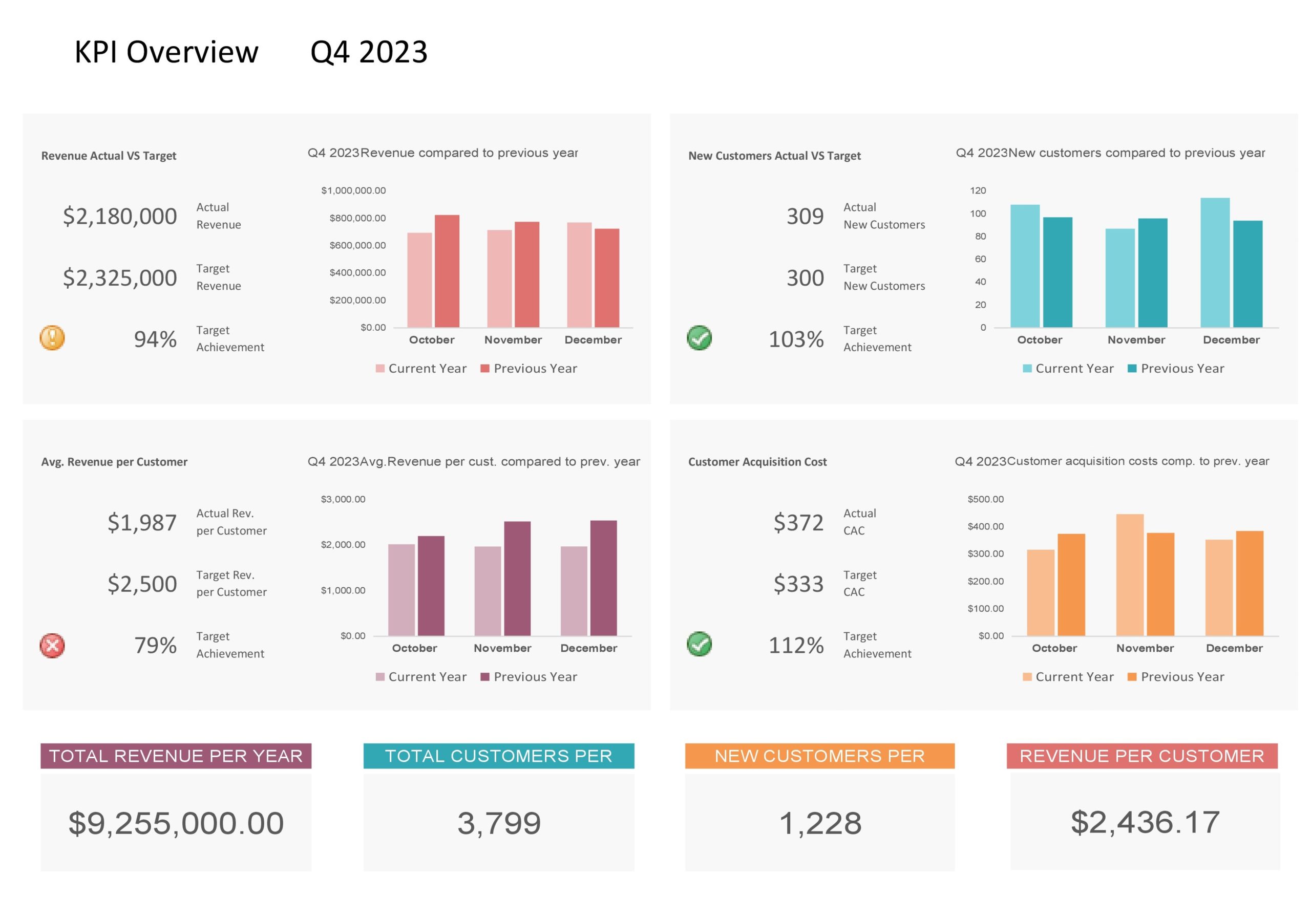
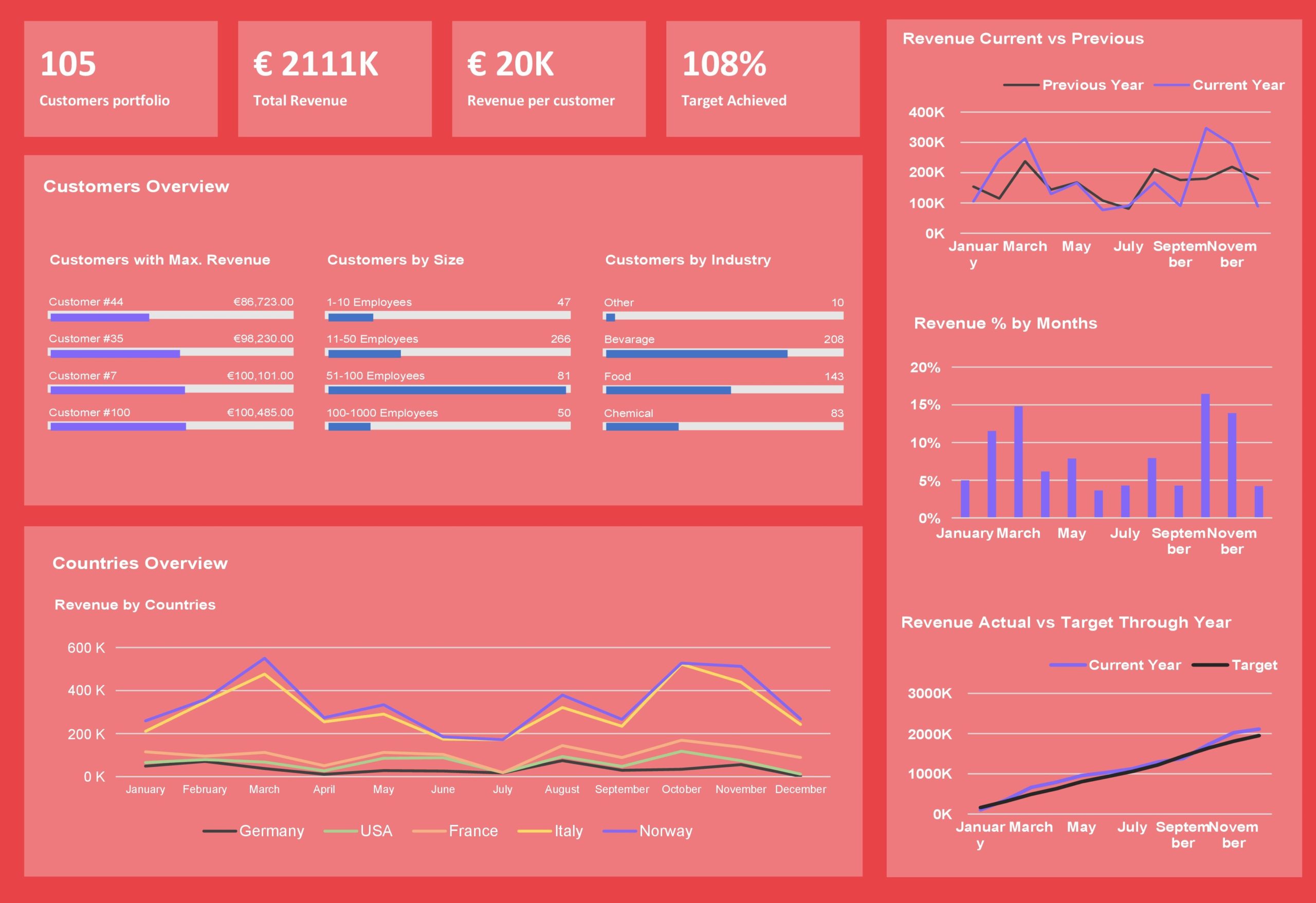
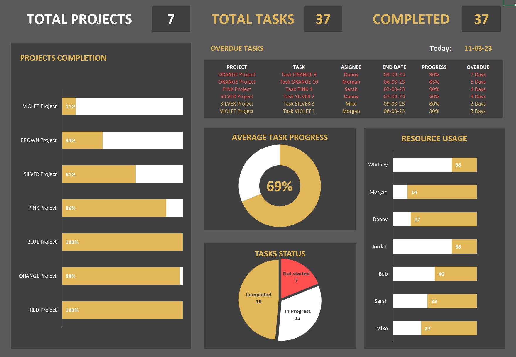
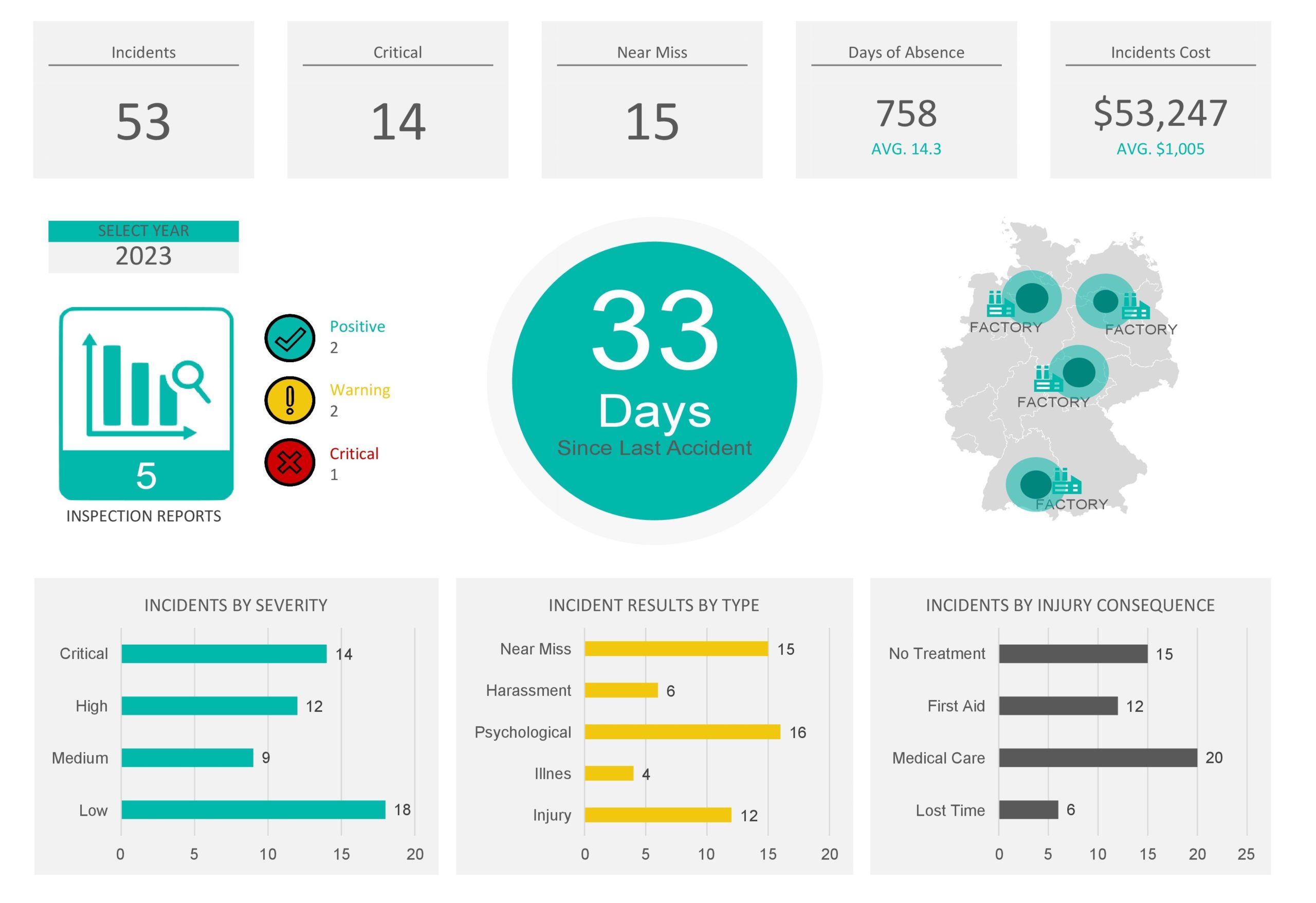
Excel dashboard templates provide you with a quick view of the key performance indicators in just one place. When you use a KPI dashboard Excel as a tool for business, it gives you a high-level view of your company’s work and assists you in making quick decisions based on data. There are a few types of dashboard report templates including:
- Strategic Dashboards
You use these dashboards for the purpose of helping you perform actions and make decisions with strategies. You do this by tracking performance related to key indicators to help you understand them better. - Analytic Dashboards
These dashboards focus on helping you compare past data so that you can identify spikes, drops, and trends. Since analytic dashboards involve lots of drill-downs and pivot tables, you can use them for interactive use. - Operational Dashboards
These dashboards present daily metrics to enable you to get a quick view of your company’s day-to-day performance.
KPI Dashboards
Benefits of using Excel dashboards
Excel dashboard templates are a type of information management tool that you can use to visually monitor, analyze then display:
- Key Performance Indications or KPIs
- Key data points and metrics that monitor the health of your business, its departments, or a certain process.
A performance dashboard Excel is a single-page summary of the analysis of the information, meaning it’s an overview of your system. Since these documents are very easy to read and comprehend, the use of a KPI dashboard Excel to review details and view the status of operations provides a significant opportunity to make your business more efficient.
You will also be much quicker to respond to opportunities and issues. Some benefits of using this tool are:
- They are highly customizable
You can customize your dashboard in terms of expectations and users. You can customize each decision level dashboard to present the most useful and valuable information. Doing this allows each person to see the level of detail needed to get the job done and meet your goals. - It’s comprehensive
Before the advent of dashboards, you would have to spend a lot of time reviewing and analyzing reports before coming to a final decision or conclusion. With the dashboard, you can see at a glance the overall situation report of the information you need. - It provides a lot of details
Dashboards don’t mean the absence of details. These tools go deeper in information as needed by choosing only the object or variable you need. - Intuitive presentation of data
Using dashboards doesn’t require exhaustive or complicated training as they are naturally intuitive for users. The graphic design allows you smooth and easy navigation throughout the document. - Accessible on mobile devices
Most dashboard software is both programmed and designed to suit any mobile device. The main purpose behind this is to give you access to the most accurate information no matter where you are.
Performance Dashboards
Preparing to make your Excel dashboard
Just imagining the data visualizations you can have when creating Excel dashboard templates will encourage you to get started. Before you start making your dashboard report template, consider these preparations first:
- Learn how to import data into Excel
Before you can create a sales or project management dashboard template, you must first know how to import your data into Excel. There are different ways to do this with varying levels of complexity depending on where your data currently exists. Research the best method to import your data. - Clean up your data
If you’re familiar with how to work with data within Excel, you should know that it is very important that each piece of information has its own cell. If your existing Excel spreadsheet is in a mess, take time to clean it up first.
Organize the information into appropriate columns and rows. While you’re at it, analyze then check the data for any errors or typos. This is also the perfect time to search for duplicate information that you need to delete.
If you want to use the dashboard feature, each row of data must be unique; otherwise, you will be double counting. A quick way to search for duplicates in Excel is to highlight the whole set of data then click the Remove Duplicates button.
Before proceeding, it’s recommended to keep your original data set somewhere else. This way, you can retrieve the data you started with in case you make a mistake. - Set up your workbook
The creation of a project or sales dashboard Excel template requires 3 separate tabs or sheets within the Excel notebook:
Give the first sheet a name that you can easily recognize like ‘Raw Data’ or ‘Data.’ This tab contains all of your raw data.
Label the second sheet “Chart Data.” This is where you store the data that you need to feed into the different charts of your dashboard.
Label the third sheet ‘Dashboard.’ This is where your charts will appear. For now, you can leave the last two sheets blank. At this point, the most important thing is to get your workbook ready. - Understand the requirements you need
After familiarizing yourself with Excel dashboards, you will realize the vast number of options that you can use. These options can feel overwhelming, which is why it’s important to be very clear on the reason behind your first dashboard. By considering the reason why you’re creating a dashboard, you will feel empowered to create a dashboard that will fit your needs exactly.
How do I create a dashboard in Excel?
Almost all Excel dashboard templates include different elements like tables, charts, gauges, and figures that help you present the data. A dashboard report template can handle any kind of data from various purposes and markets. You can use the information these provide for financial, marketing, or other projects.
But it’s best to use a KPI dashboard Excel for larger volumes of data since it is quite hectic to go through large data volumes, especially if you’re under time constraints. To create a dashboard, you can either create your own from scratch or use a template. Here are the first steps to creating your own dashboards:
- Brainstorm and strategize on the main purpose of your dashboard
You should first brainstorm the type of data to include in your dashboard before investing the effort and time to create one. Create a strategy with the main purpose you want your dashboard to serve. Then you can create strategies for achieving this main purpose. - Identify the best source of data
The next step after deciding the purpose is to identify the best source of data that you will present in your dashboard. The data will be the fundamental element of your dashboard and will guide the other components that you will add to it.
The purpose of why you create a dashboard determines to a large extent its features and appearance. Make sure that your dashboard includes only the relevant aspects of the data related to the decision making process.
Its appearance also depends on those who will receive the information. You can ask yourself questions like:
What are the preferences of your audience?
Are your target audiences consumers, managers, external clients, or your colleagues?
How much time does your audience have to go through the dashboard?
You should consider all of these attributes when designing your dashboard while remembering the preferences of your target audience. - Design your dashboard
While you brainstorm, you should also create an outline of the relevant elements that you plan to include in its design. You can decide whether to improve or use pre-built templates for the purpose of saving resources and time.
The key elements of dashboard templates include static tables, pivot tables, auto-shape objects, dynamic charts, other non-chart widgets, and gauge widgets. The space occupied by each of these items can also determine the readability and appearance of your dashboard. While designing, ask yourself questions like:
Does my dashboard have too many tiny objects making it look cluttered?
Do I need all of these elements?
Do I need a couple of bigger objects that are much easier and faster to study?
Identify all of the essential elements that you want to add to your dashboard so that you can categorize similar elements in the same section within the dashboard.
Moreover, the background color of your Excel dashboard can also affect the readability of the information to a large extent. The best technique is to select a color code for similar objects.
This makes it easier for your readers to go through the information presented on your dashboard. The choice of colors can also help your readers distinguish between certain categories of elements for easier comparisons.
You can enhance the user interface of your dashboard by simplifying the navigation panels. An effective way to do this is by adding labels to graphs, including freezing panels and drop-down lists to limit scrolling.

