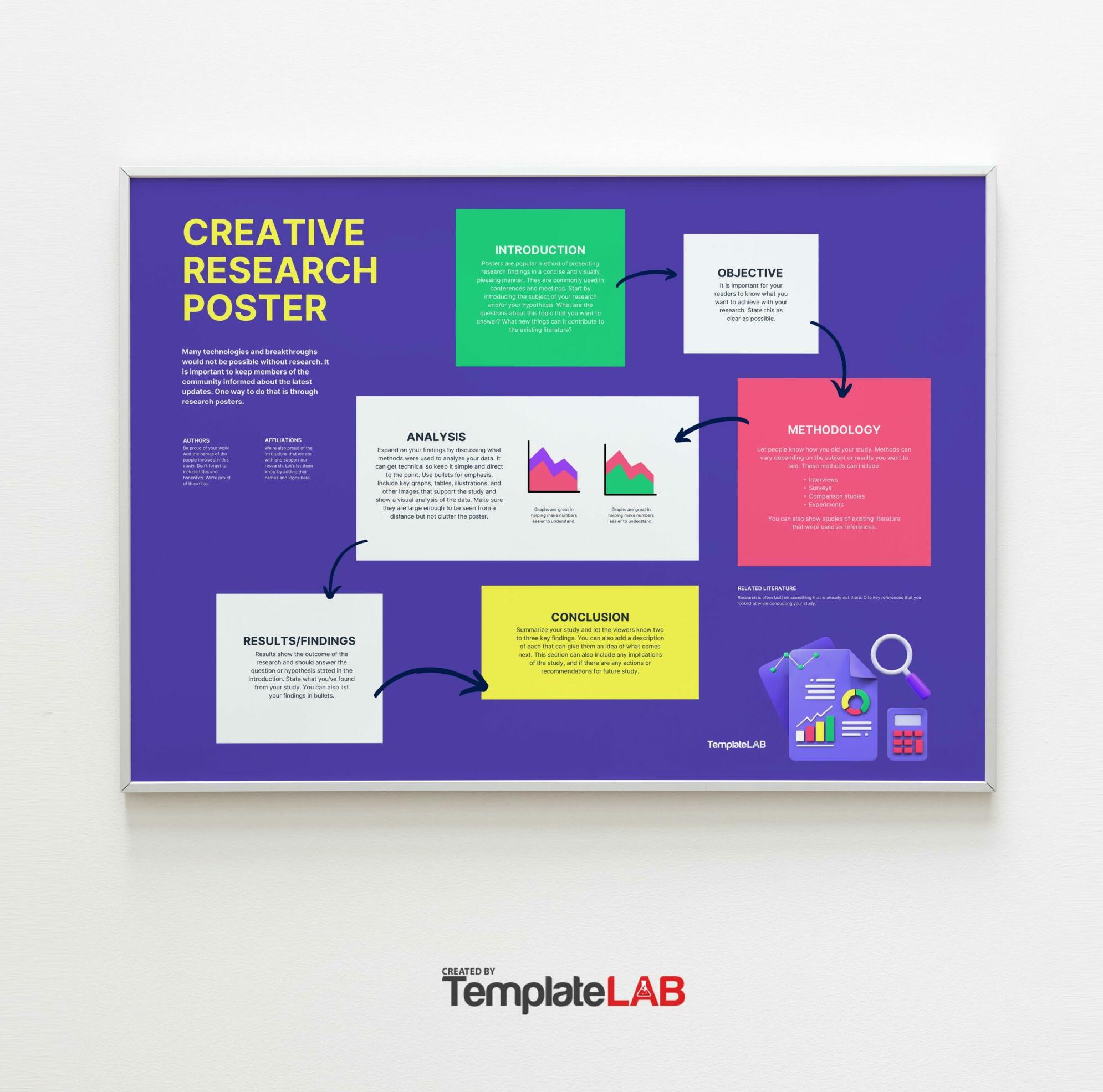
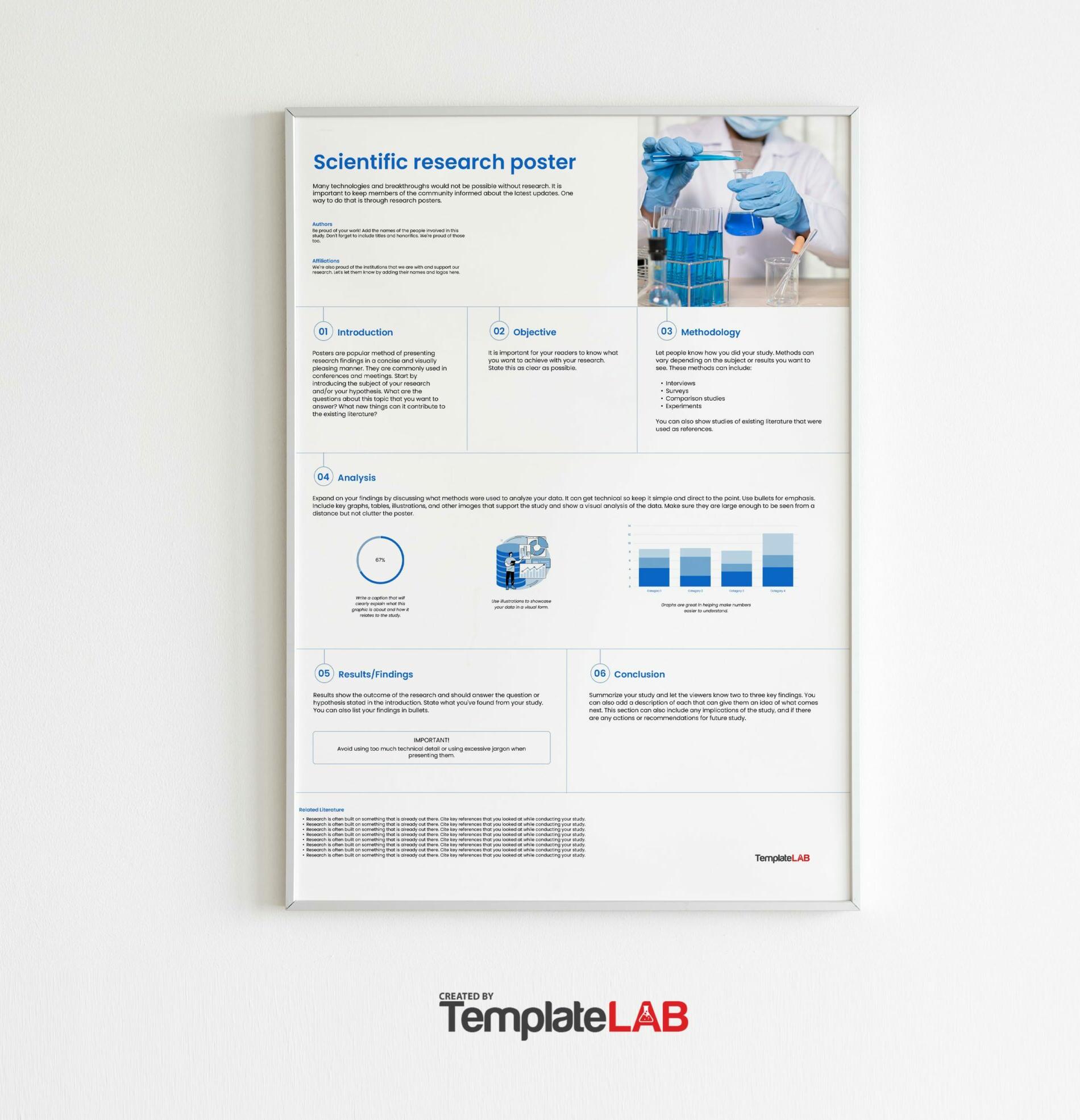
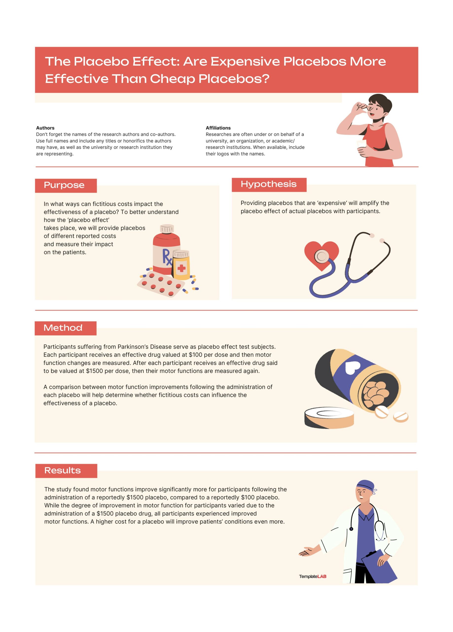
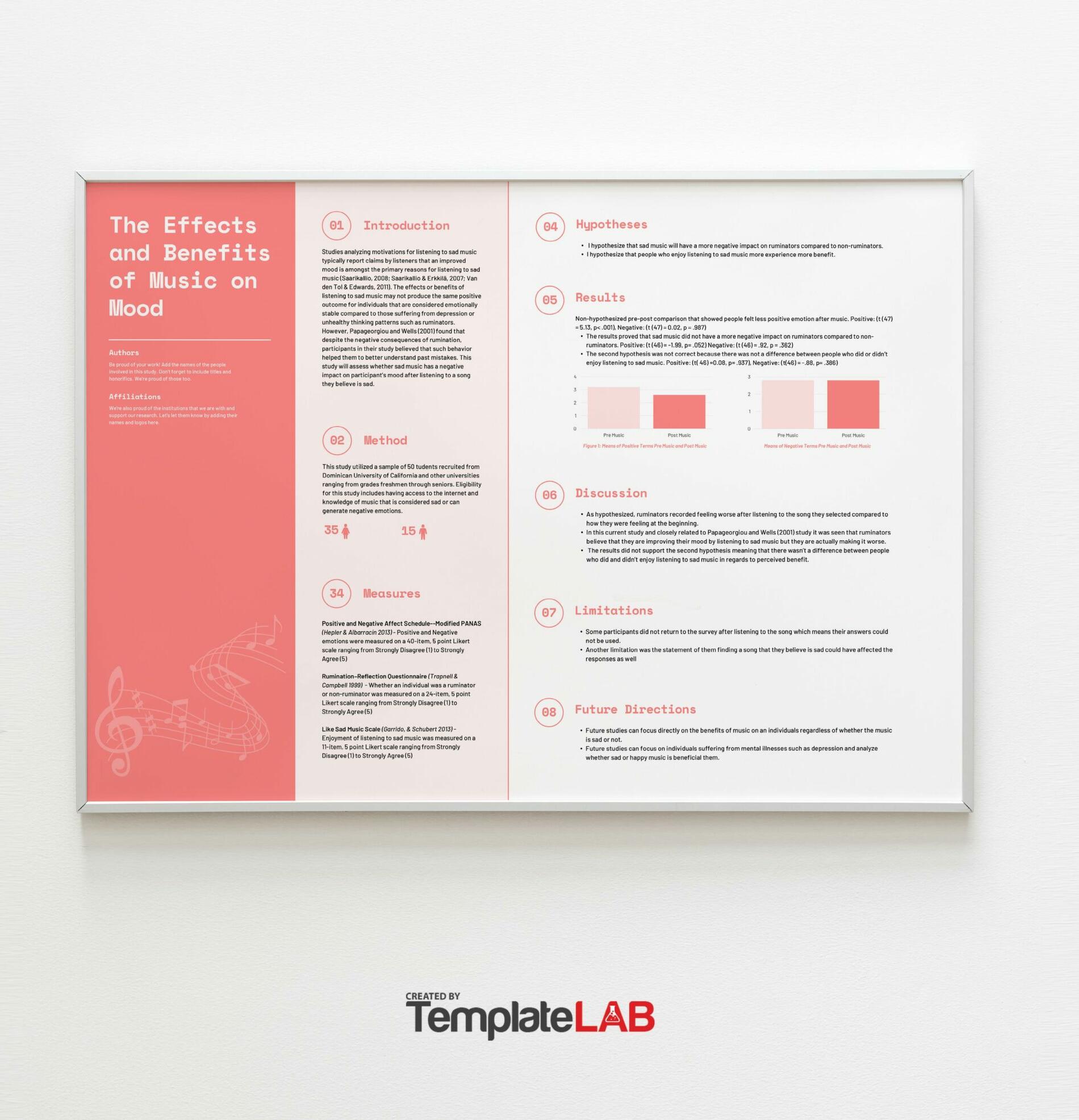
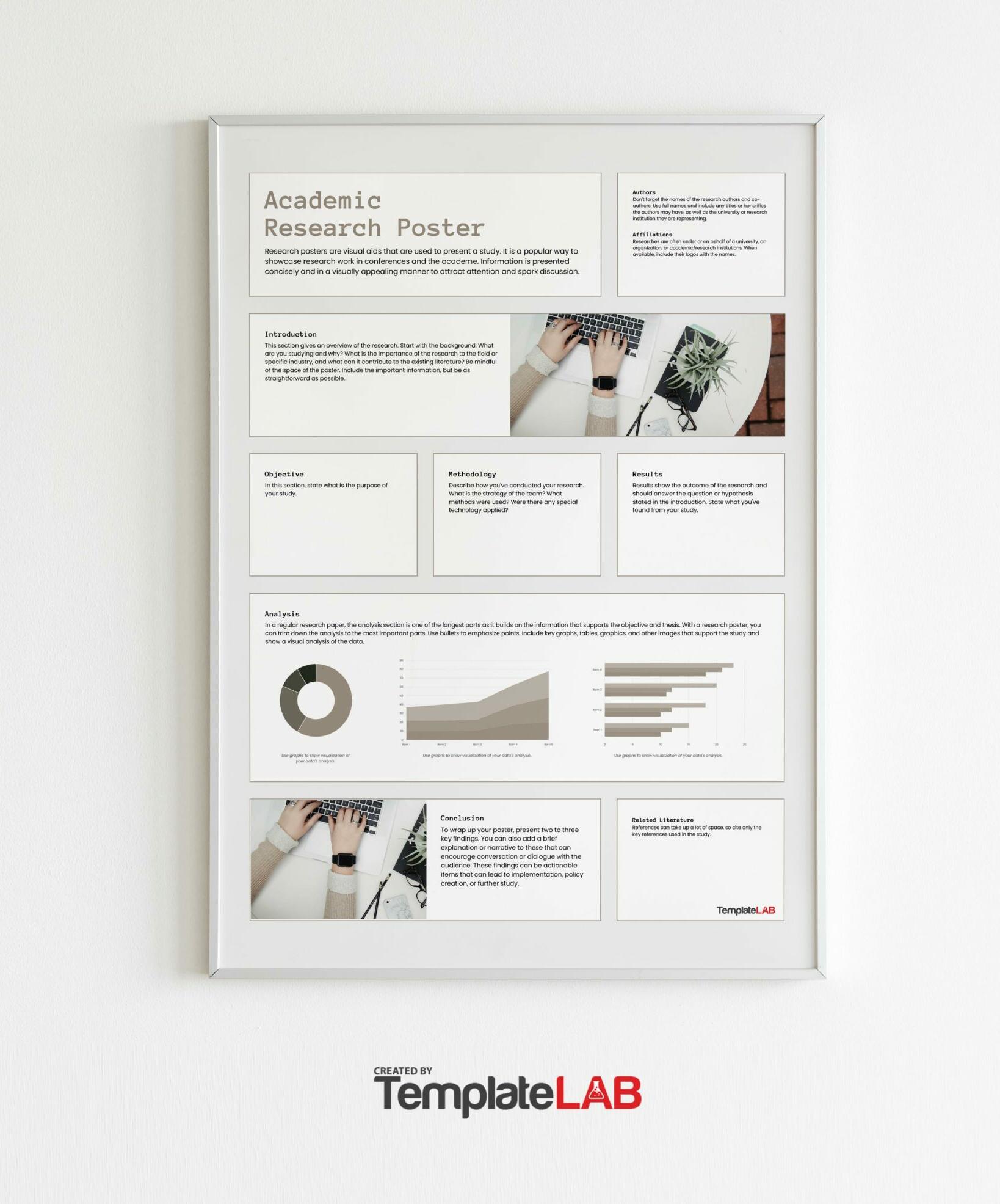
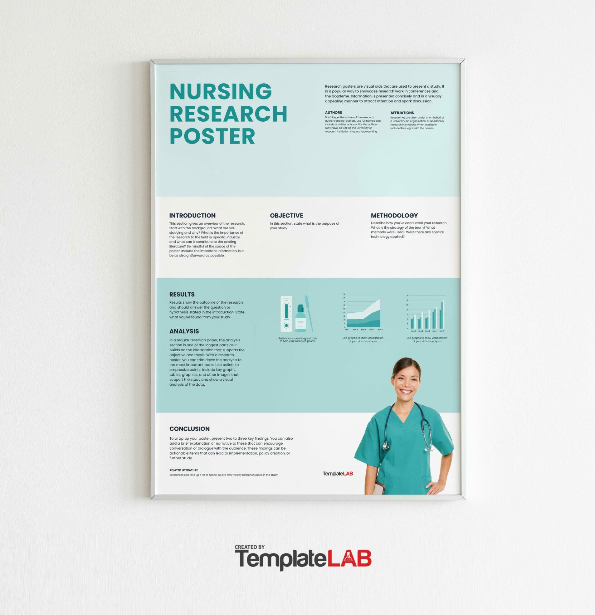
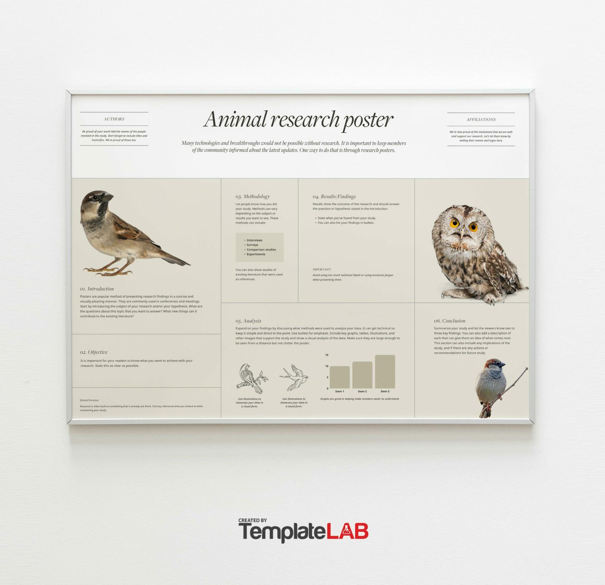
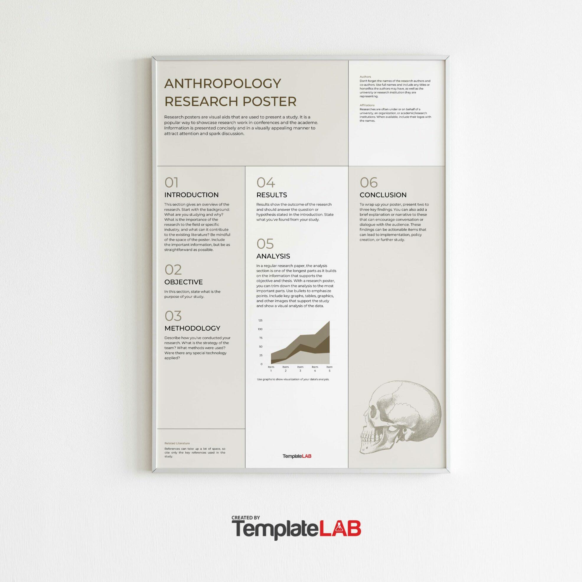
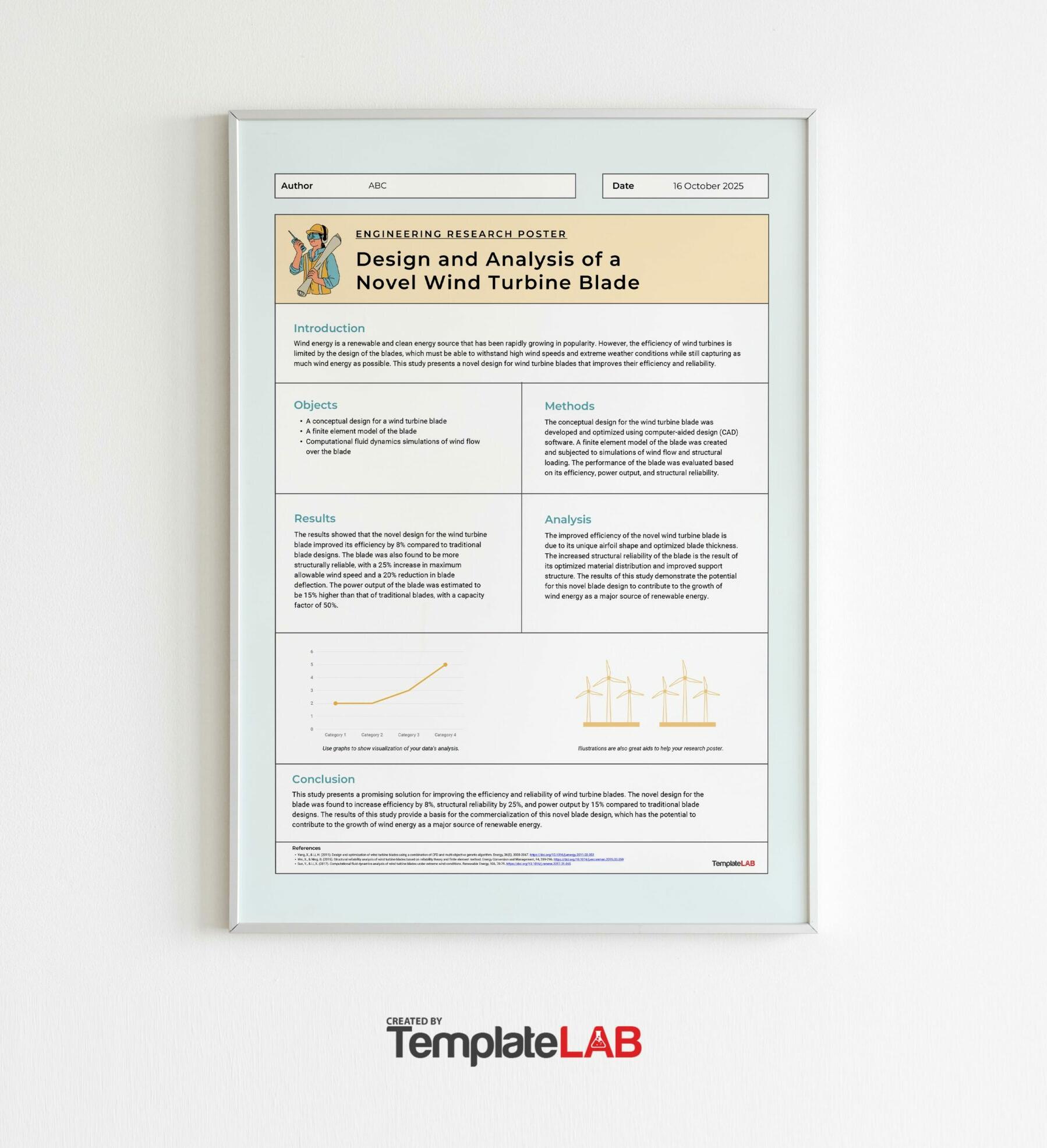
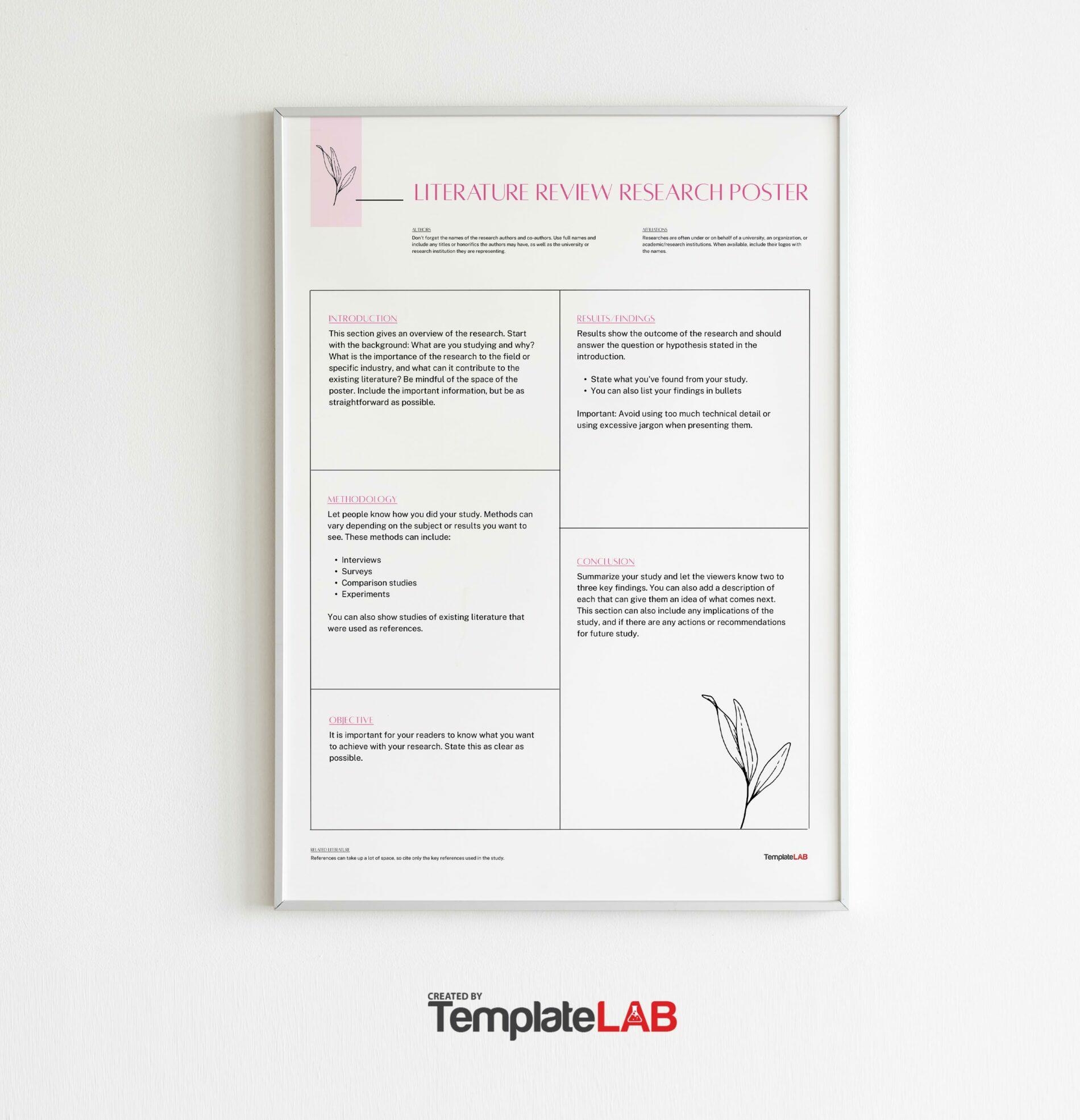
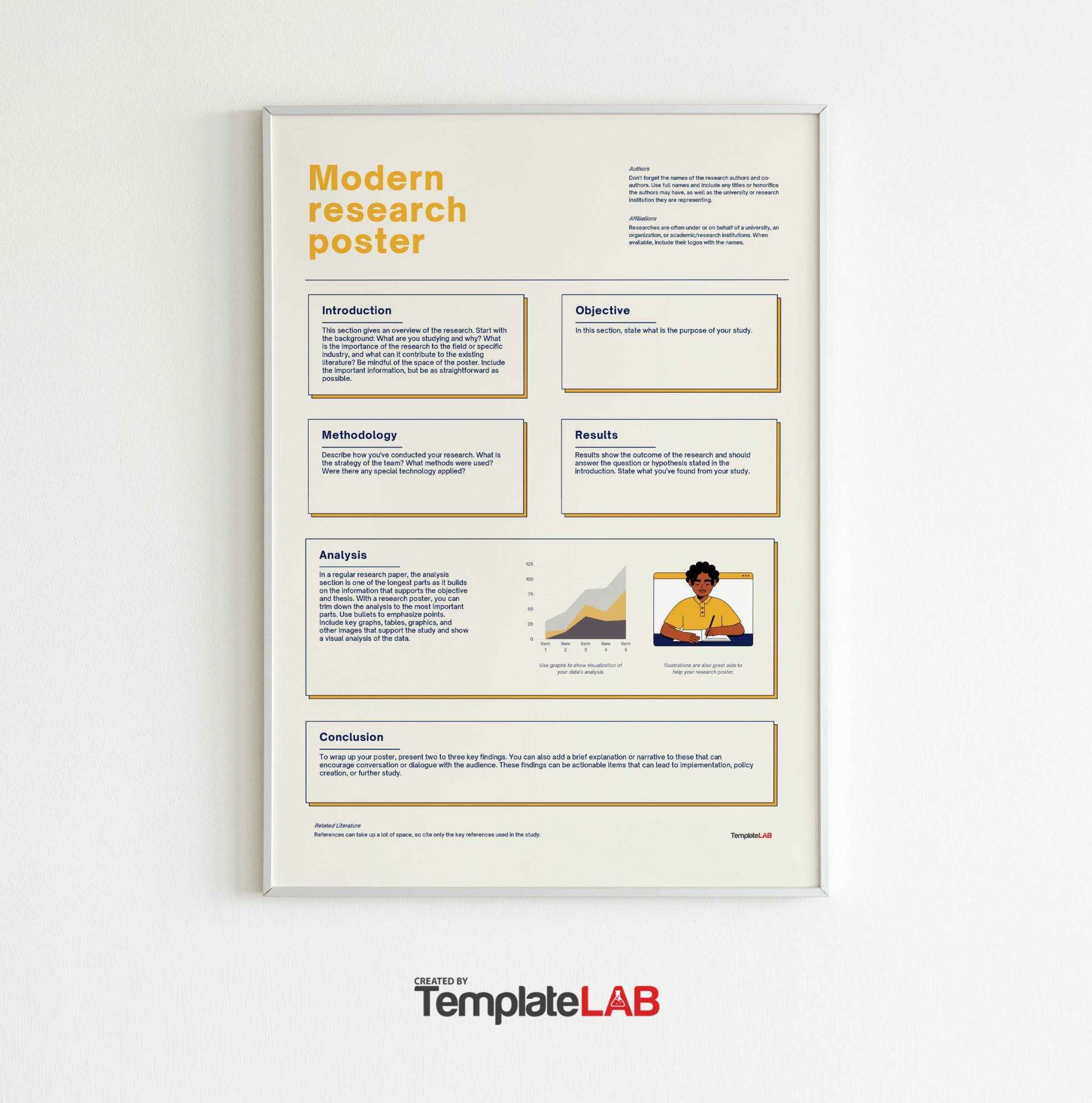
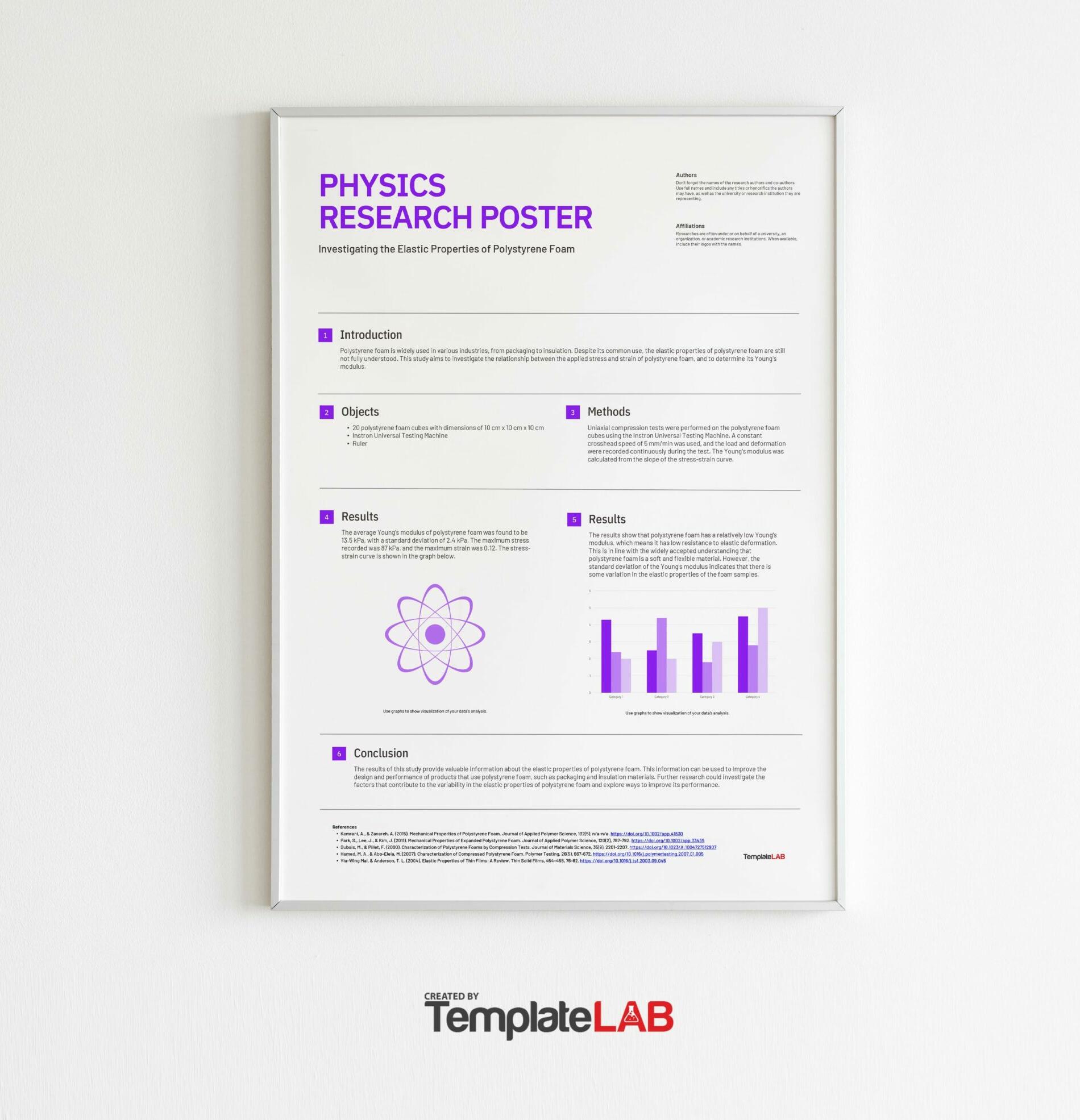
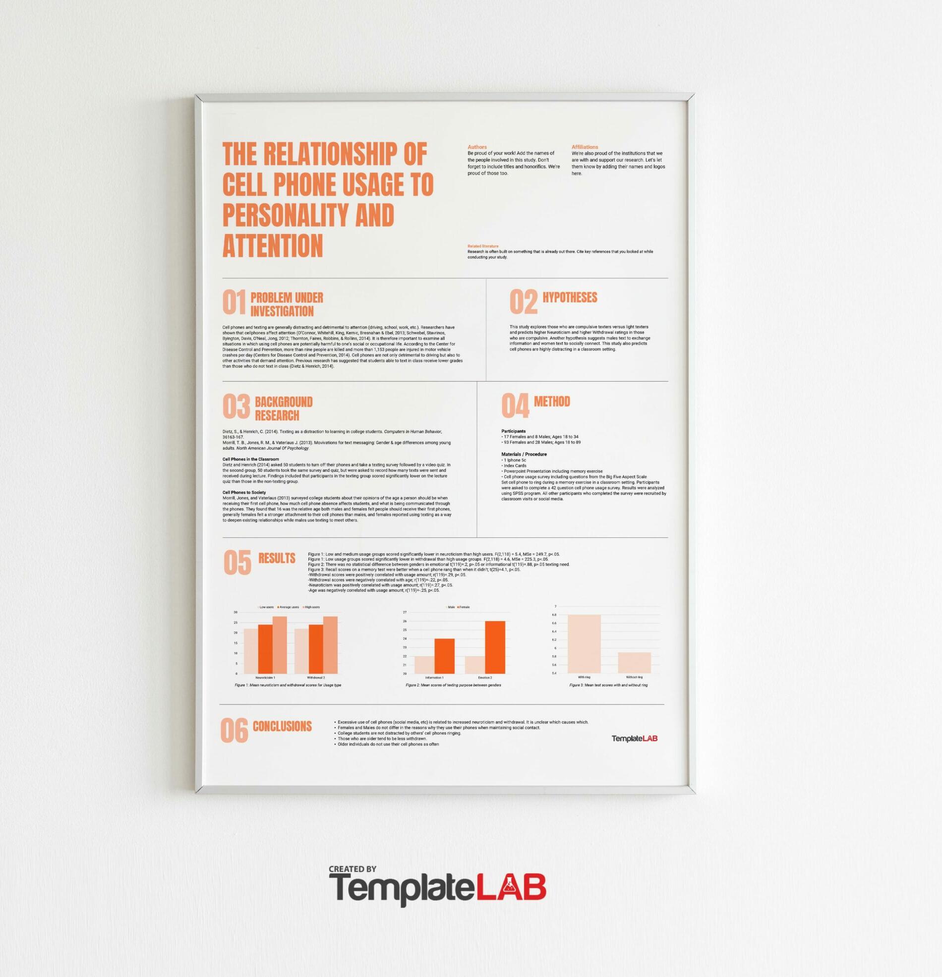
Learning how to create a research poster template is important as these are widely used in conferences, presentations, and more, especially in the academic community. A research or scientific poster template summarizes the research or information in a concise and attractive way to publicize this information and start discussions.
Table of Contents
Research Poster Templates
What makes a good research poster?
A typical research poster template contains a combination of pictures, tables, graphs, and other elements used in presentations. This type of template is also known as a scientific poster template, an academic poster template or a science poster template. At conferences, researchers stand by their poster so they can talk about the topic more effectively.
If you want to create an effective research poster, make sure that it should:
- Be completely readable from up to 10 feet away.
- It has a short title which catches the interest of the audience.
- It has a word count of 300-800.
- The text is both concise and clear.
- Make it easier to read by using headlines, numbering, and bullets.
- Use colors, fonts, and graphics effectively.
- It has a clean and consistent layout.
- It includes your name, the name of your institution, and acknowledgments.
Research Poster Examples
Components of a research poster
Most people who create research or academic poster templates organize the information into sections. Each section contains paragraphs, charts, photos, and other elements. Each section that you plan to include must have its own purpose. Also, make sure that the viewers would have familiarity with these sections.
To make it easier for you, it’s best to organize all of the information on your template into these main components or sections:
- Introduction
The elements in this section set the stage for the rest of your poster. Here, the readers learn more about your research giving them a better idea of what to expect.
Condensed Abstract
Background
Hypothesis
Purpose or Objectives - Research
This section contains all of the data you’ve collected through your research and the methods you used all throughout. It contains most of the “meat” of your template so make sure to think about this section carefully.
Materials
Methodology
Analysis
Models
Results - Conclusion
Finally, this section is where you include the summary and analysis of your results.
Recommendations
Implications
Discussion
Acknowledgments
Contact Information
You may choose to add more sections or elements depending on your needs. But these basic components are what the readers expect, therefore, you must pay special attention to them. Also, before creating your template, you must first answer these questions:
- What is your poster all about?
- Why do you need to create the poster? What do you hope to add to the discussion?
- What methods did you use during your research?
- What conclusions did you come to?
- What are your recommendations based on your research?
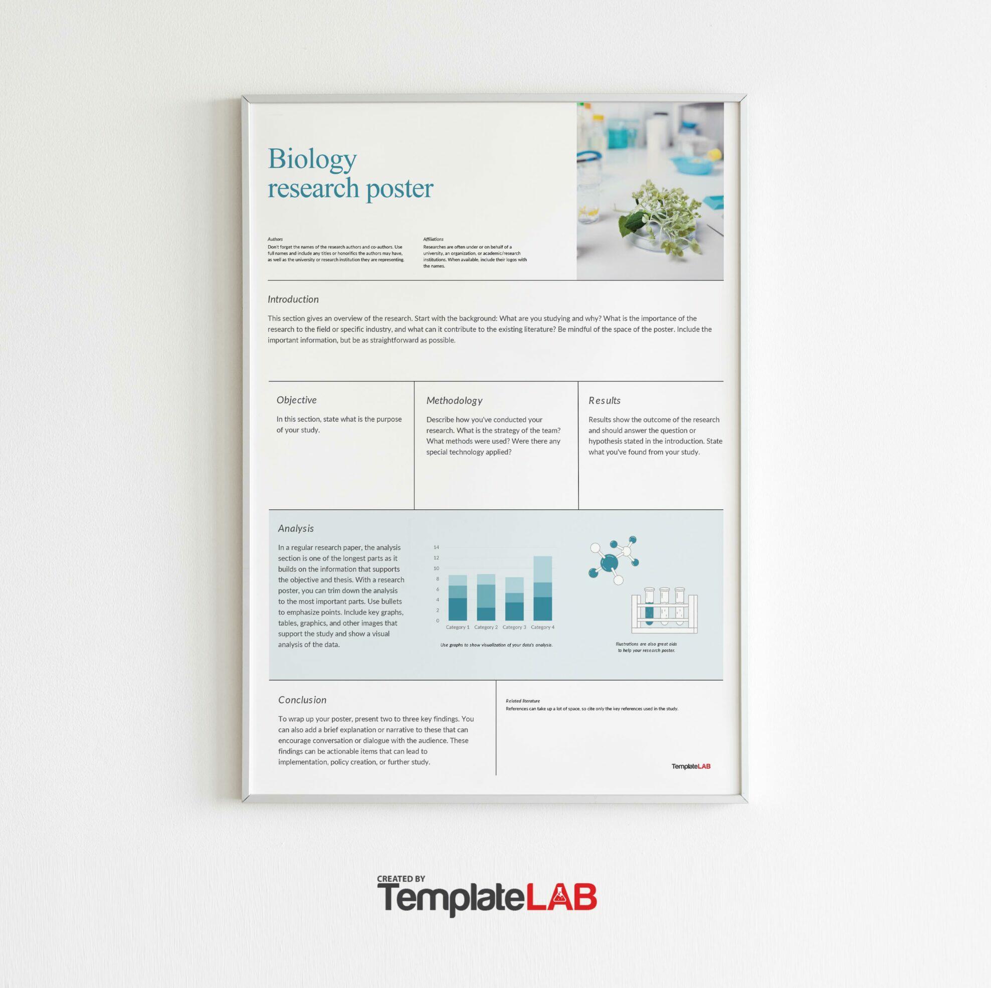
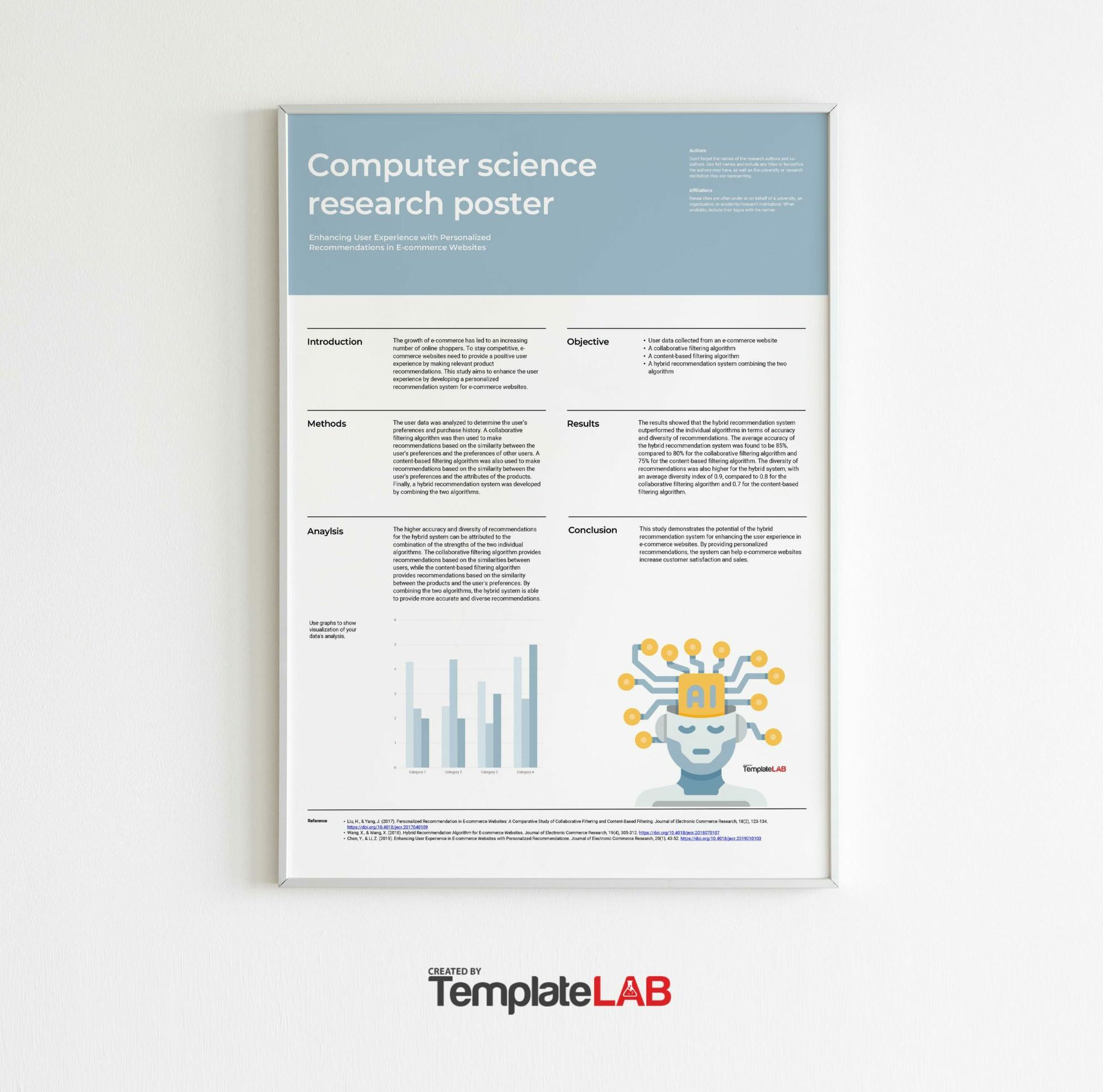
Most academic and science poster templates have columns which contain a few sections in each column. Readers go through these columns from top to bottom so you must organize the information this way. This gives your readers a clearer picture of the poster’s contents.
You can create your own research poster template or you can download starter templates and customize these according to your needs. Downloading a template makes it easier since you already have a structure to start with. But if you can’t find one which suits your preferences, you can make your own.
Research Poster Presentations
The layout of your research poster
Most types of research poster templates have similar components. There’s no standard when it comes to these types of posters. But when thinking of the layout, make sure that it’s both organized and logical. To help you out, here are some pointers to keep in mind:
- Size and orientation
If you’re looking for a “standard size,” most people use 48-inches x 36-inches in landscape orientation. But if this is too small or too big for you, feel free to modify the size. Also, there’s no problem with using a portrait orientation if that works with your content. - Background
It’s important that your poster’s background doesn’t distract the viewers. This is why most people use white or other light colors for their backgrounds. You may also use subtle gradients as long as these don’t take any attention from the rest of the elements on your poster.
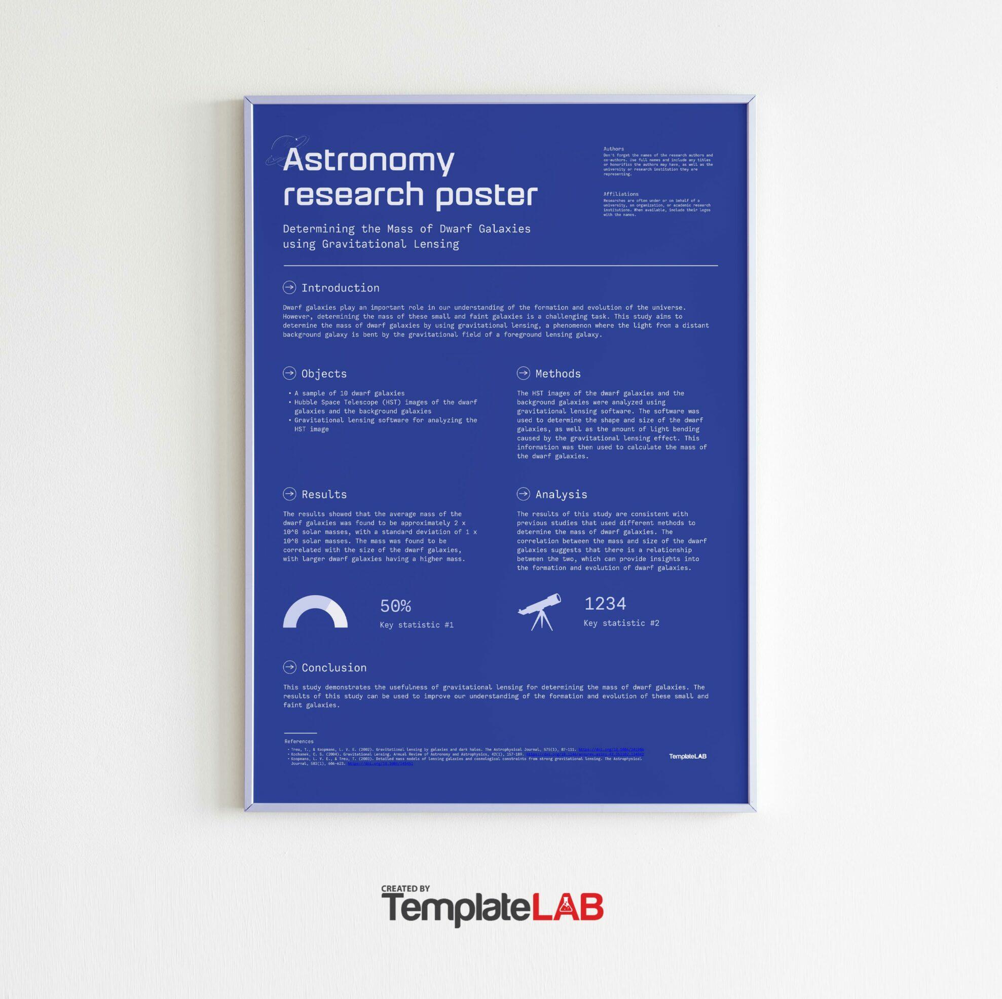
What you should avoid are distracting colors, busy patterns or even photo backgrounds. If you want to use a dark color, you may want to use white color for your text to make it more readable. - Styles of the title and headings
The best posters allow the viewers to see the titles and headings clearly at a glance. These make it easier for the viewers to know what your poster is all about. Use boxes, strategic colors, bold text, and a lot of whitespaces to make sure that these elements standout. - Fonts
The main rule when it comes to fonts is to make sure that they’re readable. Beyond this, it’s already up to your own preferences. One good principle of design is to use a single font for the title and all the headings and a different font for the rest of the text.
Also, make sure that all of the most important text on your poster can be clearly read from a normal distance. This way, even the viewers who aren’t right in front of your poster can read what’s written on it. Also, set a good spacing for the fonts as this adds to their readability. - Colors
The color scheme is an important element of your research poster template. Use colors which capture the attention of the viewers and emphasize the most important information too.
It’s best to use the same colors as your own brand but this isn’t a requirement. If you want to choose different colors, you may want to opt for neutral colors and just one bold color which you may use sparingly. - Alignment and whitespace
If you want your poster to look professional, you must align all the elements well. This doesn’t mean that you should align all the elements on the left, the right or the center. You can use different alignments as long as you make sure that everything looks organized and there’s nothing out of place.
Finally, you must also make sure that there’s enough whitespace between each of the elements in your poster design. There shouldn’t be any elements or text which are too close to each other as viewers who are far away can’t see these clearly. The more whitespace your poster has, the more you can emphasize the most important elements.
Design tips and guidelines for your research poster
At the very core, a research or scientific poster template serves as a visual representation of information which you’ve consolidated and organized into a format that’s easier to read. Ideally, viewers must understand the content of your poster in a matter of minutes. After all, they would probably move on if your template takes forever to read!
If you want to get the best results, make sure that your poster is well-designed, logical, and consistent. To help you out, here are some rules to keep in mind:
- Less is more
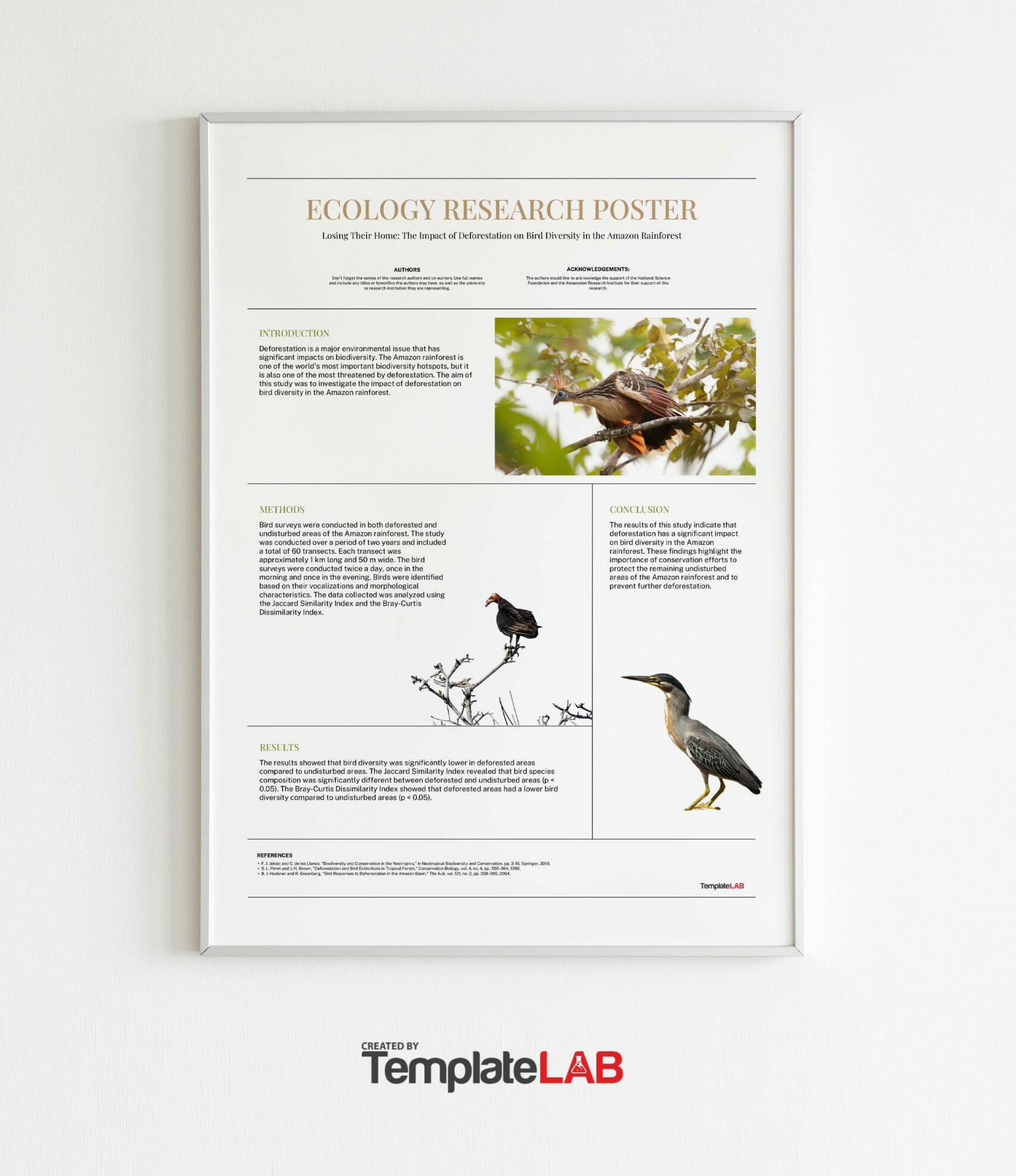
When it comes to the design of your poster, you may want to go for a simpler layout instead of a loud, distracting one. Remember, this is an academic poster template. You don’t have to add cute graphics and other irrelevant elements to it. The simpler it is, the easier your viewers will understand it. - Avoid clutter
Cluttered posters aren’t appealing in the least. Using too many elements makes it difficult for viewers to find the most important information. Also, a cluttered poster makes it challenging to distinguish the sections from one another. - Perform a final check before having the poster printed
Before you have your poster printed, perform a final check on it. Make sure that everything looks great, you haven’t made any spelling or grammatical errors, and everything is easy to read and understand. As part of your final check, you may want to answer these questions:
Is there a logical flow to all of the sections in the poster? Remember that all the sections must flow smoothly from start to finish.
Is all the text easy to read? Make sure all of the text stands out, especially the title and all of the headings.
Are all the images of a high-resolution? Zoom in to the images you’ve used to ensure their clarity and crispness. This is especially important if you plan to have a large-sized poster printed. Low-res files tend to get blurred or pixelated when printed in larger sizes.
Will your viewers understand all of your data? Make sure that all non-text elements are easy to understand. If needed, include captions under them.
Have you highlighted all of the most important information? This is important as well so that your viewers can look at all of the highlighted information to get a quick overview of the content of your poster.

